ContentControlEx is a ContentControl with two extra properties and one piece of behaviour that has no property at all. You rarely place one yourself — it is the presenter inside most MahApps templates, which is where its properties come from.
| Property | Type | Default | |
|---|---|---|---|
ContentCharacterCasing |
CharacterCasing |
Normal |
upper-cases or lower-cases string content |
RecognizesAccessKey |
bool |
False |
whether an underscore marks an access key |
Character casing

<mah:ContentControlEx Content="Save the document" ContentCharacterCasing="Upper" />
CharacterCasing is WPF's own enum with three values — Normal, Upper and Lower. The control does the work in three template triggers, each swapping the presenter's Content for the same value through a ToUpperConverter or a ToLowerConverter.
Because it is a converter on the content, not a text transform, it applies to the string and nothing else:
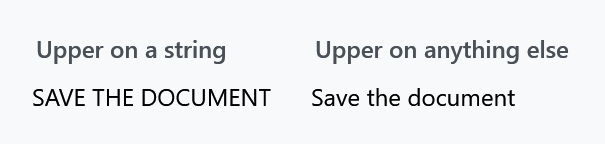
<mah:ContentControlEx ContentCharacterCasing="Upper">
    <TextBlock Text="Save the document" />
</mah:ContentControlEx>
The converter returns anything that is not a string untouched, so wrapping the text in a TextBlock opts out of the casing entirely — which is a useful escape hatch when a template forces Upper on you. The conversion is culture-aware, using the binding's culture.
It inherits
ContentCharacterCasing is registered with FrameworkPropertyMetadataOptions.Inherits, so a nested ContentControlEx picks the value up from an outer one — the fourth panel in the first figure.
It only reaches as far as the tree carries it. Because the property is registered on ContentControlEx rather than attached, an element in between that does not have it ends the inheritance: the content of a ContentControlEx inherits, the same control one panel deeper does not.
It inherits, but it is not an attached property. <StackPanel mah:ContentControlEx.ContentCharacterCasing="Upper"> fails to parse; the value can only be set on a ContentControlEx itself.
What templates actually use is ControlsHelper.ContentCharacterCasing, which is attached and can go on any control. The MahApps templates bind it through:
<mah:ContentControlEx ContentCharacterCasing="{Binding RelativeSource={RelativeSource TemplatedParent},
                                                       Path=(mah:ControlsHelper.ContentCharacterCasing)}" />
That is why writing mah:ControlsHelper.ContentCharacterCasing="Normal" on a GroupBox, an Expander, a tab header or a ToolTip turns their upper-casing off. See ControlsHelper.
Access keys

<mah:ContentControlEx Content="_Save the document" RecognizesAccessKey="True" />
RecognizesAccessKey is passed straight to the inner ContentPresenter. With it off — the default — an underscore in the content is just an underscore. With it on, the underscore marks the next character as an access key: WPF underlines it while Alt is held and routes the shortcut to the control.
The default here is False, which is the opposite of what a Button template normally does, so a template that wants access keys has to say so.
Buttons in the title bar
The behaviour with no property is in OnContentChanged. When the content is an IInputElement, ContentControlEx binds that content's WindowChrome.IsHitTestVisibleInChrome to its own, and clears the binding when the content is replaced.
That single binding is why a button placed in a MetroWindow's title bar can be clicked at all. The title bar is window chrome as far as the system is concerned, and chrome swallows mouse input unless an element opts out; ContentControlEx passes that opt-out down to whatever you put inside it, so WindowCommands and the window title work without anyone setting the attached property by hand.
Where it turns up
Eighteen other dictionaries in the library use it as their content presenter, among them the styles for Buttons, TabControl and MetroTabItem, GroupBox and Expander headers, ToolTip, GridViewColumnHeader in a ListView, ToolBar, SplitButton and DropDownButton, MetroHeader and WindowCommands.
MahApps.Styles.MetroThumbContentControl is MahApps.Styles.ContentControlEx with nothing changed — see MetroThumbContentControl.
The style
MahApps.Styles.ContentControlEx is applied through Generic.xaml, so a ContentControlEx you place yourself is styled already. It is deliberately unobtrusive: a transparent background, Focusable and IsTabStop both False, and everything stretched. It is a presenter, not a control the user interacts with.