DropDownButton is a button with a list attached. The whole button is one surface: clicking it runs its Command and opens the menu.
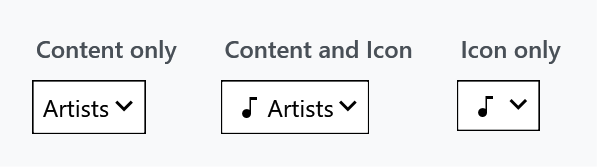
<mah:DropDownButton Content="Artists" ItemsSource="{Binding Artists}" />
ItemsSource is the content property, so the items can also be written as the button's child element instead of bound.
It is an ItemsControl, and the list is a ContextMenu
DropDownButton derives from ItemsControl and its list is a ContextMenu attached to the button inside the template. That single fact explains most of how it behaves:
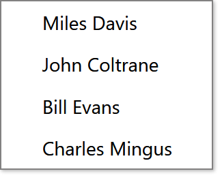
- items become
MenuItems, notListBoxItems - there is no selection — no
SelectedItem, noSelectedIndex, noSelectionChanged - the button's
Contentis yours and never changes on its own
The template forwards the usual ItemsControl properties to that menu — DisplayMemberPath, ItemTemplate, ItemTemplateSelector, ItemContainerStyle, ItemContainerStyleSelector, ItemStringFormat, ItemsPanel and GroupStyleSelector — so they work as you would expect even though the menu is not the control you are setting them on. GroupStyle entries are copied across in code, and the menu is given MinWidth="{TemplateBinding ActualWidth}" so it is never narrower than the button.
If you need selection or a button whose label follows the choice, use SplitButton instead.
Reacting to a click
There are two separate things to hook, and they fire in this order:
Command / CommandParameter / CommandTarget |
run when the button itself is clicked |
Click |
a bubbling routed event, raised straight after |
| a command on each item | run when an entry in the menu is picked |
The button click and the menu are not alternatives. Looking at ButtonClick, the control runs the command, opens the menu if it has any items, and then raises Click:
CommandHelpers.ExecuteCommandSource(this);

if (this.contextMenu?.HasItems == true)
{
    this.SetCurrentValue(IsExpandedProperty, BooleanBoxes.TrueBox);
}

e.RoutedEvent = ClickEvent;
this.RaiseEvent(e);
So a Command on the button runs on every click, including the one that opens the menu. If you only want the item commands, leave Command unset.
DropDownButton implements ICommandSource and overrides IsEnabledCore, so the button disables itself while its command reports CanExecute == false.
Giving the items a command
Each MenuItem gets one entry from the ItemsSource as its DataContext, so a command on the item has to reach back out of that context. An ItemContainerStyle is the usual way, and the way out is through the menu:
<mah:DropDownButton Content="Genres"
                    DisplayMemberPath="Name"
                    ItemsSource="{Binding Genres}">
    <mah:DropDownButton.ItemContainerStyle>
        <Style BasedOn="{StaticResource {x:Type MenuItem}}" TargetType="{x:Type MenuItem}">
            <Setter Property="Command"
                    Value="{Binding RelativeSource={RelativeSource FindAncestor, AncestorType={x:Type ContextMenu}}, Path=PlacementTarget.DataContext.GenreCommand}" />
            <Setter Property="CommandParameter" Value="{Binding Name}" />
        </Style>
    </mah:DropDownButton.ItemContainerStyle>
</mah:DropDownButton>
{Binding Name} reads the genre, because that is the item's DataContext. The other one finds the menu the item sits in and asks what the menu is placed on, which is the button inside the template, and takes the view model from there. Path=DataContext.GenreCommand works as well, since the menu inherits the same view model.
Do not reach further out than the menu. A FindAncestor binding for the button itself, or for the UserControl or Window around it, finds its target while the items are first built and nothing afterwards: the menu is a popup of its own, and WPF allows a ContextMenu no parent to walk up to. Hand the view a second view model — which is what a navigation framework such as Prism does when you leave a view and come back to it — and the items are built again, this time with nowhere to go, and their commands end up empty. See #4494.
The menu is a ContextMenu, but the right mouse button does nothing — OnMouseRightButtonUp marks the event handled. The menu opens on a normal left click, or by setting IsExpanded.
Properties
| Property | Type | Default | |
|---|---|---|---|
Content |
object |
null |
the button's label; static |
ContentTemplate / ContentTemplateSelector / ContentStringFormat |
null |
as on any ContentControl |
|
Icon / IconTemplate |
object / DataTemplate |
null |
shown before the content |
Orientation |
Orientation |
Horizontal |
stacks icon, content and arrow |
IsExpanded |
bool |
False |
two-way by default; opens the menu |
ArrowVisibility |
Visibility |
Visible |
|
ArrowBrush / ArrowMouseOverBrush / ArrowPressedBrush |
Brush |
theme | the chevron in its three states |
ButtonStyle |
Style |
MahApps.Styles.Button.DropDown |
the button inside |
MenuStyle |
Style |
MahApps.Styles.ContextMenu |
the menu |
ExtraTag |
object |
null |
a second Tag |
ButtonStyle and MenuStyle are both registered with Inherits, so setting either one on a parent panel reaches every DropDownButton below it.
Orientation
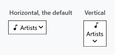
Vertical stacks the icon above the content and moves the chevron from the right edge to the bottom.
The arrow
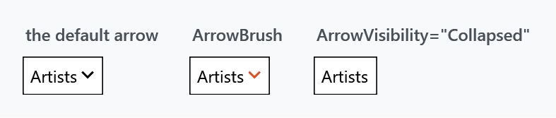
<mah:DropDownButton Content="Artists" ArrowVisibility="Collapsed" />
The chevron is a Material ChevronDown path drawn by a PathIcon. ArrowMouseOverBrush defaults to the accent brush, which is why the arrow picks up colour on hover while the rest of the button does not.
What a client is told
It is a button that opens and shuts, named after its Content, and a client can open it through the expand pattern rather than having to press it.
New on develop. In a released version the entries of the menu are the items of the control, which made it a list with no name, the button and its caption nowhere to be seen. This is #4454.
Related
SplitButton — the same idea with a selection and a split surface. ContentControlEx is what presents the content, so ControlsHelper.ContentCharacterCasing and ControlsHelper.RecognizesAccessKey apply here too.