MultiSelectionComboBox is a ComboBox that holds more than one pick. Everything a ComboBox can do it can do, and the properties below come on top.
This control is not in 2.4.11. It arrives with the next release and is in the 3.0.0 prereleases.
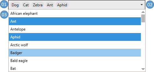
| No. | |
|---|---|
| 01 | the picks, or a text box holding them as one string while the control is editable |
| 02 | the chevron that opens and closes the list |
| 03 | the list, with the picks marked |
Selection
SelectionMode takes Single, Multiple or Extended, the same three a ListBox takes, and starts out Single. Anything else is rejected, so a fourth value cannot be set by mistake.
| Property | Type | Default | |
|---|---|---|---|
SelectionMode |
SelectionMode |
Single |
how many items may be picked |
SelectedItems |
IList |
null |
what is picked, in OrderSelectedItemsBy order; read-only |
DisplaySelectedItems |
IEnumerable |
null |
the same in the order they are drawn; read-only |
OrderSelectedItemsBy |
SelectedItemsOrderType |
SelectedOrder |
SelectedOrder keeps the order they were picked in, ItemsSourceOrder the order they stand in the source |
InterceptKeyboardSelection |
bool |
true |
whether ▲ and ▼ move the pick; Single only |
InterceptMouseWheelSelection |
bool |
true |
whether the wheel moves the pick; Single only |
SelectedItem, SelectedIndex and SelectedValue are declared anew on the control, hiding the three a ComboBox brings. SelectedItems is the one to read wherever more than one item may be picked.
Drawing the picks
| Property | Type | Default | |
|---|---|---|---|
SelectedItemTemplate |
DataTemplate |
null |
what one pick is made of |
SelectedItemTemplateSelector |
DataTemplateSelector |
null |
one template per pick |
SelectedItemStringFormat |
string |
null |
the format the picks are written in |
SelectedItemContainerStyle |
Style |
null |
the container around one pick |
SelectedItemContainerStyleSelector |
StyleSelector |
null |
one style per pick |
SelectedItemsPanelTemplate |
ItemsPanelTemplate |
null |
the panel the picks are laid out in |
TextWrapping |
TextWrapping |
NoWrap |
whether the text in the field wraps |
HorizontalScrollBarVisibility VerticalScrollBarVisibility |
ScrollBarVisibility |
Auto |
the scroll bars of the field |
The header and the footer of the list
Both are hidden to begin with and neither is drawn until it is switched on.
| Property | Type | Default | |
|---|---|---|---|
IsDropDownHeaderVisible IsDropDownFooterVisible |
bool |
false |
whether they are drawn |
DropDownHeaderContent DropDownFooterContent |
object |
null |
what stands in them |
DropDownHeaderContentTemplate DropDownFooterContentTemplate |
DataTemplate |
null |
what that content is made of |
DropDownHeaderContentTemplateSelector DropDownFooterContentTemplateSelector |
DataTemplateSelector |
null |
one template per content |
DropDownHeaderContentStringFormat DropDownFooterContentStringFormat |
string |
null |
the format the content is written in |
The styles
The default, MahApps.Styles.MultiSelectionComboBox, wraps the picks onto a second line when they do not fit on one.

MahApps.Styles.MultiSelectionComboBox.Horizontal keeps them on one line and gives them a horizontal scroll bar instead.

The rows in the list
MahApps.Styles.MultiSelectionComboBoxItem is the default and looks like a row of an ordinary ComboBox. MahApps.Styles.MultiSelectionComboBoxItem.CheckBox puts a check box in front of every row, which says what is picked without relying on the highlight.
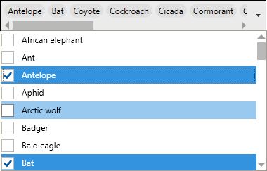
The two Windows sets bring their own rows along, MahApps.Styles.MultiSelectionComboBoxItem.Win10 and …WinUI with …CheckBox.Win10 and …CheckBox.WinUI beside them, and the set picks the plain one for you. All four share the one template, MahApps.Templates.MultiSelectionComboBoxItem.CheckBox, so what tells them apart is the colours.
The containers around the picks
These apply while IsEditable is False, since an editable control shows one string rather than a row of containers.
The default wraps every pick in a nugget. MahApps.Styles.MultiSelectionComboBoxSelectedItem.Removable adds a delete button to each one, which runs MultiSelectionComboBox.RemoveItemCommand against the pick it sits on.
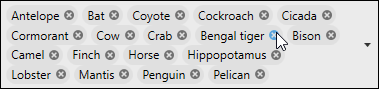
The two Windows sets bring their own nuggets along, MahApps.Styles.MultiSelectionComboBoxSelectedItem.Win10 and …WinUI with …Removable.Win10 and …Removable.WinUI beside them, and the set picks the plain one for you. A nugget of those two is a layer over the box rather than a colour of its own, because the box of either set changes its fill under the pointer and again while the list is down, and a nugget in a fixed grey would land on one of those colours.
The Windows looks
New on develop.
MahApps.Styles.MultiSelectionComboBox.Win10 and MahApps.Styles.MultiSelectionComboBox.WinUI put the control in the look of the Windows 10 and the WinUI set. Either one is the combo box of that set holding more than one answer: the same fill, the same frame, the same padding, the same chevron and the same rows in the list that comes down, so the two standing next to each other in a form are the same height and the same colour. The WinUI one rounds its corners and says the focus with the stronger line along its bottom edge.
<mah:MultiSelectionComboBox Width="320"
                            ItemsSource="{Binding Names}"
                            SelectionMode="Multiple"
                            Style="{DynamicResource MahApps.Styles.MultiSelectionComboBox.WinUI}" />
Merging one of the two sets gives every one of these boxes that look without naming the style.
The text of an editable control
Separator is what the picks are joined with, and what typed text is split on again. It is worth choosing one that cannot turn up inside an item, since a separator that can is a separator the control will split on in the wrong place.
| Property | Type | Default | |
|---|---|---|---|
Separator |
string |
null |
what the picks are joined with and split on |
EditableTextStringComparision |
StringComparison |
Ordinal |
how typed text is matched against the items |
AcceptsReturn |
bool |
false |
whether Return puts a line break in the field |
HasCustomText |
bool |
false |
whether what stands in the field is something the user typed; read-only |
SelectItemsFromTextInputDelay |
int |
-1 |
how long to wait before matching typed text, in milliseconds; -1 waits for the field to lose focus |
When the text no longer matches the picks
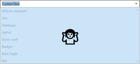
Text in the field that does not read back as the picks is something the user typed and has not finished. HasCustomText goes true, and the list that comes down is covered by an overlay and stops taking picks, so nothing the user wrote is thrown away behind their back.
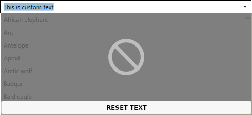
DisabledPopupOverlayContent and DisabledPopupOverlayContentTemplate put something else there. MultiSelectionComboBox.ClearContentCommand is what puts the text back to the picks, so a button running it is the way out of the state.
<mah:MultiSelectionComboBox ItemsSource="{Binding Animals}"
                            IsEditable="True"
                            Text="CustomText">
    <mah:MultiSelectionComboBox.DisabledPopupOverlayContentTemplate>
        <DataTemplate>
            <Button Background="{DynamicResource MahApps.Brushes.Accent4}"
                    BorderThickness="0"
                    Command="{x:Static mah:MultiSelectionComboBox.ClearContentCommand}">
                <TextBlock HorizontalAlignment="Center"
                           VerticalAlignment="Center"
                           FontSize="50"
                           Text="🤷" />
            </Button>
        </DataTemplate>
    </mah:MultiSelectionComboBox.DisabledPopupOverlayContentTemplate>
</mah:MultiSelectionComboBox>
Picking items by typing
An editable control with an ObjectToStringComparer picks the items the typed text names. The comparer that comes with the library, DefaultObjectToStringComparer, holds each fragment against the string the item writes itself as, under the EditableTextStringComparision in force.
Separator has to be set for this, since it is what the typed text is cut into fragments along.
<mah:MultiSelectionComboBox ItemsSource="{Binding Animals}"
                            EditableTextStringComparision="OrdinalIgnoreCase"
                            IsEditable="True"
                            ObjectToStringComparer="{mah:DefaultObjectToStringComparer}"
                            SelectItemsFromTextInputDelay="200"
                            SelectionMode="Multiple"
                            Separator=", " />
A comparer of your own
Anything implementing ICompareObjectToString can do the matching instead. Say the items are users and either the user name or the mail address should name one:
public class User
{
    public string Username { get; set; }
    public string Name { get; set; }
    public string GivenName { get; set; }
    public string MailAddress { get; set; }
}
public class MyUserToStringComparer : ICompareObjectToString
{
    public bool CheckIfStringMatchesObject(
        string? input,                      // the fragment that was typed
        object? objectToCompare,            // the item to hold it against
        StringComparison stringComparison,  // the comparison in force
        string? stringFormat)               // the format in force
    {
        if (input is null || objectToCompare is not User user)
        {
            return false;
        }

        return input.Equals(user.Username, stringComparison)
               || input.Equals(user.MailAddress, stringComparison);
    }
}
Adding items by typing
A StringToObjectParser on top of that makes a new item out of a fragment that names nothing in the source. DefaultStringToObjectParser builds one by reflection, which is enough for a list of strings or of anything with a type converter.
<mah:MultiSelectionComboBox ItemsSource="{Binding Animals}"
                            EditableTextStringComparision="OrdinalIgnoreCase"
                            IsEditable="True"
                            ObjectToStringComparer="{mah:DefaultObjectToStringComparer}"
                            SelectItemsFromTextInputDelay="200"
                            SelectionMode="Multiple"
                            Separator=", "
                            StringToObjectParser="{x:Static mah:DefaultStringToObjectParser.Instance}" />
Two events sit around the parser. AddingItem is raised before the new item goes in, carrying the Input, the ParsedObject the parser made, the TargetList it is bound for and the Parser that did the work. ParsedObject can be replaced there, and either setting Accepted to False or marking the event Handled keeps the item out. The list it would go into is the ItemsSource itself, so a source that is read-only never gains an item however the event is answered. AddedItem follows once it is in, with the AddedItem itself and the TargetList it went into.
A parser of your own
IParseStringToObject has one member. The one below asks before it adds, which is something a parser can do and the control cannot.
public class MyObjectParser : IParseStringToObject
{
    public bool TryCreateObjectFromString(
        string? input,                      // the text to parse
        out object? result,                 // the object, or null
        CultureInfo? culture = null,        // optional
        string? stringFormat = null,        // optional
        Type? elementType = null)           // optional, the type to parse to
    {
        result = null;

        if (string.IsNullOrWhiteSpace(input))
        {
            return false;
        }

        if (MessageBox.Show($"Do you want to add \"{input}\" to the animals list?",
                            "Add animal",
                            MessageBoxButton.YesNo) != MessageBoxResult.Yes)
        {
            return false;
        }

        // the list holds strings, so the input is the item
        result = input;
        return true;
    }
}
Related
AutoSuggestBox is the other box that answers as you type, with one pick rather than several. The plain drop-down is described under ComboBox, and ComboBoxHelper carries the knobs both of them read.