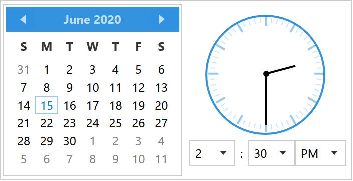
DateTimePicker is a text field with a drop-down that holds a calendar, an analogue clock and three lists for hour, minute and AM/PM. TimePicker is the same control without the calendar; both derive from TimePickerBase, so everything below applies to either unless it mentions a date.

<mah:DateTimePicker Width="190" SelectedDateTime="{Binding Appointment}" />
The value
| Property | Type | |
|---|---|---|
SelectedDateTime |
DateTime? |
the whole value, date and time together |
SelectedTime |
TimeSpan? |
the time half of it, without the day (on develop) |
SelectedTimeFormat |
TimePickerFormat |
Long (14:30:00), the default, or Short (14:30) |
SelectedDateTimeFormat |
string |
a format of your own, which overrules the two enums (on develop) |
Culture |
CultureInfo |
formatting and the twelve- or twenty-four-hour clock |
IsReadOnly |
bool |
SelectedDateTime is the one to bind. There is no pair of date and time properties, a DateTimePicker is one value, which is the point of it. What develop adds is SelectedTime, that value's time of day on its own: it reads out of the selection and writes back onto the day already in it, which the TimePicker page covers in full.
With no Culture the control follows the thread's culture, and a Language set on it or passed down from further up wins over that.
In a released version the thread is never asked. Without a Culture the picker goes by Language, which starts out at en-US however the thread is set, so a picker nobody said anything to shows 3/17/2026 2:35:00 PM on a German machine while the DatePicker beside it shows 17.03.2026. Set Culture and it behaves. Fixed on develop, which is #4064.
DateTimePicker also takes over the DatePicker properties for the calendar half: DisplayDate, DisplayDateStart, DisplayDateEnd, FirstDayOfWeek, IsTodayHighlighted and SelectedDateFormat.
The style sets IsTodayHighlighted="True", so today's date is filled in the accent colour whether or not it is the selected day. Set it to False to switch that off.
The format
SelectedTimeFormat and SelectedDateFormat choose between the culture's short and long patterns, and in a released version that is the whole choice. SelectedDateTimeFormat says it outright:
<mah:DateTimePicker SelectedDateTimeFormat="dd.MM.yyyy HH:mm"
                    SelectedDateTime="{Binding Appointment}" />
It is a custom date and time format string. Set, it has the first word over both enums; left alone, they go on deciding what the field reads. It holds for the field only — the hour, minute and second lists in the drop-down still go by HoursItemStringFormat and the two beside it.
What the user types is read back through the same format first, so a value the picker wrote itself always parses. That matters wherever the culture would make something else of the text: with Culture="en-US" and the format above, 03.04.2026 is the third of April going in and the third of April coming back, not the fourth of March. Anything else the culture can still make sense of is accepted as before, so a format costs nothing in what may be typed.
SelectedDateTimeFormat is new on develop, which is #4644. It is in neither 2.4.11 nor the 3.0 release candidate. There, the way to a format of your own is a CultureInfo with its patterns bent into shape:
var ci = new CultureInfo("de-DE");
ci.DateTimeFormat.LongTimePattern = "HH:mm";
picker.Culture = ci;
That reaches the drop-down and the twelve- or twenty-four-hour clock as well, so a culture rewritten for the field changes more than the field.
What the drop-down shows
| Property | Type | Default | |
|---|---|---|---|
IsClockVisible |
bool |
True |
the analogue clock face |
PickerVisibility |
TimePartVisibility |
HourMinute |
which of the three lists appear |
HandVisibility |
TimePartVisibility |
HourMinute |
which hands the clock draws |
Orientation |
Orientation |
Horizontal |
calendar beside the clock, or above it |
IsNowButtonVisible |
bool |
True |
the button that sets the picker to the here and now |
NowButtonContent |
object |
Now |
what that button says |
ClockSize |
double |
120 |
how large the face is drawn (on develop) |
ClockStyle |
Style |
null |
the look of the clock (on develop) |
PopupStyle |
Style |
the built-in one | the drop-down itself (on develop) |
TimePartVisibility is a flags enum — Hour, Minute, Second, plus HourMinute and All. Seconds are off by default in both places:
<mah:DateTimePicker PickerVisibility="All" HandVisibility="All" />
SourceHours, SourceMinutes and SourceSeconds replace what the lists offer, which is how you get a picker that only offers quarter hours:
<mah:TimePicker SourceMinutes="{Binding QuarterHours}" />
Each has a matching HoursItemStringFormat, MinutesItemStringFormat and SecondsItemStringFormat for how the entries are written.
The clock is a control of its own on develop, AnalogClock, and ClockSize, ClockStyle and PopupStyle are the three properties that reach it and the popup around it without a copy of the template. #4514, written up on the TimePicker page.
The Now button
Under the calendar and the clock sits a button that puts the picker on the current date and time, both halves in one press, so nobody has to walk a calendar and three lists to say what the clock on the wall already says. It is there without being asked for; a form that has no use for it switches it off:
<mah:DateTimePicker IsNowButtonVisible="False" />
NowButtonContent is the caption, an ordinary content property, because Now is a word that wants translating:
<mah:DateTimePicker NowButtonContent="Jetzt" />
The button is new on develop. It is in neither 2.4.11 nor the 3.0 release candidate, and it arrives visible, which is #4153. A drop-down that has always shown nothing but a calendar and a clock will have a button beneath them once that ships, so a layout with no room to spare wants IsNowButtonVisible="False".
Two nicer alternatives
The built-in drop-down puts the accent-banded Calendar next to the clock. This site ships two drop-in dictionaries that give the picker the same treatment as the calendar variants: a rounded Fluent look and a square Windows 10 one.
On develop the whole of it comes with the library, the field, the time selection and the calendar beside it. The Windows 10 and the WinUI sets carry both pickers and both calendars under these same keys, so merging Styles/Win10/Controls.xaml or Styles/WinUI/Controls.xaml is all there is to do (#4514 and the calendars after it). What follows is for 2.4.11 and the release candidate.
Two habits came with the pickers of those two sets, both of them what the TextBox of the same set already did. The clear button is there only while the caret is in the field and something is written in it, the way a UWP box shows its delete button, which is TextBoxHelper.ClearTextButtonFollowsFocus. And a picker that is switched off says so with the disabled colours of its set instead of with a veil drawn over it, which is ControlsHelper.DisabledVisualElementVisibility set to Collapsed along with ControlsHelper.DisabledBorderBrush. The Metro picker asks for neither and looks the way it always has.

Controls.DateTimePicker.Win10.xaml |
MahApps.Styles.DateTimePicker.Win10 |
square, with the square Win10 calendar |
Controls.DateTimePicker.WinUI.xaml |
MahApps.Styles.DateTimePicker.WinUI |
rounded, with the rounded WinUI calendar |
Each also brings the modern time selection described below.
Each needs the matching calendar dictionary merged first:
<ResourceDictionary Source="pack://application:,,,/MahApps.Metro;component/Styles/Controls.xaml" />
<ResourceDictionary Source="Styles/Controls.Calendar.WinUI.xaml" />
<ResourceDictionary Source="Styles/Controls.DateTimePicker.WinUI.xaml" />
<Style BasedOn="{StaticResource MahApps.Styles.DateTimePicker.WinUI}" TargetType="{x:Type mah:DateTimePicker}" />
<Style BasedOn="{StaticResource MahApps.Styles.TimePicker.WinUI}" TargetType="{x:Type mah:TimePicker}" />
The drop-down then carries the whole calendar variant with it:
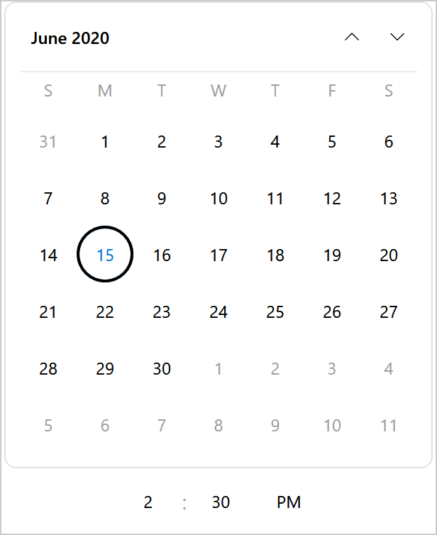
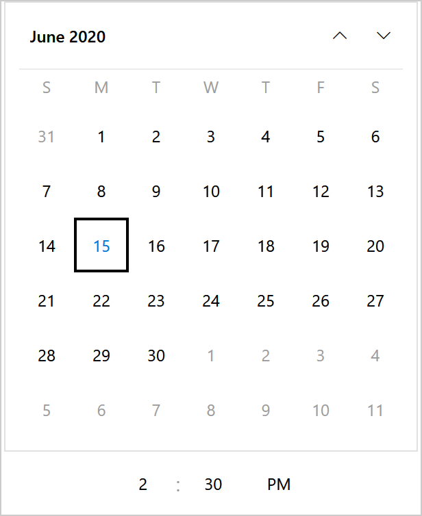
Both are styles, not replacement templates. Everything they change is something the built-in template already exposes — ControlsHelper.CornerRadius for the field, CalendarStyle for the drop-down, MinHeight and Padding — so they keep working when the library's template changes underneath them. That is also their limit.
The drop-down frame stays square in a released version, and neither variant can help it. PART_PopupBorder in the picker template is written as
<Border x:Name="PART_PopupBorder"
        Background="{DynamicResource MahApps.Brushes.Control.Background}"
        BorderBrush="{DynamicResource MahApps.Brushes.Control.Border}"
        BorderThickness="1">
with no CornerRadius, so rounding the field leaves the drop-down below it square. That is what the WinUI figure above shows, and it is the one thing that keeps the variant from being finished.
It is fixed on develop by #4582: the border takes ControlsHelper.CornerRadius from the control and the grid inside it clips the calendar and the clock along those corners, so the field and its drop-down carry the same ones. Until that ships, the only way to round the popup is a replacement template.
Its background and border colour are still MahApps.Brushes.Control.Background and .Border. Those are keys, not template bindings, so changing them for one picker alone still means putting the two keys into a resource dictionary near it.
The ComboBox popup behind the hour and minute lists had the same shape and is already fixed on develop: its PopupBorder carries a CornerRadius and clips its content to it. In a released version those little lists are still square.
A modern time selection
The analogue clock is the oldest-looking part of the drop-down, and Fluent has no clock face at all — in WinUI the time is three plain columns. IsClockVisible is a normal property, so a style can simply switch the clock off:
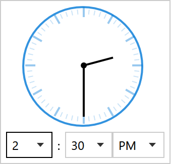
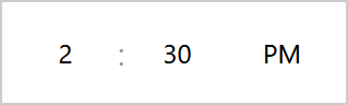
Both figures are a TimePicker drop-down, which is the time selection with no calendar above it. The second is what MahApps.Styles.TimePicker.WinUI gives you: no clock, no field chrome, no chevrons, just centred numbers. Open a column and the selected value is an accent-filled pill:
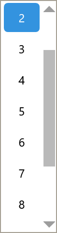
The Win10 variant is the same row — the two only part company inside the open list, where one pill is rounded and the other square.
Reaching the lists without styling every ComboBox
The hour, minute, second and AM/PM lists are ordinary ComboBoxes with no Style of their own, so the only way to reach them is an implicit ComboBox style. Putting one in the application's resources would restyle every other ComboBox in the application, which is far too blunt.
The way out is Style.Resources. Resource lookup from inside a template walks up to the templated parent's style, so an implicit style declared there is found by the drop-down and by nothing else:
<Style x:Key="MahApps.Styles.DateTimePicker.WinUI"
       BasedOn="{StaticResource {x:Type mah:DateTimePicker}}"
       TargetType="{x:Type mah:DateTimePicker}">
    <Style.Resources>
        <!--  Reaches PART_HourPicker and friends, and no other ComboBox.  -->
        <Style BasedOn="{StaticResource MahApps.Styles.ComboBox.DateTimePicker.WinUI}" TargetType="{x:Type ComboBox}" />
        <Style BasedOn="{StaticResource MahApps.Styles.Label.DateTimePicker.WinUI}" TargetType="{x:Type Label}" />
    </Style.Resources>
    <Setter Property="IsClockVisible" Value="False" />
    <!--  ...  -->
</Style>
The Label entry is the : between the columns, which has no style of its own either.
That is the whole mechanism, and it is worth knowing for any control whose template contains unstyled children.
The selected row is a rounded pill only because the dictionary carries a small ComboBoxItem template: in a released version the stock item's Border has no CornerRadius binding, so a setter alone cannot round it. That was fixed on develop by #4288 — ComboBoxItem now binds ControlsHelper.CornerRadius — so once that ships, the little template can go and one setter will do.
A true WinUI looping selector stays out of reach either way: the columns scrolling under a fixed highlight band, with an accept/dismiss row beneath, need code to keep the selection centred. A resource dictionary cannot do it.
Prefer to keep the clock? It is one setter:
<Style BasedOn="{StaticResource MahApps.Styles.DateTimePicker.WinUI}" TargetType="{x:Type mah:DateTimePicker}">
    <Setter Property="IsClockVisible" Value="True" />
</Style>
Watermarks and the clear button
Both pickers set a watermark: Select a date and Select a time. They are ordinary TextBoxHelper values, so they are replaced the usual way, and the clear button and floating watermark work as on any text box:
<mah:DateTimePicker mah:TextBoxHelper.Watermark="When?"
                    mah:TextBoxHelper.UseFloatingWatermark="True"
                    mah:TextBoxHelper.ClearTextButton="True" />
DatePickerHelper.DropDownButtonContent is the glyph on the button — the TimePicker style points it at a clock path, the DateTimePicker keeps the calendar one.
Validation
Both carry MahApps.Templates.ValidationError, so a failed binding gets the red border and the popup described on the Validation page.
When what was typed is not a date
Put something in the field that is not a date and leave it: the picker clears the value and writes the field back from that. DateTimeValidationError carries the text that would not parse, and it is the only way to tell that apart from somebody emptying the field on purpose, because both end as a SelectedDateTime of null.
<mah:DateTimePicker DateTimeValidationError="OnDateTimeValidationError" />
private void OnDateTimeValidationError(object sender, DateTimeValidationErrorEventArgs e)
{
    this.hint.Text = $"{e.Text} is not a date I can read.";
}
It is a routed event, so a form can listen once further up the tree instead of on every picker it holds. An emptied field raises nothing: clearing a date is a thing somebody meant to do.
DateTimeValidationError is new on develop, which is #4645. It is in neither 2.4.11 nor the 3.0 release candidate, where there is nothing to hook at all: the value goes, the field is overwritten, and a typo and a deliberately emptied field look exactly alike from the outside.
Related
TimePicker for the time alone, DatePicker for the date alone, and Calendar for the calendar the drop-down shows — including the two variants these styles reuse.