Applies to CheckBox and RadioButton. One property, which puts the box or the circle on the other side of the label.
Despite the name it does nothing on a ToggleButton. The property is marked browsable for ToggleButton and RadioButton, so the designer offers it on both, but only the CheckBox and RadioButton templates read it — a plain ToggleButton has no separate box and label to swap around.
| Property | Type | Default | |
|---|---|---|---|
ContentDirection |
FlowDirection |
LeftToRight |
which side the box or circle sits on |
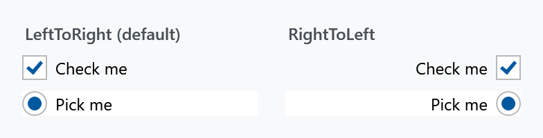
LeftToRight is the usual layout — the box on the left, the label to the right of it. RightToLeft swaps them, so the label comes first and the box sits at the far end.
<CheckBox mah:ToggleButtonHelper.ContentDirection="RightToLeft" Content="Check me" />
That is the layout to use for a settings list, where a column of labels on the left with their switches lined up on the right reads better than a ragged column of boxes.
This is not FlowDirection on the control. Setting the control's own FlowDirection to RightToLeft mirrors the text as well; this only moves the box relative to the label and leaves the label reading normally.
Related
The size and colours of the box itself are in CheckBoxHelper and RadioButtonHelper.