Badged wraps a control and draws a small badge over one of its corners or edges — an unread count, a status, a short word.
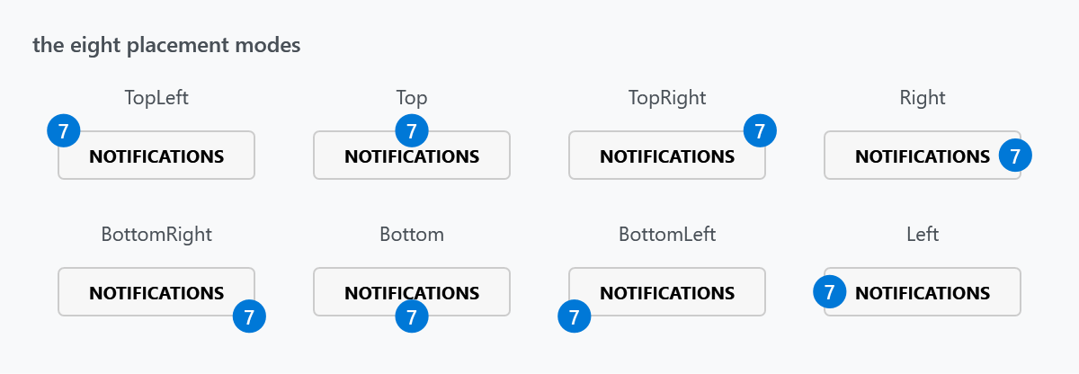
<mah:Badged Badge="42">
    <Button Content="Notifications" />
</mah:Badged>
The badge is placed by BadgePlacementMode, which defaults to TopRight:
<mah:Badged Badge="{Binding UnreadCount}" BadgePlacementMode="BottomRight">
    <Button>
        <iconPacks:PackIconFontAwesome Kind="CommentOutline" />
    </Button>
</mah:Badged>
The iconPacks control in that sample comes from MahApps.Metro.IconPacks, a separate package.
The badge content
Badge is an object, so it takes anything a ContentControl would — a number, a string, an element, or a view model with a BadgeTemplate.

<mah:Badged Badge="3" BadgeStringFormat="{}{0} new" />
The fourth panel has no Badge at all: when it is null or empty the badge is hidden and IsBadgeSet is false. Bind the count and the badge appears and disappears on its own — there is no visibility to manage.
Styling the badge
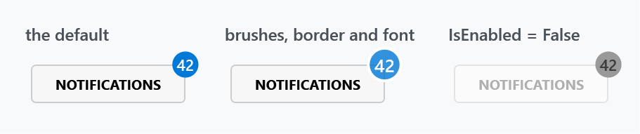
<mah:Badged Badge="42"
            BadgeBackground="{DynamicResource MahApps.Brushes.Accent}"
            BadgeForeground="{DynamicResource MahApps.Brushes.IdealForeground}"
            BadgeBorderBrush="{DynamicResource MahApps.Brushes.ThemeBackground}"
            BadgeBorderThickness="2"
            BadgeFontSize="13">
    <Button Content="Notifications" />
</mah:Badged>
A border in the window's background colour is the usual trick for a badge that overlaps busy content — it gives the disc a ring of clear space.
The pop when the value changes
This is the one property MahApps adds; everything else on this page comes from BadgedEx in ControlzEx, which Badged derives from.
| Property | Type | Default |
|---|---|---|
BadgeChangedStoryboard |
Storyboard |
a scale animation |
When Badge changes, the storyboard is started on the badge container, so the disc springs briefly as the number goes up. The default scales X and Y through a SineEase; replace it to change the gesture, or set it to {x:Null} for no animation at all:
<mah:Badged Badge="{Binding UnreadCount}" BadgeChangedStoryboard="{x:Null}" />
A storyboard that cannot run on the badge container — one targeting a property the container does not have, for instance — is not swallowed. Badged catches the failure and rethrows it as a MahAppsException with the message "Uups, it seems like there is something wrong with the given Storyboard.", so a bad animation surfaces at the first badge change rather than silently doing nothing.
Properties
| Property | Type | Default | |
|---|---|---|---|
Badge |
object |
null |
what the badge shows |
BadgePlacementMode |
BadgePlacementMode |
TopRight |
where it sits |
BadgeMargin |
Thickness |
1 0 |
nudges the badge from that position |
BadgeBackground |
Brush |
MahApps.Brushes.Badged.Background |
|
BadgeForeground |
Brush |
MahApps.Brushes.Badged.Foreground |
|
BadgeBorderBrush |
Brush |
null |
|
BadgeBorderThickness |
Thickness |
0 |
|
BadgeFontFamily, BadgeFontSize, BadgeFontStyle, BadgeFontStretch, BadgeFontWeight |
11, DemiBold for the last two |
the badge's own font, independent of the content's | |
BadgeStringFormat |
string |
null |
format for a non-string Badge |
BadgeTemplate, BadgeTemplateSelector |
null |
for a badge that is more than text | |
BadgeChangedStoryboard |
Storyboard |
a scale animation | see above |
IsBadgeSet |
bool, read-only |
whether there is anything to show | |
BadgeChanged |
RoutedEvent |
raised when Badge changes |
What a screen reader is told
The badge is a mark on whatever the control wraps, so it belongs to that thing rather than standing beside it.
In a released version the badge arrives as a stray piece of text next to the content, with nothing tying the two together. A reader announces the inbox button and, somewhere after it, a lone "3".
On develop the control hands the badge over as the status of what it wraps, which is what ItemStatus is for, and says it is a group holding that content. A reader then has the count and the button in one place. Nothing about the drawing changes.
BadgePlacementMode
Eight values, all shown in the first figure: TopLeft, Top, TopRight, Right, BottomRight, Bottom, BottomLeft, Left.
The corner modes put the badge outside the control's corner; the edge modes centre it on that edge. Either way the badge hangs over the edge by half its own size, and a Badged asks for no more room than its content needs, so the badge is outside anything the layout knows about. Next to something else it will overlap. A margin on the Badged is what keeps the two apart.
On develop a badge on a tab header is no longer cut in half. A Badged takes no layout clip of its own any more, and the host that carries a tab header rounds the way the grid around it does. Between them those were what did it: the header asking for a tenth of a pixel more than the rounding handed out was enough for WPF to clip it, and a clip takes the whole overhanging badge with it. Which header it happened to came down to where the caption landed, which is why #2994 reads as though it picked its victims at random. A container that clips on purpose still clips.