TimePicker is a text field with a drop-down for picking a time. It is DateTimePicker without the calendar half — both derive from TimePickerBase and share one control template.

<mah:TimePicker Width="170" SelectedDateTime="{Binding Departure}" />
How it differs from DateTimePicker
Almost nothing separates the two, which is worth knowing because everything on the DateTimePicker page applies here as well.
IsDatePickerVisible |
TimePicker's constructor sets it to False, and the shared template shows the calendar only when it is True |
| the drop-down button | a clock glyph instead of a calendar one, through DatePickerHelper.DropDownButtonContent |
| the watermark | Select a time instead of Select a date |
| typing into the field | parsed as a time; the date part of SelectedDateTime is kept |
IsDatePickerVisible is a read-only dependency property with a protected setter, so you cannot turn the calendar back on from XAML. Use a DateTimePicker if you want both halves.
The value
SelectedDateTime is a DateTime?, not a TimeSpan — the same property the DateTimePicker uses. When the user types a time, TimePicker parses it and keeps whatever date was there:
this.SetCurrentValue(SelectedDateTimeProperty,
                     this.SelectedDateTime.GetValueOrDefault().Date + timeSpan.TimeOfDay);
On develop there is a second way in. SelectedTime is a TimeSpan? and carries that same value without the day it falls on, so bind whichever of the two your view model is written for:
<mah:TimePicker Width="170" SelectedTime="{Binding Departure}" />
The two follow each other. Written to, SelectedTime keeps the day that is already selected and settles on today where there is none, and null clears the selection. More than a day takes the date along, so 25 hours land on the next day at 01:00. It sits on TimePickerBase, so the DateTimePicker has it as well, where it is the time half of its value.
SelectedTime is new on develop, which is #4080. It is in neither 2.4.11 nor the 3.0 release candidate, where a view model holding a TimeSpan needs a converter in between.
On an empty picker the date part depends on how the time was set, and the two ways disagree.
Typing a time keeps SelectedDateTime.GetValueOrDefault().Date, which is default(DateTime) when nothing was selected — so typing 14:30 gives you 0001-01-01 14:30.
Picking from the drop-down runs through ClockSelectedTimeChanged instead, which falls back to today — so the same 14:30 gives you today at 14:30.
If your view model wants a time on a particular day, seed SelectedDateTime with that date first. If it only wants the time, bind SelectedTime and the date part stays out of the way; before develop, take .TimeOfDay from what you get back.
DateTimeKind is Unspecified on develop. Before that it depended on the order. Picking the time first produced DateTimeKind.Local, because that path fell back to DateTime.Today, while the calendar and the text field produced Unspecified. A view model bound to SelectedDateTime saw two different kinds from one control.
This is not in 2.4.11, nor in the 3.0 release candidate. Fixed for the next release in #4551; all three paths report Unspecified now. The date the drop-down falls back to is unchanged, it is still today.
Format and culture

| Property | Type | Default | |
|---|---|---|---|
SelectedTimeFormat |
TimePickerFormat |
Long |
Long shows seconds, Short does not |
SelectedDateTimeFormat |
string |
null |
a format of your own, which overrules the enum (on develop) |
Culture |
CultureInfo |
null |
formatting and the twelve- or twenty-four-hour clock |
IsReadOnly |
bool |
False |
The default is Long, which is why an untouched picker already shows 2:30:00 PM rather than 2:30 PM.
With no Culture the control follows the thread's culture, and a Language set on it or passed down from further up wins over that. de-DE gives a twenty-four-hour clock and drops the AM/PM list from the drop-down.
In a released version the thread is never asked. Without a Culture the picker goes by Language, which starts out at en-US however the thread is set, so a picker nobody said anything to shows an American time on a German machine while the DatePicker beside it shows a German date. Set Culture and it behaves. Fixed on develop, which is #4064.
A format of your own
SelectedDateTimeFormat takes a custom format string and is read back through the same format first, so a value the picker wrote always parses:
<mah:TimePicker SelectedDateTimeFormat="HH:mm" />
It sits on TimePickerBase, so both pickers take one, and DateTimePicker covers it in full. So does DateTimeValidationError, the event that says what was typed when the field holds something that is not a time — both are new on develop (#4644 and #4645).
The drop-down
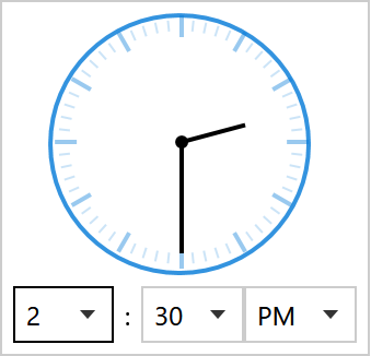
| Property | Type | Default | |
|---|---|---|---|
IsClockVisible |
bool |
True |
the analogue clock face |
PickerVisibility |
TimePartVisibility |
HourMinute |
which lists appear |
HandVisibility |
TimePartVisibility |
HourMinute |
which hands the clock draws |
IsDropDownOpen |
bool |
False |
|
IsNowButtonVisible |
bool |
True |
the button that sets the picker to the time of day |
NowButtonContent |
object |
Now |
what that button says |
ClockSize |
double |
120 |
how large the face is drawn (on develop) |
ClockStyle |
Style |
null |
the look of the clock (on develop) |
PopupStyle |
Style |
the built-in one | the drop-down itself (on develop) |
TimePartVisibility is a flags enum — Hour, Minute, Second, plus the combinations HourMinute and All. Seconds are off in both places by default, so turning them on takes two properties:
<mah:TimePicker PickerVisibility="All" HandVisibility="All" />
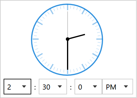
SourceHours, SourceMinutes and SourceSeconds replace what the lists offer — this is how you build a picker that only offers quarter hours:
<mah:TimePicker SourceMinutes="{Binding QuarterHours}" />
Each has a matching HoursItemStringFormat, MinutesItemStringFormat and SecondsItemStringFormat.
The button under the lists puts the picker on the time of day in one press. It is the same one the DateTimePicker carries, described on its page along with the caption property and the note that it is new on develop.
Reaching into the drop-down
The three properties below and the AnalogClock control are new on develop, which is #4514. In a released version the clock and the popup are markup in the middle of the shared template, so the only way at either of them is a copy of the whole template.
The clock face is a control of its own, AnalogClock, and the picker carries three properties that reach it and the popup around it.
ClockSize is the one the issue asked for. The face is drawn at its natural 120 and scaled to whatever size it is given, so one number takes the ring, the dots and the hands with it, and the drop-down grows to fit:
<mah:TimePicker ClockSize="200" />
ClockStyle is the look of that clock, anything an AnalogClock style can say. The size is not part of it: it comes from ClockSize, because the template hands that to the clock and what a template sets on one of its own elements beats what a style sets on it.
<mah:TimePicker>
    <mah:TimePicker.ClockStyle>
        <Style BasedOn="{StaticResource MahApps.Styles.AnalogClock}" TargetType="{x:Type mah:AnalogClock}">
            <Setter Property="BorderBrush" Value="{DynamicResource MahApps.Brushes.Gray5}" />
            <Setter Property="BorderThickness" Value="1" />
        </Style>
    </mah:TimePicker.ClockStyle>
</mah:TimePicker>
PopupStyle is the drop-down: where it is placed, how far it is offset, how much room it may take. Stand your own on MahApps.Styles.Popup.TimePickerBase, which is what a popup needs to behave like a drop-down and used to sit on the element in the template:
<Style x:Key="DropUp" BasedOn="{StaticResource MahApps.Styles.Popup.TimePickerBase}" TargetType="{x:Type Popup}">
    <Setter Property="Placement" Value="Top" />
</Style>
Two nicer alternatives
On develop the two other style sets carry the pickers themselves, so there is nothing to download: merge Styles/Win10/Controls.xaml or Styles/WinUI/Controls.xaml instead of Styles/Controls.xaml and the TimePicker wears that set without another line (#4514). The keys are the same ones the drop-ins use, MahApps.Styles.TimePicker.Win10 and MahApps.Styles.TimePicker.WinUI, and both sets bring the field chrome of their text boxes along with the time selection described below.
In a released version they are the two drop-in dictionaries that restyle the DateTimePicker, one TimePicker style each.

Controls.DateTimePicker.Win10.xaml |
MahApps.Styles.TimePicker.Win10 |
square |
Controls.DateTimePicker.WinUI.xaml |
MahApps.Styles.TimePicker.WinUI |
rounded |
The files are named for the DateTimePicker because they cover both controls. For a TimePicker you only need the one dictionary — the calendar dictionary the DateTimePicker page asks for is used by the DateTimePicker styles alone.
<ResourceDictionary Source="pack://application:,,,/MahApps.Metro;component/Styles/Controls.xaml" />
<ResourceDictionary Source="Styles/Controls.DateTimePicker.WinUI.xaml" />
<Style BasedOn="{StaticResource MahApps.Styles.TimePicker.WinUI}" TargetType="{x:Type mah:TimePicker}" />
What they change
Both switch the analogue clock off, because Fluent has no clock face — the three columns are the whole time selection there:
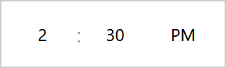
No chrome, no chevrons, just centred numbers. Open a column and the selected value is an accent-filled pill:
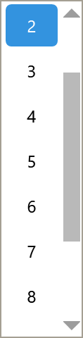
The Win10 variant is the same row; the two only part company inside the open list, where one pill is rounded and the other square. Set IsClockVisible="True" in a derived style to keep the clock.
Reaching those lists at all needs a trick, because they are plain ComboBoxes with no style of their own — see the DateTimePicker page for how Style.Resources scopes an implicit style to one control's drop-down.
The drop-down frame stays square in a released version, whichever variant you use, because PART_PopupBorder in the shared template has no CornerRadius. It is fixed on develop by #4582, where that border follows ControlsHelper.CornerRadius and clips its content to it. Its background and border colour still come from the MahApps.Brushes.Control.Background and .Border keys rather than from the control.
Watermark and the clear button
The watermark and the clear button are ordinary TextBoxHelper values:
<mah:TimePicker mah:TextBoxHelper.Watermark="When?"
                mah:TextBoxHelper.UseFloatingWatermark="True"
                mah:TextBoxHelper.ClearTextButton="True" />
Related
DateTimePicker for date and time together — and for the properties both controls share. DatePicker for the date alone.