WindowCommands holds the buttons a MetroWindow puts in its title bar, left or right of the title. It is what you fill to add settings, about or a login indicator up there.
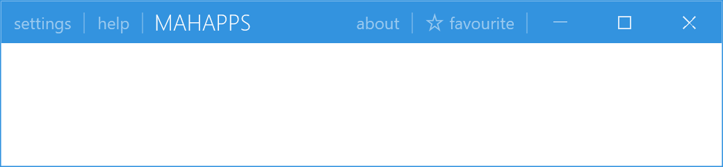
<mah:MetroWindow.LeftWindowCommands>
<mah:WindowCommands>
<Button Content="settings" />
<Button Content="help" />
</mah:WindowCommands>
</mah:MetroWindow.LeftWindowCommands>
<mah:MetroWindow.RightWindowCommands>
<mah:WindowCommands>
<Button Content="about" />
<Button>
<StackPanel Orientation="Horizontal">
<mah:FontIcon FontSize="13" VerticalAlignment="Center" Glyph="" />
<TextBlock Margin="4 0 0 0" VerticalAlignment="Center" Text="favourite" />
</StackPanel>
</Button>
</mah:WindowCommands>
</mah:MetroWindow.RightWindowCommands>
The window's own LeftWindowCommands and RightWindowCommands properties are where they go. Content is arbitrary: plain Buttons get the title-bar look automatically, and anything else you put in is left alone.
WindowCommands derives from ToolBar, not from a plain ItemsControl. That is where its item handling comes from, and it means ToolBar's properties are available — but also that a ToolBar's overflow behaviour is in play if the buttons do not fit.
Each child is wrapped in a WindowCommandsItem, a ContentControl with an IsSeparatorVisible property and a read-only ParentWindowCommands back-reference. ItemContainerStyle is typed to it, so that is the hook for restyling the wrapper rather than the buttons.
Separators

| Property | Type | Default | |
|---|---|---|---|
ShowSeparators |
bool |
True |
draw separators at all |
ShowLastSeparator |
bool |
True |
include the one after the final item |
SeparatorHeight |
double |
15 |
The trailing separator is the one people usually want gone, since it sits between your buttons and the window buttons:
<mah:WindowCommands ShowLastSeparator="False">
Light and dark
| Property | Type | Default |
|---|---|---|
Theme |
string |
ThemeManager.BaseColorLight |
LightTemplate |
ControlTemplate |
null |
DarkTemplate |
ControlTemplate |
null |
Theme holds a base-colour name, not a theme object — the string "Light" or "Dark". Its changed callback swaps Template for LightTemplate or DarkTemplate, and only if the matching one is set:
case ThemeManager.BaseColorLightConst:
{
    if (windowCommands.LightTemplate != null)
    {
        windowCommands.SetValue(TemplateProperty, windowCommands.LightTemplate);
    }
    …
}
So the pair exists to give the commands a different template over a light title bar than over a dark one. Leave both null and Theme does nothing — which is the normal case, since the default template already adapts through the theme brushes.
ParentWindow is a read-only property pointing at the hosting MetroWindow.
Visibility over flyouts
The window decides whether its commands stay visible when a Flyout is open, through LeftWindowCommandsOverlayBehavior and RightWindowCommandsOverlayBehavior. Both are a WindowCommandsOverlayBehavior, which has only Never and HiddenTitleBar — so window commands can never be drawn over an open flyout. See Flyouts for the full table.
Related
WindowButtonCommands for the minimise, maximise and close buttons at the end of the same title bar. MetroWindow hosts both.