An .ico file holds the same artwork several times over, drawn for different sizes. WPF's Image takes one of those frames and stretches it; MultiFrameImage picks the frame that suits the size it is being drawn at.
<mah:MultiFrameImage Width="64" Height="64" Source="app.ico" />
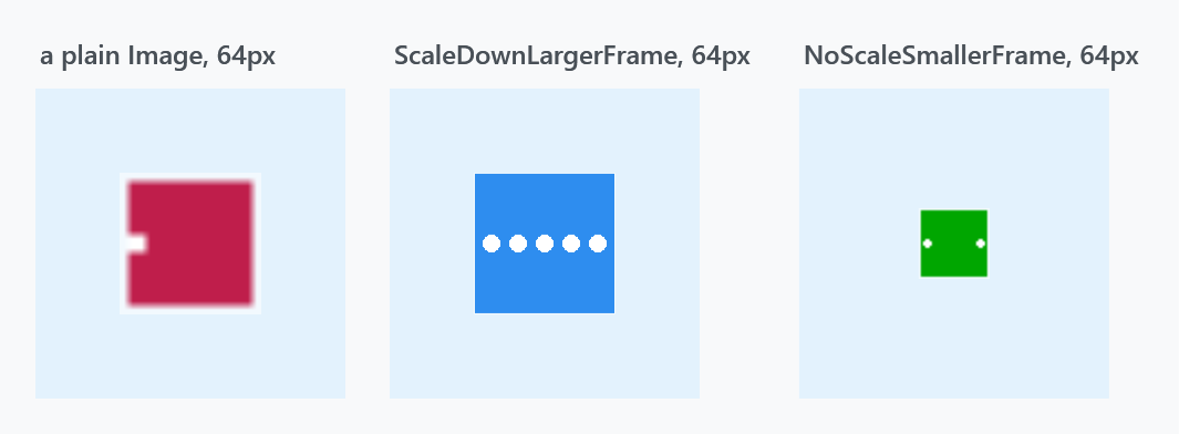
The icon in these figures is a demonstration one whose three frames are deliberately different pictures — crimson with one dot at 16px, green with two at 32px, blue with five at 128px — so you can see which frame was chosen. A real icon would draw the same thing at each size.
The left panel is a plain Image at 64px: it shows the decoder's first frame, the 16px one, blown up four times and blurred. The other two are the same file in a MultiFrameImage.
The two modes
MultiFrameImageMode |
|
|---|---|
ScaleDownLargerFrame |
the default. Picks the first frame at least as large as the control's longer side and draws it stretched to fill. So it only ever scales down — unless no frame is big enough, in which case the largest is used. |
NoScaleSmallerFrame |
Picks the last frame no larger than the control's shorter side and draws it at its native size, centred — never scaled. If every frame is too big, the smallest is used. |
ScaleDownLargerFrame fills the control and stays sharp; NoScaleSmallerFrame guarantees pixel-exact artwork but may leave empty space around it, which is the green square floating in the third panel above.
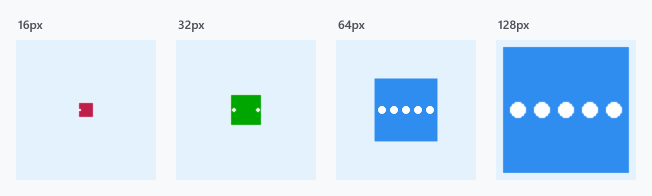
Growing the control walks up the frames: at 16px the 16px frame, at 32px the 32px one, and from 64px upward the 128px frame scaled to fit.
The property is registered with AffectsRender, so changing it redraws immediately.
Which frames it considers
When Source changes the control rebuilds its list:
_frames.AddRange(
    decoder.Frames
           .GroupBy(f => f.PixelWidth * f.PixelHeight)
           .OrderBy(g => g.Key)
           .Select(g => g.OrderByDescending(f => f.Format.BitsPerPixel).First()));
Frames are grouped by pixel area and sorted smallest first, and within one size only the frame with the highest colour depth survives. An icon carrying a 4-bit and a 32-bit version of 32×32 contributes just the 32-bit one, so the old low-colour frames in a legacy icon never get picked.
The Source has to be a BitmapFrame. The control reads the frame list off Source as BitmapFrame and its Decoder. Anything else leaves the list empty, and OnRender then falls through to base.OnRender — a plain Image again, silently.
Setting Source in XAML is fine: the converter produces a BitmapFrameDecode, which is a BitmapFrame.
<!--  works: the converter yields a BitmapFrame  -->
<mah:MultiFrameImage Source="app.ico" />
Assigning a BitmapImage in code does not — BitmapImage derives from BitmapSource, not BitmapFrame, so the multi-frame handling is skipped without any error:
// no: silently behaves like a plain Image
image.Source = new BitmapImage(new Uri("app.ico", UriKind.Relative));

// yes
image.Source = BitmapFrame.Create(new Uri("app.ico", UriKind.Relative));
Where it is used
MetroWindow draws its title-bar icon with a MultiFrameImage, which is what makes a proper multi-resolution .ico look right in the title bar at any DPI. The window exposes the mode as its own property:
<mah:MetroWindow Icon="app.ico" IconScalingMode="NoScaleSmallerFrame">
IconScalingMode is a MultiFrameImageMode and defaults to ScaleDownLargerFrame, the same as the control.
Related
MetroWindow for IconScalingMode and the rest of the title bar. FontIcon is the other way to put an icon on screen, from a symbol font rather than a bitmap.