ToggleSwitch is an on/off switch. It does the same job as a CheckBox but says its state in words as well as shape, and it is easier to hit with a finger. It derives from HeaderedContentControl and implements ICommandSource.

<mah:ToggleSwitch Header="Background sync" IsOn="{Binding SyncEnabled}" />
IsOn is the state and binds two-way by default. The knob can be clicked or dragged, and the switch is toggled by Space as well.
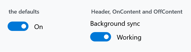
Header and per-state content
| Property | Type | Default | |
|---|---|---|---|
Header |
object |
null |
a label above the switch, from HeaderedContentControl |
OnContent |
object |
"On" |
shown beside the switch while on |
OffContent |
object |
"Off" |
shown beside the switch while off |
OnContent and OffContent each have a matching …Template, …TemplateSelector and …StringFormat. Both default to text, which is why an untouched switch already says On and Off — set them to {x:Null} for a bare switch.
The header is styled through HeaderedControlHelper: the style sets HeaderFontFamily, HeaderFontSize, HeaderForeground and HeaderMargin, so those are what to change rather than the header's own properties.
Which side the switch is on
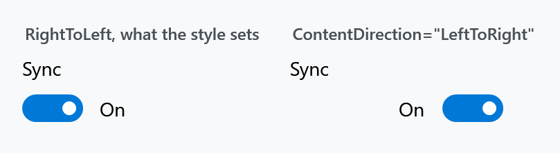
ContentDirection is a FlowDirection that decides whether the switch sits before or after its on/off content.
The dependency property's default is LeftToRight, but MahApps.Styles.ToggleSwitch sets RightToLeft, and that style is applied to every ToggleSwitch through Generic.xaml. So the effective default is RightToLeft — switch on the left, text on its right — and setting LeftToRight is what mirrors it.
Width

A ToggleSwitch is much wider than it looks. The style sets
<Setter Property="MinWidth" Value="{DynamicResource ToggleSwitchThemeMinWidth}" />
and ToggleSwitchThemeMinWidth is 154. The switch and its label take far less, so the rest is invisible padding that still consumes layout space — the tinted boxes in the figure are the controls' actual bounds.
In a tight layout set MinWidth="0", and clear OnContent and OffContent if you do not want the words either.
ContentPadding (default: an empty Thickness) pads the on/off content, and the theme exposes ToggleSwitchPreContentMargin, ToggleSwitchPostContentMargin and ToggleSwitchContentSpaceMargin as GridLength resources for the spacing around it.
Reacting to a change
There are four hooks and they do not fire in the same situations. This is the part worth getting right.
| Fires when | |
|---|---|
Toggled |
IsOn changes for any reason — a click, a binding, a property set in code |
Command |
the user toggles the switch, in either direction |
OnCommand |
the user toggles it on |
OffCommand |
the user toggles it off |
The commands are executed from Toggle(), which only user interaction reaches:
private void Toggle()
{
    var newValue = !this.IsOn;
    this.SetCurrentValue(IsOnProperty, BooleanBoxes.Box(newValue));

    CommandHelpers.ExecuteCommandSource(this);
    CommandHelpers.ExecuteCommandSource(this, newValue ? this.OnCommand : this.OffCommand);
}
Toggled, by contrast, is raised from the IsOn property-changed callback. So setting IsOn in code raises Toggled and runs no command, while a click does both. Pick Toggled for "the value changed" and the commands for "the user changed it".
Command and the pair share one CommandParameter and CommandTarget. All three can be set at once; Command runs first.
Toggled is not a routed event. Despite its RoutedEventHandler signature it is a plain CLR event:
public event RoutedEventHandler Toggled;
It is raised with Toggled?.Invoke(this, new RoutedEventArgs()), so it does not bubble and cannot be attached with an EventSetter in a style or handled on a parent element. Subscribe on the switch itself, or use the commands.
Other properties
| Property | Type | |
|---|---|---|
IsPressed |
bool, read-only |
whether the switch is being pressed or dragged |
ContentPadding |
Thickness |
padding around the on/off content |
The template parts are SwitchKnobBounds, SwitchKnob, KnobTranslateTransform and SwitchThumb, plus a content presenter for each of the header, content, on-content and off-content. The Thumb is what makes the knob draggable, and ToggleSwitchTranslateDuration (0.5 s) is the resource that times the slide.
Validation
The style sets Validation.ErrorTemplate to MahApps.Templates.ValidationError, so a failed binding on IsOn gets the same treatment as any other input control — see Validation.
Related
HeaderedControlHelper for the header's font and colour. ToggleButtonHelper and the CheckBox styles cover the other two-state controls.