CustomValidationPopup is the popup that carries a validation message next to the control that failed. You almost never place one: it is part of MahApps.Templates.ValidationError, so every styled input control already has one. See Validation for the error template as a whole.
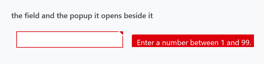
It derives from WPF's Popup, and the whole point of it is what a plain Popup will not do.
Why a plain Popup is not enough
A Popup is its own top-level window. It has no idea what happens to the window it belongs to, which is exactly wrong for something anchored to a text box. CustomValidationPopup subscribes to everything that could move it or make it wrong, and reacts:
| It watches | What it does |
|---|---|
the host window's LocationChanged and SizeChanged |
repositions itself |
the PlacementTarget's SizeChanged |
repositions itself |
the window's Activated and Deactivated |
becomes topmost with the window, and stops being topmost when the window loses focus, so it does not float over other applications |
the window's StateChanged |
on restore from minimised, closes and forces the error adorner to be rebuilt |
the nearest ancestor ScrollViewer |
repositions, and closes when the field scrolls out of view |
an ancestor MetroContentControl or TransitioningContentControl |
suppresses itself while a transition is running |
| an ancestor Flyout | suppresses itself while the flyout is opening or closing |
All of it is unhooked again when the popup unloads.
That last group is what CanShow reports.
Properties
| Property | Type | Default | |
|---|---|---|---|
AdornedElement |
UIElement |
null |
the control the popup belongs to; the template binds it |
CanShow |
bool, read-only |
False |
whether it is safe to open right now |
CloseOnMouseLeftButtonDown |
bool |
True |
clicking the popup dismisses it |
ShowValidationErrorOnMouseOver |
bool |
False |
open on hover, not only on focus |
CanShow is the interesting one. It is False while an ancestor is animating — a flyout sliding in, a MetroContentControl transitioning — and the error template's trigger requires it before opening the popup:
<MultiDataTrigger.Conditions>
    <Condition Binding="{Binding ElementName=ValidationPopup, Path=CanShow}" Value="True" />
    <Condition Binding="{Binding ElementName=placeholder, Path=AdornedElement.IsKeyboardFocusWithin}" Value="True" />
    <Condition Binding="{Binding ElementName=placeholder, Path=AdornedElement.(Validation.HasError)}" Value="True" />
</MultiDataTrigger.Conditions>
Without it the message would appear pinned to where the field is going to be, halfway through the animation that puts it there.
Two properties, two places
CloseOnMouseLeftButtonDown and ShowValidationErrorOnMouseOver exist twice, once on this control and once on ValidationHelper as attached properties, and their defaults disagree:
| on the popup | on ValidationHelper |
|
|---|---|---|
CloseOnMouseLeftButtonDown |
True |
False |
ShowValidationErrorOnMouseOver |
False |
False |
Set them through ValidationHelper on your control — that is the pair you can reach from XAML without replacing the template. The popup's own properties are what the template reads, and the click handler consults both: a click closes the popup if either the popup's CloseOnMouseLeftButtonDown is True or the helper's is set on the adorned element. If neither is, the click is swallowed rather than falling through to whatever is behind.
<TextBox Text="{Binding Age, ValidatesOnDataErrors=True}"
         mah:ValidationHelper.ShowValidationErrorOnMouseOver="True"
         mah:ValidationHelper.CloseOnMouseLeftButtonDown="True" />
The style
MahApps.Styles.CustomValidationPopup is implicit, from Styles/Controls.xaml, and is five setters — Placement="Right", both offsets zero, HorizontalAlignment="Right" and PopupAnimation="Fade". That is what puts the card to the right of the field, as in the figure.
A detail worth knowing
WPF has no method for "recompute this popup's placement". CustomValidationPopup gets around it the way everyone does: it sets HorizontalOffset to one more than it is and back again, which forces the placement to be recalculated. If you build something similar on top of Popup, that is the trick.
Related
Validation for the error template, the layered card and what opens it; ValidationHelper for the two attached properties.