SplitButton is a button split into two halves: the left runs a command, the right opens a list. Picking from the list changes what the left half shows.

<mah:SplitButton ItemsSource="{Binding Artists}"
                 SelectedIndex="0"
                 Command="{Binding PlayCommand}" />
ItemsSource is the content property, so the items can also be written as the button's child element.
It is a ComboBox
SplitButton derives from ComboBox, which is where most of its API comes from and is the shortest explanation of how it differs from DropDownButton:
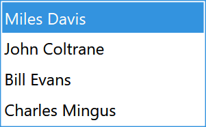
SelectedItem, SelectedIndex, SelectionChanged, ItemsSource, DisplayMemberPath, ItemTemplate, IsDropDownOpen, MaxDropDownHeight and the rest all behave exactly as they do on a ComboBox. Items become ComboBoxItems in a Popup.
The button's label is not a property of its own — the template binds it to SelectionBoxItem, so it is the selected item and follows the selection. With nothing selected the label is empty, as in the first panel above.
Virtualization is on by default: the style sets IsVirtualizing, IsVirtualizingWhenGrouping and VirtualizationMode="Recycling", so long lists cost what they should.
IsEditable is coerced to False and cannot be changed. The control overrides its metadata with a coercion callback that returns false unconditionally:
private static object CoerceIsEditableProperty(DependencyObject dependencyObject, object value)
{
    // For now SplitButton is not editable
    return false;
}
Setting it in XAML is accepted and then silently ignored.
The two halves
PART_Button, the left half |
runs Command, raises Click, then closes the drop-down |
PART_Expander, the arrow |
toggles IsDropDownOpen, and nothing else |
This is the opposite of DropDownButton, where one click both runs the command and opens the list. Here the two are genuinely separate, which is the point of splitting the button.
SplitButton implements ICommandSource and overrides IsEnabledCore, so it disables itself while its command reports CanExecute == false — and the template disables the arrow along with it.
Both halves are real Buttons and are styled separately:
ButtonStyle |
MahApps.Styles.Button.Split |
the left half |
ButtonArrowStyle |
MahApps.Styles.Button.Split.Arrow |
the arrow |
Both are registered with Inherits, so either can be set on a parent panel to reach every SplitButton below it.
Properties of its own
| Property | Type | Default | |
|---|---|---|---|
Icon / IconTemplate |
object / DataTemplate |
null |
shown before the selected item |
Orientation |
Orientation |
Horizontal |
see below |
ArrowBrush / ArrowMouseOverBrush / ArrowPressedBrush |
Brush |
theme | the chevron in its three states |
ButtonStyle / ButtonArrowStyle |
Style |
see above | the two halves |
ExtraTag |
object |
null |
a second Tag |
Click |
routed event | bubbling, raised by the left half |
Unlike DropDownButton there is no ArrowVisibility: the arrow is the only way to open the list, so it cannot be hidden.
Orientation
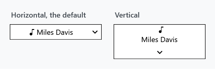
<mah:SplitButton Orientation="Vertical" ItemsSource="{Binding Artists}" SelectedIndex="0" />
Vertical puts the arrow underneath instead of beside, and stacks the icon above the label.
Orientation is two separate templates, and that breaks a custom one. The style ships MahApps.Templates.SplitButton.Horizontal and MahApps.Templates.SplitButton.Vertical and switches between them from a Style.Triggers entry on Orientation.
A trigger outranks a plain setter anywhere in the style chain, so a derived style that sets Template is beaten by that inherited trigger the moment the button turns vertical:
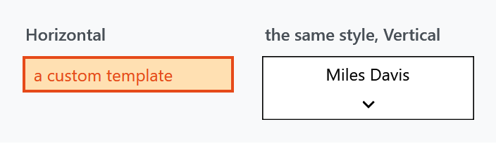
Both buttons above use the same derived style with the same custom Template. To make a custom template survive, repeat the trigger in your own style:
<Style BasedOn="{StaticResource {x:Type mah:SplitButton}}" TargetType="{x:Type mah:SplitButton}">
    <Setter Property="Template" Value="{StaticResource MyHorizontalTemplate}" />
    <Style.Triggers>
        <Trigger Property="Orientation" Value="Vertical">
            <Setter Property="Template" Value="{StaticResource MyVerticalTemplate}" />
        </Trigger>
    </Style.Triggers>
</Style>
The Slider style has the same shape and the same trap.
The drop-down frame
The popup's PopupBorder takes its BorderBrush from the control, but its Background is a fixed MahApps.Brushes.ThemeBackground, its BorderThickness is a hardcoded 1, and it has no CornerRadius at all. So ControlsHelper.CornerRadius rounds the button and leaves the list square. The same shape in the DateTimePicker template is tracked as #4582.
Related
DropDownButton — no selection, a static label, and a ContextMenu instead of a popup list. ContentControlEx presents the label, so ControlsHelper.ContentCharacterCasing and ControlsHelper.RecognizesAccessKey apply here too.