MetroAnimatedTabControl is a MetroTabControl whose content slides in when you switch tabs. The class itself is four lines — it derives from BaseMetroTabControl and only points at a different default style. Everything below is that style.
<mah:MetroAnimatedTabControl>
    <TabItem Header="Overview">
        <!--  content  -->
    </TabItem>
    <TabItem Header="Details">
        <!--  content  -->
    </TabItem>
</mah:MetroAnimatedTabControl>
Because it derives from BaseMetroTabControl, everything on the MetroTabControl page applies here too — closeable tabs, CloseTabCommand, the header styling through TabControlHelper, and so on.
Where the animation comes from
The template hosts the tab content in a TransitioningContentControl, replayed on every tab change:
<mah:TransitioningContentControl behaviors:ReloadBehavior.OnSelectedTabChanged="True"
                                 Transition="{TemplateBinding mah:TabControlHelper.Transition}"
                                 ... />
That is the whole mechanism, and it explains both how to change the animation and what its limits are. A plain MetroTabControl has no TransitioningContentControl in its template at all, which is why it does not animate.
Choosing the transition
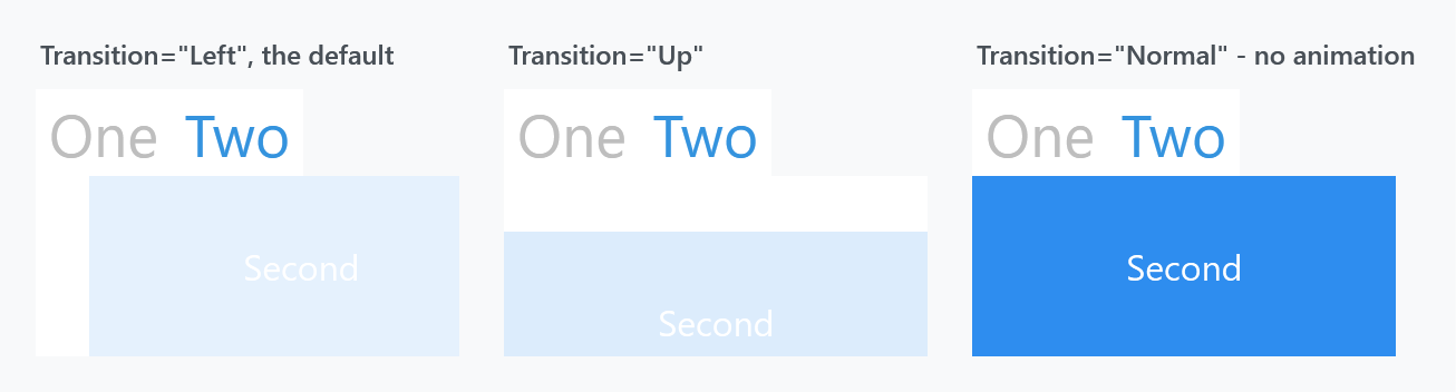
TabControlHelper.Transition sets it, and the style's default is Left:
<mah:MetroAnimatedTabControl mah:TabControlHelper.Transition="Up">
The value is a TransitionType, so every option on the TransitioningContentControl page is available here — including Normal, which does not animate at all and is the way to keep this control's template while turning the movement off, and Custom for your own visual state.
Headers wrap onto more rows
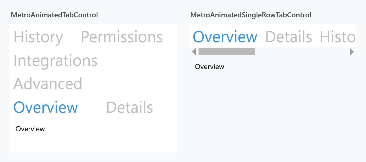
The headers sit in a plain TabPanel, so when they do not fit across the control they wrap onto further rows, and each row takes space away from the content. The left panel above shows six headers in a 280px-wide control folding onto three rows.
Note that the selected tab's row is moved down next to the content — that is TabPanel's own behaviour, not something MahApps does, and it is why Overview appears on the bottom row rather than the top.
If you would rather have one row that scrolls, use MetroAnimatedSingleRowTabControl, which is the same control with a ScrollViewer around the headers.
Related
MetroTabControl for the shared API and the non-animated version. MetroAnimatedSingleRowTabControl for the scrolling-header variant. TransitioningContentControl for what the transitions actually do.