FlipView shows one item at a time and flips between them with animated transitions. It derives from Selector, so it is an items control with a selection — ItemsSource, Items, SelectedItem and SelectedIndex all work as usual.
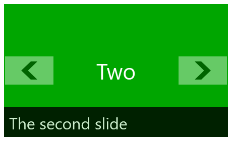
<mah:FlipView Width="230" Height="140" BannerText="The second slide">
    <Grid Background="#FF2E8DEF" />
    <Grid Background="#FF00A600" />
    <Grid Background="#FFBF1E4B" />
</mah:FlipView>
It was inspired by the WinRT control of the same name but shares no code with it.
Navigating
The user flips with the two buttons or with the arrow keys. In code:
GoBack() / GoForward() |
one item, honouring CircularNavigation |
SelectedIndex |
jump anywhere; the transition direction is worked out from the old and new index |
CircularNavigation |
False by default; when True, the ends wrap around |
Which button is visible is computed, not fixed. DetectControlButtonsStatus hides the back button on the first item and the forward button on the last, unless CircularNavigation is on.
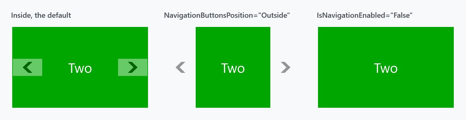
| Property | Type | Default | |
|---|---|---|---|
IsNavigationEnabled |
bool |
True |
hides both buttons when False |
NavigationButtonsPosition |
NavigationButtonsPosition |
Inside |
Inside or Outside |
NavigationButtonStyle |
Style |
MahApps.Styles.Button.FlipView.Navigation |
|
ButtonBackContent / ButtonForwardContent / ButtonUpContent / ButtonDownContent |
object |
chevrons | each with a matching …Template and …StringFormat |
Outside puts the buttons beside the item instead of over it, which costs width — compare the second panel above with the first.
There is no swipe gesture. FlipView handles OnKeyDown and OnMouseDown and nothing else — no manipulation or touch handling anywhere in the control. Older documentation said otherwise.
The keyboard is also tied to the buttons: OnKeyDown only acts if the button for that direction is visible and enabled. So hiding the buttons — through IsNavigationEnabled="False" or HideControlButtons() — takes the arrow keys with it. Left/Right flip when horizontal, Up/Down when vertical.
HideControlButtons() does not stick. It is a one-shot: it sets the buttons' visibility once and changes no state.
public void HideControlButtons()
{
    this.ExecuteWhenLoaded(() => this.DetectControlButtonsStatus(Visibility.Hidden));
}
Anything that recomputes the buttons afterwards brings them back — a selection change among them, which is exactly what an automatic slideshow does:
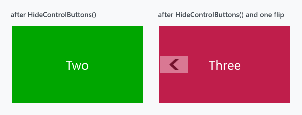
Both panels called HideControlButtons(). The right one then flipped once, and the back button returned. (The forward button stays hidden because that panel is now on the last item.)
Use IsNavigationEnabled="False" instead. It is a dependency property, it is re-read on every recompute, and it survives.
Transitions
The animation between items is a TransitioningContentControl, and there is one TransitionType per direction:
| Property | Default |
|---|---|
LeftTransition |
LeftReplace |
RightTransition |
RightReplace |
UpTransition |
Up |
DownTransition |
Down |
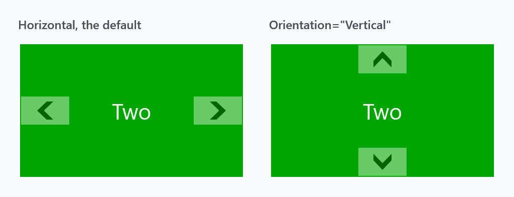
Orientation decides which pair is used: Horizontal uses left/right, Vertical uses up/down, and it also moves the buttons.
The banner
The strip along the bottom. It is on by default and slides open and shut.
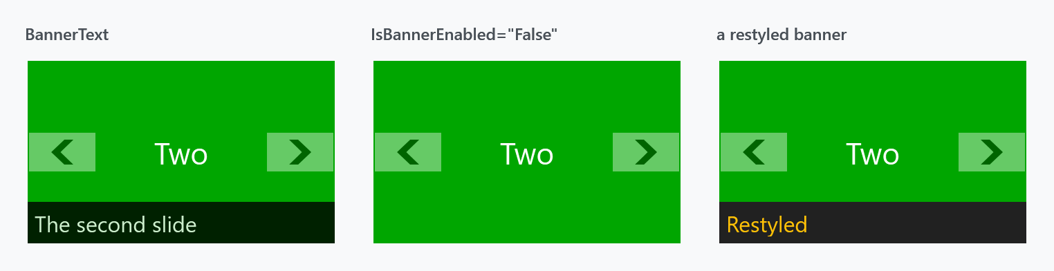
| Property | Type | Default | |
|---|---|---|---|
IsBannerEnabled |
bool |
True |
|
BannerText |
object |
null |
plus BannerTextTemplate, BannerTextTemplateSelector, BannerTextStringFormat |
BannerBackground |
Brush |
MahApps.Brushes.ThemeForeground |
|
BannerForeground |
Brush |
MahApps.Brushes.ThemeBackground |
|
BannerOpacity |
double |
0.8 |
applies to the whole strip, text included |
The banner does not follow the selection on its own. Bind it to the selected item:
<mah:FlipView ItemsSource="{Binding Slides}"
              BannerText="{Binding SelectedItem.Caption, RelativeSource={RelativeSource Self}}" />
On develop an item can also name its own banner, by way of a FlipViewItem in the item template:
<mah:FlipView ItemsSource="{Binding Slides}">
    <mah:FlipView.ItemTemplate>
        <DataTemplate>
            <mah:FlipViewItem BannerText="{Binding Caption}">
                <Image Source="{Binding Image}" />
            </mah:FlipViewItem>
        </DataTemplate>
    </mah:FlipView.ItemTemplate>
</mah:FlipView>
That is the only place for it. A FlipView shows its selected item in a presenter and wraps nothing in a container of its own, so there are no FlipViewItem containers for an ItemContainerStyle to reach. In a released version the item never found the control it belongs to and the banner kept the text a FlipViewItem starts out with, which is #4447.
An item that names no banner leaves the one on the control alone, so the two ways can be mixed.
The banner's text colour is BannerForeground, not Foreground. Setting Foreground on the FlipView does nothing to the banner — the template binds the banner label to BannerForeground, which wins:
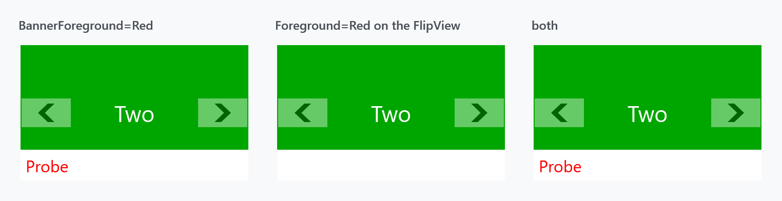
The middle panel sets Foreground="Red" and shows nothing at all, because BannerForeground is still its default of MahApps.Brushes.ThemeBackground — white text on the white banner. The third sets Foreground="Blue" and BannerForeground="Red" and comes out red.
Foreground is not useless, though: the item container style binds each FlipViewItem's foreground to its owner's, so Foreground reaches the items.
Changing BannerText fades the label out, swaps the text and fades it back in, so the new text does not appear instantly.
The index
A row of dots showing how many items there are and which one is current. It is off by default, and the old documentation never mentioned it.
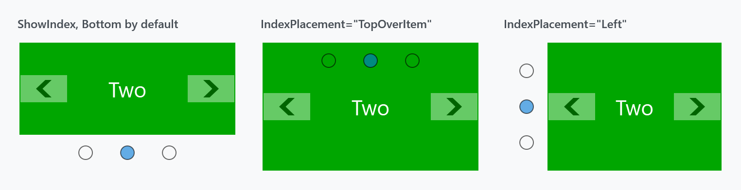
<mah:FlipView ShowIndex="True" IndexPlacement="TopOverItem" ItemsSource="{Binding Slides}" />
| Property | Type | Default | |
|---|---|---|---|
ShowIndex |
bool |
False |
|
IndexPlacement |
NavigationIndexPlacement |
Bottom |
|
IndexHorizontalAlignment / IndexVerticalAlignment |
Center |
within the strip | |
IndexItemContainerStyle |
Style |
MahApps.Styles.ListBoxItem.FlipView.Index |
the dots |
NavigationIndexPlacement has eight values: Left, Right, Top, Bottom, and a …OverItem variant of each. The plain values give the index a strip of its own and shrink the item; the OverItem ones lay it over the item, as in the middle panel above.
The index is a ListBox in the template and it is clickable, so it navigates as well as reports.
The hover border
A border drawn over the item while the mouse is inside, to show the control has focus for the arrow keys.
| Property | Type | Default |
|---|---|---|
MouseHoverBorderEnabled |
bool |
True |
MouseHoverBorderBrush |
Brush |
theme |
MouseHoverBorderThickness |
Thickness |
4 |
An automatic slideshow
Increment SelectedIndex on a timer, with CircularNavigation so it wraps and IsNavigationEnabled="False" so the buttons stay away:
<mah:FlipView x:Name="Slideshow"
              CircularNavigation="True"
              IsNavigationEnabled="False"
              ShowIndex="True"
              ItemsSource="{Binding Slides}" />
var timer = new DispatcherTimer { Interval = TimeSpan.FromSeconds(4) };
timer.Tick += (_, _) => this.Slideshow.GoForward();
timer.Start();
GoForward() wraps by itself once CircularNavigation is on, so there is no index arithmetic to get wrong.
What a client is told
A flip view builds nothing for the pages it is not showing, so there is no list of pages to walk. It says which page is up and how many there are, as 1 / 3, and the page itself with its banner is in the tree the way any content is.
New on develop. In a released version it arrives as an empty list. This is #4454.
Related
FlipViewItem is the container, styled by MahApps.Styles.FlipViewItem. The transitions come from TransitioningContentControl.