MetroTabItem is a TabItem with a close button and the four properties around it. It is what MetroTabControl creates for you when you bind ItemsSource, and its style is based on MahApps.Styles.TabItem, so everything on the TabControl styles page applies here too.
<mah:MetroTabControl>
    <mah:MetroTabItem Header="General" CloseButtonEnabled="True">
        <TextBlock Margin="10" Text="First page" />
    </mah:MetroTabItem>
</mah:MetroTabControl>
| Property | Type | Default | |
|---|---|---|---|
CloseButtonEnabled |
bool |
False |
whether the tab has a close button at all |
CloseButtonMargin |
Thickness |
0 |
where that button sits |
CloseTabCommand |
ICommand |
null |
run when the button is clicked |
CloseTabCommandParameter |
object |
null |
what the command is handed |
The button appears on the selected tab
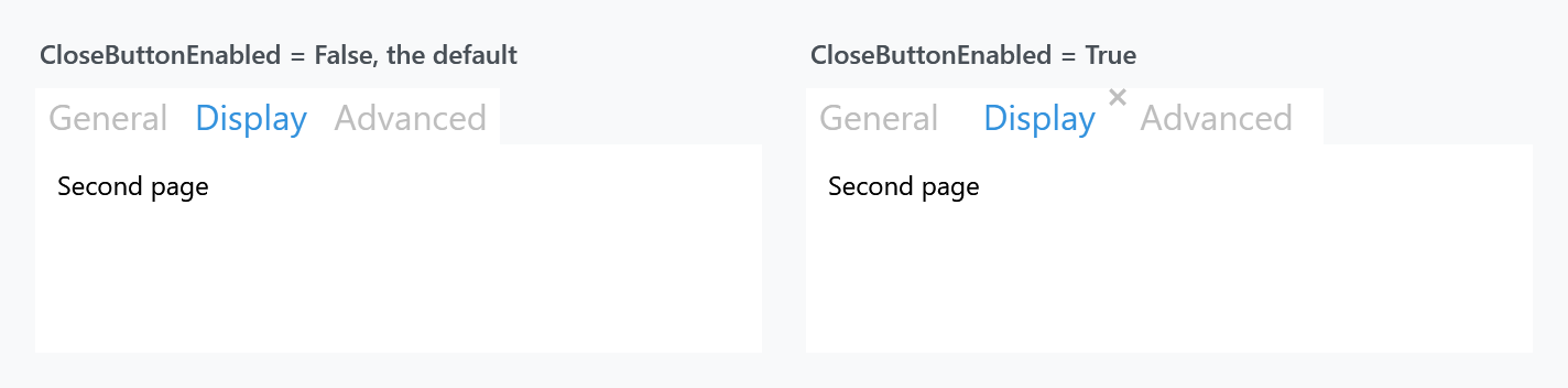
Look at the figure: only Display has a cross, and all three tabs have CloseButtonEnabled="True".
CloseButtonEnabled alone puts the button in the layout but leaves it Hidden — it takes up its space so the header does not jump. Two triggers make it Visible: the tab being selected, and the pointer being over it. That is the usual pattern for closable tabs, and it is why the figure shows one cross rather than three.
The button's size follows HeaderedControlHelper.HeaderFontSize through a converter, so it stays in proportion when you shrink the tab headers.
CloseButtonEnabled and CloseButtonMargin are declared with FrameworkPropertyMetadataOptions.Inherits, but they are properties of MetroTabItem, not attached properties — you cannot write them on the MetroTabControl. Put them on each item, or in an ItemContainerStyle:
<mah:MetroTabControl.ItemContainerStyle>
    <Style BasedOn="{StaticResource {x:Type mah:MetroTabItem}}" TargetType="{x:Type mah:MetroTabItem}">
        <Setter Property="CloseButtonEnabled" Value="True" />
    </Style>
</mah:MetroTabControl.ItemContainerStyle>
What the close button does
The button raises no Click you can handle — a CloseTabItemAction behaviour is attached to it, and that runs a fixed sequence:
- The item's
CloseTabCommandis asked whether it can run.CanExecutereturningfalsekeeps the tab and ends it there; otherwise the command runs. - Then the control's
CloseThisTabItemruns, which raises the closing event and, unless a handler says no, either executes the control'sCloseTabCommandor removes the tab.
So there are three ways to keep a tab: a CanExecute of false on the item's command, a cancelled closing event on the MetroTabControl, or a CloseTabCommand on the control, which takes the removal over entirely.
The first of those three is new on develop. In 2.4.11 the item's command could not stop anything: a CanExecute of false only meant the command did not run, and the tab went anyway.
The button itself is disabled while the answer is false, so the case only shows when the answer turns without the command saying that it has.
<mah:MetroTabItem Header="Report"
                  CloseButtonEnabled="True"
                  CloseTabCommand="{Binding SaveBeforeCloseCommand}"
                  CloseTabCommandParameter="{Binding RelativeSource={RelativeSource Self}, Path=Header}" />
CloseTabCommandParameter does double duty: it is the parameter for the item's command, and the control's CloseTabCommand is handed it as well, falling back to the MetroTabItem itself where the item has none.
The plain TabItem alternative
TabControlHelper has CloseButtonEnabled, CloseTabCommand and CloseTabCommandParameter as attached properties that work on an ordinary TabItem.
Those three are read only by the Visual Studio tab style in Styles/VS/TabControl.xaml. Under the ordinary MahApps styles they do nothing, and the close button in the figure above comes from MetroTabItem's own properties. If you want closable tabs without the Visual Studio look, use MetroTabItem.
Related
MetroTabControl for the closing pipeline seen from the other end, TabControl for the look, and TabControlHelper for the underline and the transition.