MetroWindow replaces WPF's Window. Using it is what gives an application the MahApps title bar, and it is the host for flyouts, dialogs and the title-bar commands. If you are starting out, read the Quick Start first.
It has around fifty properties. They are grouped here by what they do rather than listed alphabetically.
The title bar

| Property | Type | Default | |
|---|---|---|---|
ShowTitleBar |
bool |
True |
|
TitleBarHeight |
int |
30 |
|
TitleAlignment |
HorizontalAlignment |
Stretch |
|
TitleCharacterCasing |
CharacterCasing |
Upper |
why titles shout by default |
TitleForeground |
Brush |
||
TitleTemplate |
DataTemplate |
null |
replace the title's presentation entirely |
WindowTitleBrush |
Brush |
Transparent |
the bar's background |
NonActiveWindowTitleBrush |
Brush |
Gray |
the same while the window is inactive |
TitleCharacterCasing="Normal" is the one most people reach for first — the third panel above.
ShowTitleBar="False" removes the bar but not the window buttons: the fourth panel above still has minimise, maximise and close floating over the content. That is WindowButtonCommandsOverlayBehavior, which defaults to Always and so includes the hidden-title-bar case. Set it to Never if you want them gone with the bar.
WindowTitleBrush being Transparent by default is worth knowing: the accent colour you see comes from the theme, not from this property, so setting it is how you get a title bar that ignores the theme.
Borders, glow and shadow

A normal border is BorderBrush plus BorderThickness, inherited from Window:
<mah:MetroWindow BorderBrush="{DynamicResource MahApps.Brushes.Accent}"
                 BorderThickness="1" />
GlowColor instead draws a soft glow around the frame. The default style sets it to the accent, so a window glows without being asked to:
<mah:MetroWindow GlowColor="{DynamicResource MahApps.Colors.Accent}" />
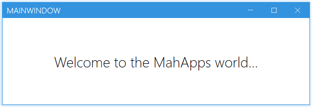
The glow is a colour now, not a brush. GlowBrush and NonActiveGlowBrush were in 2.4.11; on develop they are GlowColor and NonActiveGlowColor, which came along when the window moved onto ControlzEx's WindowChromeWindow. Reach for a MahApps.Colors.… key rather than a MahApps.Brushes.… one, and set the colour to {x:Null} to take the glow away.
The glow is painted by separate windows around the frame, not by the window's own visual tree. A BorderThickness="0" window with no glow colour therefore has no edge at all — the middle panel of the first figure.
For a drop shadow and no border, set BorderThickness="0" with a dark glow:
<mah:MetroWindow BorderThickness="0"
                 GlowColor="Black"
                 ResizeMode="CanResizeWithGrip"
                 WindowTransitionsEnabled="False" />
| Property | Type | Default | |
|---|---|---|---|
GlowColor |
Color? |
the accent | the glow while the window is active |
NonActiveGlowColor |
Color? |
the theme foreground | the same while it is not |
GlowDepth |
int |
how far the glow reaches | |
IsGlowTransitionEnabled |
bool |
whether it fades between the two colours | |
PreferDWMBorderColor |
bool |
let Windows draw the border itself where it can, instead of the glow windows | |
CornerPreference |
WindowCornerPreference |
Default |
DoNotRound, Round or RoundSmall, which is what Windows 11 rounds the corners by |
NonActiveBorderBrush |
Brush |
Gray |
|
KeepBorderOnMaximize |
bool |
True |
|
ResizeBorderThickness |
Thickness |
6 |
the invisible grab area for resizing |
Everything in that table down to CornerPreference comes from ControlzEx rather than from MahApps, since MetroWindow derives from WindowChromeWindow now. IgnoreTaskbarOnMaximize, ShowMinButton and ShowMaxRestoreButton moved there as well, and are set on a MetroWindow exactly as before.
The window buttons

There are two pairs of properties, and they do different things:
ShowMinButton, ShowMaxRestoreButton, ShowCloseButton |
remove the button |
IsMinButtonEnabled, IsMaxRestoreButtonEnabled, IsCloseButtonEnabled |
keep it, greyed out |
All six default to True. The middle panel above is a disabled close button — still there, still visibly a button; the right-hand one has the other two removed outright.
WindowButtonCommands is the control itself, should you want to reach it — see WindowButtonCommands, which also has the cancellable ClosingWindow event.
ShowSystemMenu and ShowSystemMenuOnRightClick (both True) control the system menu.
Title-bar commands and the icon
LeftWindowCommands and RightWindowCommands take a WindowCommands each, for your own buttons at either end of the bar. OverrideDefaultWindowCommandsBrush forces a brush onto all of them at once.
| Property | Type | Default | |
|---|---|---|---|
ShowIconOnTitleBar |
bool |
True |
|
IconTemplate |
DataTemplate |
null |
|
IconScalingMode |
MultiFrameImageMode |
ScaleDownLargerFrame |
see MultiFrameImage |
IconBitmapScalingMode |
BitmapScalingMode |
||
IconEdgeMode |
EdgeMode |
||
IconOverlayBehavior |
OverlayBehavior |
Never |
whether the icon shows over a flyout |
Icon is inherited from Window and takes only an ImageSource (Microsoft docs). For anything else, use IconTemplate — the icon is bound to it, so {Binding} inside the template is the Icon.
<mah:MetroWindow Icon="app.ico" ShowIconOnTitleBar="True">
    <mah:MetroWindow.IconTemplate>
        <DataTemplate>
            <Image Margin="4" RenderOptions.BitmapScalingMode="HighQuality" Source="{Binding}" />
        </DataTemplate>
    </mah:MetroWindow.IconTemplate>
</mah:MetroWindow>
The template does not have to show the Icon at all — put an icon-pack glyph in it and the window has a vector icon:
<mah:MetroWindow.IconTemplate>
    <DataTemplate>
        <iconPacks:PackIconUnicons Width="30" Height="30" Margin="4"
                                   Kind="BatteryBolt"
                                   Foreground="{DynamicResource MahApps.Brushes.IdealForeground}" />
    </DataTemplate>
</mah:MetroWindow.IconTemplate>
Because the icon is drawn by a MultiFrameImage, a multi-resolution .ico picks the frame that suits the title bar rather than being stretched — IconScalingMode is that control's mode.
Clicking the icon
The icon behaves like the one on any other window: a left click opens the system menu, a double click closes the window. ShowSystemMenu and CloseOnIconDoubleClick (both True) turn either of those off.
A right click is left to the template, so an icon of your own can bring a menu of its own:
<mah:MetroWindow.IconTemplate>
    <DataTemplate>
        <Image Margin="4" Source="{Binding}">
            <Image.ContextMenu>
                <ContextMenu>
                    <MenuItem Header="Settings" />
                    <MenuItem Header="About" />
                </ContextMenu>
            </Image.ContextMenu>
        </Image>
    </DataTemplate>
</mah:MetroWindow.IconTemplate>
Where the template has none, the right click falls back to the system menu, which is what Windows does on an icon, and ShowSystemMenuOnRightClick turns that off.
In a released version the system menu takes the right click either way, so a menu in the template never gets its turn. Fixed on develop by #4488.
Flyouts and dialogs
Flyouts takes the FlyoutsControl holding the window's flyouts, and FlyoutOverlayBrush paints the dimming behind a modal one.
| Property | Type | Default | |
|---|---|---|---|
MetroDialogOptions |
MetroDialogSettings |
defaults for the dialogs shown on this window | |
ShowDialogsOverTitleBar |
bool |
True |
|
OverlayBrush |
Brush |
the dialog overlay | |
OverlayOpacity |
double |
0.7 |
|
OverlayFadeIn / OverlayFadeOut |
Storyboard |
replace the fade | |
IsAnyDialogOpen |
bool, read-only |
False |
|
IsCloseButtonEnabledWithDialog |
bool, read-only |
True |
whether the close button works while a dialog is up |
The four overlay-behaviour properties — LeftWindowCommandsOverlayBehavior, RightWindowCommandsOverlayBehavior, WindowButtonCommandsOverlayBehavior and IconOverlayBehavior — decide what stays visible above an open flyout. They are documented with their defaults on the Flyouts page.
InfoBars takes an InfoBarsControl whose info bars lie over the top of the content, under the title bar and under the flyouts, the overlay and the dialogs. It is new on develop and not in 2.4.11.
A WindowsFormsHost over a dialog
New on develop with #3849.
A WindowsFormsHost, a WebBrowser, anything built on HwndHost is a window of its own sitting on top of yours. It paints over the WPF content around it whatever the z order says, so a dialog or a flyout drawn over it is cut in half. There is nothing to arrange your way out of, and it is a WPF thing rather than a MahApps one.
The only way to show the dialog whole is for the hosted handle to be gone while it is up, which is what CollapseHwndHosts does:
<mah:MetroWindow x:Class="Sample.MainWindow"
                 xmlns:mah="http://metro.mahapps.com/winfx/xaml/controls"
                 CollapseHwndHosts="True">
    <DockPanel>
        <TextBlock DockPanel.Dock="Top" Text="a report" />
        <WindowsFormsHost>
            <wf:ReportViewer x:Name="Viewer" />
        </WindowsFormsHost>
    </DockPanel>
</mah:MetroWindow>
Every HwndHost in the window is collapsed for as long as a dialog or a Flyout is open, and gets back the visibility it had once the last of them is gone. A flyout counts as gone when it has finished sliding out, not when it is told to close, so nothing pops up in front of it on the way.
The price is that the hosted control disappears and comes back. It is only hidden, not rebuilt: the window handle stays the same, and so does whatever the control holds, its text and its caret. But it is visibly gone while the dialog is up and it redraws when it returns, which for something like a video player or a browser is an interruption rather than a flicker. That is why this is off by default.
Position, dragging and startup
| Property | Type | Default | |
|---|---|---|---|
SaveWindowPosition |
bool |
False |
restore size and position on next launch |
WindowPlacementSettings |
IWindowPlacementSettings |
null |
where that is stored |
IgnoreTaskbarOnMaximize |
bool |
False |
maximise over the taskbar |
IsWindowDraggable |
bool |
True |
drag the window by its title bar |
WindowTransitionsEnabled |
bool |
True |
the content's entrance animation |
SaveWindowPosition="True" is a nice convenience and a real support risk. If a monitor is detached between exit and restart, the window can come back off screen with no way for the user to get at it. Provide a reset, or validate the restored placement against the current screens yourself.
Where the placement is stored
Left alone, the placement goes into the application settings, through ApplicationSettingsBase. That store depends on the configuration system, and it does fail: on .NET 9 before 9.0.3 saving throws when the application runs from a network location, and the position is silently lost.
WindowPlacementSettings takes any IWindowPlacementSettings, so the storage is yours to pick. WindowPlacementFileSettings writes a file instead, either one you name or one under the local application data of the current user:
public MainWindow()
{
    this.InitializeComponent();
    this.WindowPlacementSettings = WindowPlacementFileSettings.ForWindow(this);
}
It has no dependency on the configuration system, and it behaves the same on every target framework. Writing your own implementation is a small interface away if you would rather keep the placement in a database or next to the rest of your own settings.
WindowPlacementFileSettings is on develop and ships with the next release. In a released version, write the interface yourself, it is Placement, Reload, Save, Upgrade, UpgradeSettings and Reset.
IsWindowDraggable is what MetroThumbContentControl checks — the title bar is one of those, and dragging it is what moves the window.
Related
WindowCommands and WindowButtonCommands for the title bar's two sets of buttons. Flyouts for the overlay panels and the overlay-behaviour table. MetroNavigationWindow is a MetroWindow with a navigation bar built in.