MetroProgressBar derives from ProgressBar and replaces its template. Determinate, it is a flat bar without a frame; indeterminate, it is five dots sweeping across instead of a striped fill.

<mah:MetroProgressBar Width="190" Value="70" />
Everything about the value is inherited, so Minimum, Maximum, Value and IsIndeterminate work exactly as on a ProgressBar.
Against the styled ProgressBar

ProgressBar |
MetroProgressBar |
|
|---|---|---|
| indicator | Foreground, a gradient by default |
flat, Foreground |
Foreground |
honoured on develop, ignored before it, see ProgressBar |
honoured |
| track | MahApps.Brushes.Gray5 |
#1FFFFFFF |
| frame | 1px MahApps.Brushes.Control.Border |
none |
MinHeight |
10 | 6 |
| indeterminate | scrolling diagonal stripes | five sweeping dots |
Padding |
ignored | insets the determinate bar |
Neither is a variant of the other: MahApps.Styles.MetroProgressBar lives in Themes/MetroProgressBar.xaml and is applied as the control's default style through Generic.xaml, so it needs no Style reference.
The invisible track
The style sets Background to #1FFFFFFF — white at 12% opacity. That reads as a faint lightening on a dark surface, which is what it was drawn for, and as nothing at all on a light one. Look at the Value = 0 panel in the first figure: there is no bar there, just an empty strip. Give the control a Background of your own whenever it sits on a light background.

<mah:MetroProgressBar Width="190"
                      Value="55"
                      Background="{DynamicResource MahApps.Brushes.Gray8}"
                      Foreground="#FF107C10" />
Background, BorderBrush, BorderThickness and Foreground are all template bindings here, so all four work. Padding is bound to the margin of the determinate part, which insets the bar inside the control's own bounds.
Indeterminate

<mah:MetroProgressBar Width="190" IsIndeterminate="True" />
Five ellipses ease in from the left one after another, cross the bar together, and leave to the right, on a loop just under four seconds long. They are filled from Foreground, like the determinate bar.
The track is not merely covered while this runs — the animation fades the whole determinate part to zero, so Background and BorderBrush have nothing to paint. An indeterminate MetroProgressBar is the dots and nothing else.
For the same idea as a spinner rather than a strip, see ProgressRing.
EllipseDiameter and EllipseOffset
The two properties the control adds are the size of the dots and the gap between them:

A single frame of the sweep, so the three are directly comparable.
<mah:MetroProgressBar Width="190"
                      IsIndeterminate="True"
                      EllipseDiameter="8"
                      EllipseOffset="16" />
Left alone, both are picked from the bar's own length:
| Length | EllipseDiameter |
EllipseOffset |
|---|---|---|
| up to 180 | 4 | 4 |
| up to 280 | 5 | 7 |
| longer | 6 | 9 |
The control only fills them in while they are still 0, and it does so with SetCurrentValue, so a value you set — or a binding — survives. Setting either back to 0 hands it to the automatic sizing again.
The control's height is a minimum (MahApps.Sizes.ProgressBar.MinHeight, 6), not a fixed size, so dots larger than that make the bar taller rather than being clipped.
Vertical
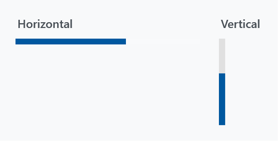
<mah:MetroProgressBar Width="6"
                      Height="90"
                      Orientation="Vertical"
                      Value="60"
                      Background="{DynamicResource MahApps.Brushes.Gray8}" />
Orientation="Vertical" rotates the template by -90°, so the bar fills from the bottom and the dots sweep upwards. The trigger also swaps the minimum, putting the 6 on MinWidth; give the control the Width and Height you want, the rotation happens inside.
Resizing
The sweep is a storyboard whose travel distances are computed from the actual length of the bar, so the control rebuilds and restarts it whenever the size changes, and again when it becomes visible after being hidden. That is handled for you — worth knowing only if you wonder why an indeterminate bar restarts its loop when its container is re-laid out.
Where it is used
The progress dialog is built on a MetroProgressBar, and its ProgressBarForeground binds straight to this control's Foreground — which works precisely because this template honours it.