FontIcon draws one character from a symbol font. That is the whole control: a Glyph property and a template that puts it in a TextBlock.
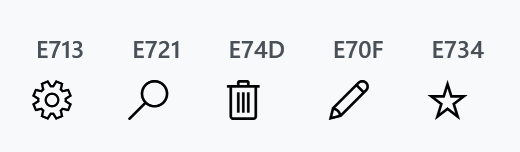
<mah:FontIcon Glyph="" />
var icon = new FontIcon { Glyph = "\uE713" };
Glyph is a string, not a character, so it can hold a surrogate pair or several characters if a font needs them.
You do not need to set the FontFamily
The style already points at the symbol font, so the old advice to write FontFamily="Segoe MDL2 Assets" on every icon is unnecessary — and it costs you the embedded fallback, as the note below explains.
<Setter Property="FontFamily" Value="{DynamicResource MahApps.Fonts.Family.SymbolTheme}" />
<Setter Property="FontSize" Value="20" />
To use a different icon font, override FontFamily on the control or redefine MahApps.Fonts.Family.SymbolTheme for the whole application.
MahApps ships the font, so you do not need it installed. MahApps.Fonts.Family.SymbolTheme is a fallback chain: the installed font first, then a copy embedded in the library.
<FontFamily x:Key="MahApps.Fonts.Family.SymbolTheme">Segoe MDL2 Assets,/MahApps.Metro;component/Assets/#Segoe MDL2 Assets</FontFamily>
Assets/segmdl2.ttf is compiled into MahApps.Metro.dll as a WPF resource, so the second half resolves even on a machine where Segoe MDL2 Assets is not installed. Older documentation's "you must have the font available for the glyphs to show" was true of plain WPF, not of MahApps.
This is exactly why you should not write FontFamily="Segoe MDL2 Assets" on your icons. A bare family name replaces the whole chain and throws the embedded copy away, so the icons work on your Windows 11 machine and turn into empty boxes wherever the font is missing.
Size and colour
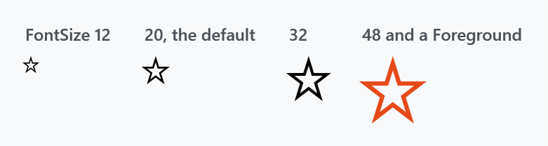
FontIcon derives from Control, so it has no size or brush properties of its own — a glyph is text, and FontSize, FontWeight, FontStyle and Foreground are what shape it. The default FontSize is 20.
Foreground is registered to inherit and the style sets none, so an icon takes its colour from around it. What happens when the icon is handed to a control as content is under IconElement below:
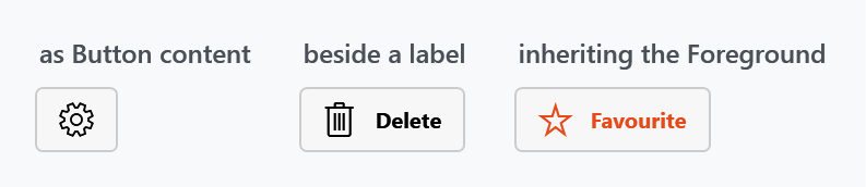
<Button Foreground="#FFE64A19">
<StackPanel Orientation="Horizontal">
<mah:FontIcon Margin="0 0 8 0" FontSize="16" Glyph="" />
<TextBlock VerticalAlignment="Center" Text="Favourite" />
</StackPanel>
</Button>
It is decoration, not a control
The style makes that explicit: Focusable="False", IsTabStop="False" and FocusVisualStyle="{x:Null}". A FontIcon never takes focus and never appears in the tab order, which is what you want for something sitting inside a button.
Two more details in the template are worth knowing if you are styling around it:
- the inner
TextBlockis givenStyle="{x:Null}", so an implicitTextBlockstyle in your application cannot reach it and change the glyph's look TextOptions.TextRenderingModeisAliased, which keeps small glyphs crisp instead of blurring them across pixels
The template's root Grid has no background, so a FontIcon is not hit-testable on its own. Put it in something that is — a Button, or a panel with a Background — if it needs to react to the mouse.
Finding glyph codes
Codes are private-use code points assigned by the font's designers, so they mean nothing outside that font. For Segoe MDL2 Assets, Microsoft publishes the full list in the Segoe MDL2 Assets icon list; the Character Map utility shipped with Windows will also show them.
There is no Symbol enumeration in MahApps.Metro. That is a UWP and WinUI API, and older documentation mentioned it here by mistake. In WPF you write the code point yourself, as  in XAML or "\uE713" in C#.
PathIcon
PathIcon is the other icon in the library. It draws vector geometry rather than a glyph, and it is what the library's own templates use for the chevron on a DropDownButton, the clear button on a text box and marks of that kind.
<mah:PathIcon Data="M7.41,8.58L12,13.17L16.59,8.58L18,10L12,16L6,10L7.41,8.58Z" />
Data is a Geometry with a GeometryConverter on it, so the path markup syntax works straight from the attribute. The template puts the path in a Viewbox and stretches it uniformly, which means Width and Height, both 16 to begin with, are what size an icon and Padding is the room left around it. The path is filled with Foreground and never stroked, so a geometry drawn as an outline comes out solid.
PathIcon is new on develop. In 2.4.11 the same thing was a ContentControl carrying MahApps.Styles.ContentControl.PathIcon with the geometry as its Content, and that style key is gone.
IconElement
FontIcon and PathIcon both derive from IconElement, which is where the colour is settled.
Foreground is registered on it to inherit, and an icon that was given none of its own takes the one of its visual parent rather than its logical one. That is the difference that matters: an icon handed to a Button as content is put into the button's template, so its logical parent is the button and its visual parent is whatever part of the template holds the content. Binding to the visual parent is what makes the icon follow the colour the template is painting with, including the one a checked or disabled state switches to.
InheritsForegroundFromVisualParent is the read-only property saying whether that is happening. It is True while the icon carries no Foreground of its own and its two parents differ, which is exactly the case of an icon handed to a control as content. Give the icon a Foreground and it stops, and the colour you set is the colour it keeps.
IconElement was an empty base class in 2.4.11 with FontIcon as its only subclass. Both the colour handling and PathIcon are new on develop.
Related
MahApps.Metro.IconPacks is the separate package with the large icon sets in it, if neither a symbol font nor a path of your own is what you want. Buttons and ToggleButton show an icon used as the content of a control.