Every Button, RepeatButton and ToggleButton in a MahApps application is styled without any markup on your side. Beyond that the library ships a set of keyed styles to pick from — square, circular, flat, chromeless — plus a good many that belong to particular controls.

The implicit style
Styles/Controls.xaml applies MahApps.Styles.Button to Button and RepeatButton, and MahApps.Styles.ToggleButton to ToggleButton. Merging that dictionary — which the quick start does — is all it takes:
<ResourceDictionary Source="pack://application:,,,/MahApps.Metro;component/Styles/Controls.xaml" />
The default button is a rounded, bordered button with bold, upper-cased content. The upper-casing is not a font trick: the style sets ControlsHelper.ContentCharacterCasing to Upper, and setting it back to Normal gives you the content as written.
<Button mah:ControlsHelper.ContentCharacterCasing="Normal" Content="Save" />
Along with it the style sets ControlsHelper.CornerRadius to 3, which is yours to override. A released version also sets FocusBorderThickness to 2, which made the border thicker while the button had the focus and moved its content along with it. That is gone on develop: focus colours the border through FocusBorderBrush and leaves its thickness alone. See ControlsHelper.
The square styles
<Button Style="{StaticResource MahApps.Styles.Button.Square}" Content="Save" />
| Style | |
|---|---|
MahApps.Styles.Button.Square |
a flat-cornered button with a 2 pixel border |
MahApps.Styles.Button.Square.Accent |
the same filled with the accent colour |
MahApps.Styles.Button.Square.Highlight |
the same filled with the highlight colour, a darker accent |
Look at the captions in the figure above: the default style upper-cases its content, but the square styles set ContentCharacterCasing to Lower, so Content="Save" comes out as save. It is a deliberate part of the look rather than an accident, but it surprises people who expect the content verbatim. Set the property to Normal if you want it as written, or, since both casings come out of resources rather than out of the styles, override MahApps.CharacterCasing.Button.Square once and every square button follows. The default style reads MahApps.CharacterCasing.Button the same way.
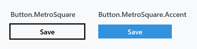
MahApps.Styles.Button.MetroSquare is a third square variant, and it leaves the casing alone:
| Style | |
|---|---|
MahApps.Styles.Button.MetroSquare |
transparent with a 2 pixel border and wider padding |
MahApps.Styles.Button.MetroSquare.Accent |
the same filled with the accent colour |
Both of those keys are on their way out. They were dropped from the library in July 2022 as unused, and no release carries that removal yet, so 2.4.11 still has them and the next version will not. The nearest thing left afterwards is MahApps.Styles.Button.Square with ControlsHelper.ContentCharacterCasing back at Normal.
Circle, flat and chromeless
| Style | |
|---|---|
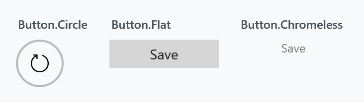
MahApps.Styles.Button.Circle |
a round, transparent button with a 2 pixel border, meant for an icon rather than text |
MahApps.Styles.Button.Flat |
a filled button with no border at all |
MahApps.Styles.Button.Chromeless |
no border, no background — the content and nothing else |
The circle button has no content of its own, so give it one:
<Button Width="48" Height="48" Style="{StaticResource MahApps.Styles.Button.Circle}">
<TextBlock FontFamily="Segoe MDL2 Assets" FontSize="18" Text="" />
</Button>
Chromeless is what the library uses for the small buttons inside a text box or a picker, and it is the one to reach for when a button should read as part of another control rather than as a button.
The flat button needs no extra import. Older documentation says to merge Styles/Controls.FlatButton.xaml — that dictionary still exists, but all it does is make the flat style implicit for every Button in scope. MahApps.Styles.Button.Flat itself lives in Controls.Buttons.xaml, which Controls.xaml already merges, so referencing it by key works out of the box.
The Windows 10 set
Three more keys are on develop and in no release yet. Not one of them is in 2.4.11:
| Style | |
|---|---|
MahApps.Styles.Button.Win10 |
the flat button with a two pixel border and the content font at its normal weight, in place of the bold, upper-cased button font |
MahApps.Styles.Button.Accent.Win10 |
the same one filled with the accent colour |
MahApps.Styles.Button.Flat.Accent |
built on the accented one, with the ordinary button colours painted back over it |
The last name promises more accent than it shows. Flat.Accent is the plain button at rest with a one pixel border, hovering moves that border to the accent colour, and the accent fills the button only while it is really held down.
The WinUI set
Two more keys, also on develop and in no release yet:
| Style | |
|---|---|
MahApps.Styles.Button.WinUI |
the Windows 10 button in the colours Windows 11 gives it |
MahApps.Styles.Button.Accent.WinUI |
the same one filled with the accent colour |
It is the Windows 10 button with rounded corners, one pixel of border instead of two and the padding WinUI leaves around a word. What is new is the line along the bottom, drawn a shade stronger than the rest of the border, which is what makes the button look as if it stood a little above the page. Press it and that line goes, so a button that is down reads as lying flat. The accented one is framed by a thin white above and a black below rather than by the grey of the quiet one.
Both round themselves by MahApps.CornerRadius.WinUI.Control rather than by a number of their own, and both carry a minimum height of 32, the one every other control of that set has, so a button holding nothing but an icon is still as tall as the box beside it. The line along the bottom is a border of its own in the template reading ControlsHelper.BottomBorderBrush, which is why the Windows 10 button, leaving that brush unset, draws nothing there. The frame itself stops short of the bottom, since two translucent lines lying on top of each other come out brighter than either of them.
Dialog buttons
The three styles the built-in dialogs use are public, which is what makes a custom dialog look like the built-in ones:

| Style | |
|---|---|
MahApps.Styles.Button.Dialogs |
the plain one |
MahApps.Styles.Button.Dialogs.Accent |
for the affirmative action |
MahApps.Styles.Button.Dialogs.AccentHighlight |
the highlight variant |
They are MahApps.Styles.Button.Square and its variants with a minimum size and ContentCharacterCasing back at Normal — which is why a dialog button says Cancel rather than cancel.
Toggle buttons
MahApps.Styles.ToggleButton is the implicit style for ToggleButton, and MahApps.Styles.ToggleButton.Circle and .Flat are the counterparts of Button.Circle and Button.Flat. They have a page of their own: ToggleButton.
The rest
Most of the button styles in the library belong to one control and are not meant to be applied by hand. They are listed here so a name in the resource dictionary is recognisable rather than mysterious:
| Prefix | Belongs to |
|---|---|
Button.MetroWindow.*, Button.WindowCommands, ToggleButton.WindowCommands |
the window chrome and its command buttons |
Button.DropDown, Button.Split, Button.Split.Arrow |
DropDownButton and SplitButton |
Button.Calendar.* |
the calendar header and its arrows |
Button.Hamburger |
the HamburgerMenu toggle |
Button.Reveal |
the reveal button of a PasswordBox |
Button.ToolBar, ToggleButton.ToolBar, ToggleButton.ToolBarOverflow |
ToolBar |
Button.FlipView.Navigation |
the FlipView arrows |
ToggleButton.ExpanderHeader.* |
the Expander header, one per direction |
ToggleButton.ComboBoxDropDown, ToggleButton.ColorPickerDropDown |
the arrow of a ComboBox or ColorPicker |
ToggleButton.TreeViewItem.ExpandCollapse |
the expander of a TreeViewItem |
*.VisualStudio |
the Visual Studio look, in Styles/VS/, which Controls.xaml does not merge |
Button.FocusVisualStyle.* |
focus adorners used by the styles above |
Basing your own style on one of these is fine — that is how the Expander and TreeViewItem helpers expect you to customise them. Applying one to an ordinary button generally is not, since most assume the template around them.