One style, applied implicitly, that turns WPF's tooltip into a flat bordered card in the theme colours and fades it in and out.
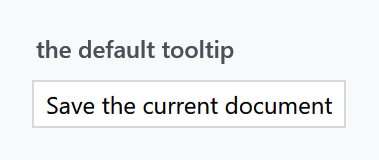
<Button Content="Save" ToolTip="Save the current document" />
Styles/Controls.xaml applies MahApps.Styles.ToolTip to every ToolTip, so the quick start is all the setup there is. In 2.4.11 there is no second style. On develop the two Windows sets bring one each, see The Windows looks.
What the style sets
| Property | Set to |
|---|---|
Background |
MahApps.Brushes.Control.Background |
BorderBrush |
MahApps.Brushes.Gray7 |
BorderThickness |
1 |
Foreground |
MahApps.Brushes.ThemeForeground |
FontSize |
MahApps.Font.Size.Tooltip, which is 12 |
Padding |
6 3 |
SnapsToDevicePixels |
True |
ToolTipHelper.CloseOnScroll |
True (on develop), so the tip closes when the page under it scrolls; see ToolTipHelper |
The first seven are ordinary properties on a border the template draws, so all of them can be changed on the control:

<Button Content="Save">
    <Button.ToolTip>
        <ToolTip Content="Save the document"
                 Background="{DynamicResource MahApps.Brushes.Accent}"
                 BorderBrush="{DynamicResource MahApps.Brushes.AccentBase}"
                 Foreground="{DynamicResource MahApps.Brushes.IdealForeground}" />
    </Button.ToolTip>
</Button>
Note what is missing: the template's border has no CornerRadius binding, so a tooltip is always square-cornered — ControlsHelper.CornerRadius does nothing here, unlike on a Label or a Button. There is no drop shadow either.
Both are already fixed in develop and will arrive with the next release: the border gets CornerRadius="{TemplateBinding mah:ControlsHelper.CornerRadius}", and a HasDropShadow setter — True by default — applies a new MahApps.DropShadowEffect.ToolTip. Until then, rounding a tooltip means replacing the template, and if you do, mind the visual states below.
The fade
The template's root border is written as Opacity="0", and an OpenStates visual state group fades it to 1 over 0.3 seconds when the tooltip opens, then back to 0 over 0.4 on close.
That means a replacement template must keep those visual states. Drop them and you get a tooltip that is measured, positioned and completely invisible — with no error to tell you why. If you write your own, copy the VisualStateManager.VisualStateGroups block across with it, or start the root at Opacity="1" and give up the fade.
Content
The template's presenter is a mah:ContentControlEx, which is what makes ControlsHelper.ContentCharacterCasing work on a tooltip:

<ToolTip Content="Save the document" mah:ControlsHelper.ContentCharacterCasing="Upper" />
Being a ContentControl, a tooltip is not limited to a string. ContentTemplate and ContentStringFormat are template-bound, and anything you put in the content is laid out normally:
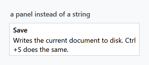
<Button Content="Save">
    <Button.ToolTip>
        <ToolTip>
            <StackPanel MaxWidth="220">
                <TextBlock FontWeight="SemiBold" Text="Save" />
                <TextBlock Margin="0 2 0 0"
                           TextWrapping="Wrap"
                           Text="Writes the current document to disk. Ctrl+S does the same." />
            </StackPanel>
        </ToolTip>
    </Button.ToolTip>
</Button>
A tooltip does not size itself, so give a wrapping block a MaxWidth or a long sentence turns into one very long line.
The Windows looks
Both styles are on develop and ship with the next release.
MahApps.Styles.ToolTip.Win10 and MahApps.Styles.ToolTip.WinUI are the tool tips Windows draws, read off the ToolTip style of the UWP generic.xaml and off ToolTip_themeresources.xaml of WinUI 3. The Win10 and the WinUI set apply them by type, so merging a set is all it takes.
| Win10 | WinUI | |
|---|---|---|
Background |
MahApps.Brushes.ToolTip.Win10.Background, the chrome of a flyout |
MahApps.Brushes.ToolTip.WinUI.Background, see below |
BorderBrush |
MahApps.Brushes.ToolTip.Win10.BorderBrush |
MahApps.Brushes.ToolTip.WinUI.BorderBrush |
Foreground |
MahApps.Brushes.ToolTip.Win10.Foreground |
MahApps.Brushes.ToolTip.WinUI.Foreground |
FontFamily |
MahApps.Fonts.Family.Control.Win10 |
MahApps.Fonts.Family.Caption.WinUI, the Small cut |
FontSize |
MahApps.Font.Size.Caption.Win10, 12 |
MahApps.Font.Size.Caption.WinUI, 12 |
Padding |
8 5 8 7 |
9 6 9 8 |
ControlsHelper.CornerRadius |
none | MahApps.CornerRadius.WinUI.Control, 4 |
HasDropShadow |
False |
True, the shadow of a WinUI flyout |
Both write at the Caption step of the type ramp, so making that step larger makes the tool tips larger too. Neither fades in or out: Windows shows its tool tip at once, so these two templates have no OpenStates group, and the warning about the fade below is about the Metro template only.
A plain string breaks into lines at 320, the width Microsoft gives its tool tip, so a long sentence needs no MaxWidth of its own in these two looks. Anything else in the content is laid out as before. A number with a ContentStringFormat is formatted and stays on one line.
Windows lays acrylic under the WinUI tool tip. WPF cannot draw that, so the style takes the colour the acrylic falls back to, #F9F9F9 in the light theme and #2C2C2C in the dark one. That colour is MahApps.Colors.WinUI.AcrylicInAppFillDefault in the theme.
The shadow needs room around the tip, so while there is one the WinUI template raises the MaxWidth to 336, which is 320 for the tip and 8 either side for the shadow. Where Windows draws no shadows it stays at 320.
Both looks put the tip where Windows puts it: above the pointer and centred on it, and below where there is no room above. That is ToolTipHelper.PlaceLikeWindows, which the two styles turn on. What is in the tip is clipped to the rounded corners, as everywhere else in the library.
Timing and placement
None of this is MahApps — the style changes how a tooltip looks, not when it appears. That stays with WPF's ToolTipService, and the library sets no defaults for it:
| Attached property | WPF default | |
|---|---|---|
InitialShowDelay |
1000 ms | how long the pointer has to rest first |
ShowDuration |
Int32.MaxValue |
how long it stays, which is until the pointer leaves |
BetweenShowDelay |
100 ms | grace period in which the next tooltip appears at once |
ShowOnDisabled |
False |
set it to show why a control is disabled |
Placement, PlacementTarget |
Mouse |
<Button Content="Save"
        IsEnabled="False"
        ToolTip="Nothing to save yet"
        ToolTipService.ShowOnDisabled="True" />
ShowOnDisabled is the one worth remembering: a disabled control with an unexplained reason is exactly where a tooltip earns its keep, and by default it will not show one.
The five seconds quoted for ShowDuration in most places is not what WPF registers. The default is Int32.MaxValue, on .NET Framework and on modern .NET alike, so a tooltip stays for as long as the pointer rests on the control. Setting the property shortens it rather than lengthening it.
Related
Slider and RangeSlider have their own value tooltip through AutoToolTipPlacement, which is a separate mechanism and does not use this style. Validation errors are drawn by CustomValidationPopup rather than by a tooltip — see Validation.