A ToggleButton is a button that stays pressed. MahApps styles it to match the ordinary buttons and adds a circular and a flat variant.
The implicit style
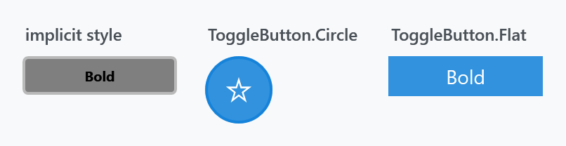
Styles/Controls.xaml applies MahApps.Styles.ToggleButton to every ToggleButton, so a plain one already looks like the figure:
<ToggleButton Content="Bold" />
Because CheckBox and RadioButton derive from ToggleButton, this style is not what they use — each has its own, and their look is controlled through CheckBoxHelper and RadioButtonHelper.
The styles
| Style | |
|---|---|
MahApps.Styles.ToggleButton |
the implicit one; filled while checked |
MahApps.Styles.ToggleButton.Circle |
round and transparent, filled with the accent colour while checked |
MahApps.Styles.ToggleButton.Flat |
no border, filled while checked |
<ToggleButton Width="48" Height="48"
              Style="{StaticResource MahApps.Styles.ToggleButton.Circle}" />
These are the general-purpose ones. The library has a dozen more ToggleButton styles that belong to particular controls — the Expander header, the ComboBox arrow, the TreeViewItem expander — which the buttons page lists.
The states

Note the third one. IsThreeState="True" makes the value cycle through null, and that works — but the style draws the indeterminate state exactly like unchecked, so the user has no way to tell the two apart. Where a third state has to be visible, use a CheckBox: its style has a distinct dash glyph for it.
Icons
The circle style has no content of its own and is meant to carry an icon. Anything that renders works — a glyph from an icon font is the least trouble:
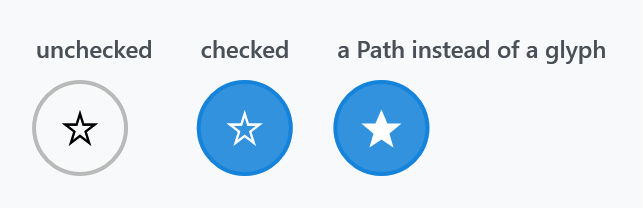
<ToggleButton Width="48" Height="48" Style="{StaticResource MahApps.Styles.ToggleButton.Circle}">
<TextBlock FontFamily="Segoe MDL2 Assets" FontSize="18" Text="" />
</ToggleButton>
The icon takes the button's Foreground, and the template switches that to MahApps.Brushes.IdealForeground while the button is checked — so a glyph you draw in the accent colour disappears against the checked fill. Leave the Foreground alone unless you also handle the checked state.
For a Path rather than a glyph, PathIcon keeps it scaled and coloured correctly:
<ToggleButton Width="48" Height="48" Style="{StaticResource MahApps.Styles.ToggleButton.Circle}">
    <mah:PathIcon Width="20" Height="20"
                  Data="M12,2L15,9L22,9L16,14L18,21L12,17L6,21L8,14L2,9L9,9Z" />
</ToggleButton>
ToggleButtonHelper does not apply here
ToggleButtonHelper is named after this control, but its one property — ContentDirection, which puts the box on the other side of the label — is read only by the CheckBox and RadioButton templates. A plain ToggleButton has no separate box and label to swap, and none of the three styles above look at the property. See CheckBoxHelper and RadioButtonHelper for the controls where it does something.
Related
For a switch rather than a button that stays pressed, use the ToggleSwitch control — it has an on/off track and its own header, and reads as a setting rather than as an action.