ThemeManager is the class behind everything a theme does after startup: switching, detecting, following the Windows setting, and building themes that are not in the box. It lives in ControlzEx, not in MahApps.Metro, so every snippet here starts with
using ControlzEx.Theming;
and works through the singleton ThemeManager.Current. For the forty-six themes that ship with the library and how to pick one in App.xaml, see Usage.
Changing the theme
ThemeManager.Current.ChangeTheme(Application.Current, "Dark.Green");
That swaps the theme for the whole application, and every control follows immediately — the styles reach their colours through DynamicResource, so nothing needs recreating.
The same call takes a FrameworkElement instead, which is how one window, or one panel, gets a theme of its own while the rest of the application keeps the application theme:
public partial class MainWindow : MetroWindow
{
    public MainWindow()
    {
        this.InitializeComponent();

        ThemeManager.Current.ChangeTheme(this, "Dark.Red");
    }
}
In XAML the equivalent is merging the theme dictionary into the window's own resources:
<mah:MetroWindow.Resources>
    <ResourceDictionary>
        <ResourceDictionary.MergedDictionaries>
            <ResourceDictionary Source="pack://application:,,,/MahApps.Metro;component/Styles/Themes/Dark.Red.xaml" />
        </ResourceDictionary.MergedDictionaries>
    </ResourceDictionary>
</mah:MetroWindow.Resources>
One axis at a time
Two shortcuts change the base theme or the colour scheme and leave the other alone, which is what a light/dark toggle wants:
ThemeManager.Current.ChangeThemeBaseColor(Application.Current, "Dark");
ThemeManager.Current.ChangeThemeColorScheme(Application.Current, "Emerald");
Finding out what is applied
| Member | |
|---|---|
DetectTheme() |
the theme currently applied to the application, or null |
DetectTheme(element) |
the same for one element |
GetTheme("Dark.Red") |
look a theme up by name without applying it |
GetInverseTheme(theme) |
the same colour scheme on the other base — the light/dark toggle in one call |
Themes |
every theme known to the manager, the built-in ones and any you added |
ThemeChanged |
raised after a change, with the old and new theme |
var current = ThemeManager.Current.DetectTheme(Application.Current);

if (current is not null)
{
    ThemeManager.Current.ChangeTheme(Application.Current, ThemeManager.Current.GetInverseTheme(current));
}
Themes is what to bind a theme picker to; each Theme carries a DisplayName, a BaseColorScheme, a ColorScheme and a ShowcaseBrush for the swatch.
Following Windows
ThemeSyncMode decides how much of the Windows personalisation setting the application adopts. It is a flags enum:
| Value | |
|---|---|
DoNotSync |
ignore Windows entirely |
SyncWithAppMode |
follow the light/dark app mode |
SyncWithAccent |
follow the Windows accent colour |
SyncWithHighContrast |
follow the high-contrast setting |
SyncAll |
all three |
Set the mode, then sync once; after that the manager keeps up with changes on its own:
protected override void OnStartup(StartupEventArgs e)
{
    base.OnStartup(e);

    ThemeManager.Current.ThemeSyncMode = ThemeSyncMode.SyncAll;
    ThemeManager.Current.SyncTheme();
}
SyncWithAccent generates a theme from whatever colour the user picked, which is the mechanism the next section uses directly. On develop such a theme also takes the shades of the accent from Windows itself, so the WinUI controls come out in the colours a Windows 11 app has.
A theme from any colour
RuntimeThemeGenerator builds a complete theme — every brush, both the accent ramp and the greys — from a base theme and one colour. No dictionary to write:
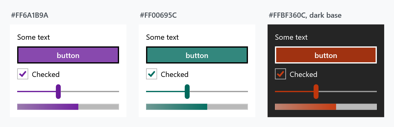
var theme = RuntimeThemeGenerator.Current.GenerateRuntimeTheme("Light", Color.FromRgb(0x6A, 0x1B, 0x9A));

ThemeManager.Current.AddTheme(theme);
ThemeManager.Current.ChangeTheme(Application.Current, theme);
Each panel in the figure is that call with a different colour, applied to the panel rather than to the application — ChangeTheme takes an element, so a theme can be scoped to as little as one Border.
Generate both bases if the application has a light/dark toggle, so GetInverseTheme has somewhere to go:
foreach (var baseTheme in new[] { "Light", "Dark" })
{
    ThemeManager.Current.AddTheme(RuntimeThemeGenerator.Current.GenerateRuntimeTheme(baseTheme, brandColour));
}
AddTheme also takes a hand-built Theme, if you want to control the name and the showcase brush:
ThemeManager.Current.AddTheme(new Theme("CustomDarkRed", "CustomDarkRed", "Dark", "Red", Colors.DarkRed, Brushes.DarkRed, true, false));
A theme written by hand
When the generated ramp is not what you want — a brand palette with its own greys, say — write the dictionary yourself and register it as a library theme:
var theme = ThemeManager.Current.AddLibraryTheme(
    new LibraryTheme(
        new Uri("pack://application:,,,/SampleApp;component/CustomAccents/Light.Accent1.xaml"),
        MahAppsLibraryThemeProvider.DefaultInstance));

ThemeManager.Current.ChangeTheme(this, theme);
The dictionary needs seven metadata keys at the top, and the manager reads them to place the theme:
<system:String x:Key="Theme.Name">Light.Accent1</system:String>
<system:String x:Key="Theme.Origin">MahAppsMetroThemesSample</system:String>
<system:String x:Key="Theme.DisplayName">Accent1 (Light)</system:String>
<system:String x:Key="Theme.BaseColorScheme">Light</system:String>
<system:String x:Key="Theme.ColorScheme">Accent1</system:String>
<Color x:Key="Theme.PrimaryAccentColor">#FFD80073</Color>
<SolidColorBrush x:Key="Theme.ShowcaseBrush" Color="#FFD80073" options:Freeze="True" />
Everything after that is colours and brushes. A complete worked example is available as a file — five hundred lines, which is why it is not printed here.
Three things to plan for.
Write the dark counterpart as well, Dark.Accent1.xaml with Theme.BaseColorScheme set to Dark. A theme that exists in only one base leaves GetInverseTheme and SyncWithAppMode with nowhere to go.
Give the theme a name of its own, Accent1 rather than Blue. A name one of the shipped themes already carries makes AddTheme hand back that theme and drop yours without a word, and AddLibraryTheme merge into it. With ThemeSyncMode on, the next settings change from Windows then looks the theme up by base colour and accent, finds the shipped one and takes your dictionary out by name, which takes every key in it along.
The authoritative list of what a theme can define is Theme.Template.xaml in the library — 422 keys, of which 79 vary between themes. A dictionary that omits one falls back to whatever was there before, which is rarely what you meant. See Usage for how the shipped themes are generated from that template.
On develop the keys that do not change with the accent live in Theme.Base.Template.xaml instead, and every shipped theme merges pack://application:,,,/MahApps.Metro;component/Styles/ThemeBase/Light.xaml or Dark.xaml. A theme of your own can merge the same base and define only the keys of Theme.Template.xaml. A theme made by RuntimeThemeGenerator does that by itself. Those keys now include the six shades of the accent, MahApps.Colors.SystemAccentLight1 to SystemAccentDark3, and the foreground that reads on two of them, MahApps.Colors.IdealForeground.SystemAccentDark1 and .SystemAccentLight2. AccentPalette.Create gives you the shades for your colour.
A complete sample project is on GitHub.
Related
Usage for the themes that ship with the library and the naming, and the quick start for putting the first one in place.