The Win10 styles draw a control the way UWP drew it on Windows 10: a filled accent square for a check box rather than an outline with a tick, a ring with a solid centre for a radio button, a rounded pill for the slider thumb, and a frame two pixels thick around a text box that turns accent-coloured once the caret is in it.
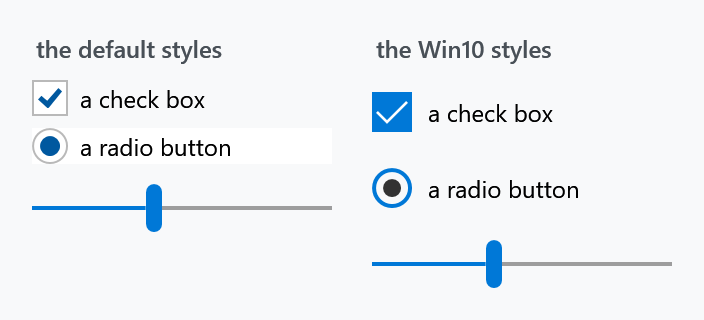
Three of them are already what a control wears with nothing merged on your side: the Slider, the RangeSlider and the WindowButtonCommands.
The set
Styles/Win10/Controls.xaml is on develop and ships with the next release. It is not in 2.4.11, where the styles below are individual keys you apply one control at a time.
The set goes in place of Styles/Controls.xaml rather than next to it, because it merges that dictionary itself and puts its own styles in front of it:
<ResourceDictionary.MergedDictionaries>
    <ResourceDictionary Source="pack://application:,,,/MahApps.Metro;component/Styles/Win10/Controls.xaml" />
    <ResourceDictionary Source="pack://application:,,,/MahApps.Metro;component/Styles/Fonts.xaml" />
    <ResourceDictionary Source="pack://application:,,,/MahApps.Metro;component/Styles/Themes/Light.Blue.xaml" />
</ResourceDictionary.MergedDictionaries>
Everything the library has is still there. What comes out in the Windows 10 look is the Button, the RepeatButton, the CheckBox, the RadioButton, the TextBox, the PasswordBox, the RichTextBox, the ComboBox, the box that holds several picks, the suggestion box, the shortcut box, the colour picker, the ScrollBar, the four up-downs, the Calendar, the DatePicker, the AnalogClock, the two pickers, the link and the HyperlinkButton; every other control keeps the default look, because the set has nothing of its own for it. UWP drew no tab strip, so the tab styles of this set carry the keys and the look of the default one, which is what the WinUI set stands on where it has nothing of its own.
Merge it into a window or a panel rather than into App.xaml and it reaches that part of the tree alone. The demo does exactly that, to stand the three sets next to each other.
The controls of the set write in Segoe UI at 14, and the set brings a window style that does the same for plain text. A window derived from MetroWindow has to name that style itself; Typography has the keys, the type ramp of the look and the window. The demo does exactly that, to stand the three sets next to each other.
The pickers of the set carry two habits its text box already had: the clear button is there only while the caret is in the field and something is written in it, and a picker that is switched off says so with the disabled colours rather than with a veil over it. DatePicker has the detail. The combo box of the set takes the second of the two.
One thing about the set changes layout rather than looks. Its scrollbar is the two-state one a UWP window draws, a two-unit line until the pointer arrives, so the set also applies a scroll viewer that lays the bars over the content instead of beside it. Leave sixteen units of padding at the edge of anything interactive, or an expanded bar will cover it. ScrollBars has the whole story.
The individual styles
Nothing forces the whole set on you. Every style in it has a key, and always has had one:
| Style | Covered on |
|---|---|
MahApps.Styles.Button.Win10, …Button.Accent.Win10 |
Buttons |
MahApps.Styles.CheckBox.Win10 |
CheckBox |
MahApps.Styles.CheckBox.DataGrid.Win10 |
DataGrid columns |
MahApps.Styles.RadioButton.Win10 |
RadioButton |
MahApps.Styles.TextBox.Win10 (on develop) |
TextBox |
MahApps.Styles.PasswordBox.Win10 (on develop) |
PasswordBox |
MahApps.Styles.RichTextBox.Win10 (on develop) |
TextBox |
MahApps.Styles.ComboBox.Win10, …ComboBoxItem.Win10 (on develop) |
ComboBox |
MahApps.Styles.AutoSuggestBox.Win10 (on develop) |
AutoSuggestBox |
MahApps.Styles.MultiSelectionComboBox.Win10 (on develop) |
MultiSelectionComboBox |
MahApps.Styles.HotKeyBox.Win10 (on develop) |
HotKeyBox |
MahApps.Styles.ColorPicker.Win10, …ColorCanvas.Win10, …ColorPalette.Win10, …ColorEyeDropper.Win10 (on develop) |
ColorPicker |
MahApps.Styles.DatePicker.Win10 (on develop) |
DatePicker |
MahApps.Styles.ScrollBar.Win10, …ScrollViewer.Win10 (on develop) |
ScrollBars |
MahApps.Styles.NumericUpDown.Win10 (on develop) |
NumericUpDown |
MahApps.Styles.TabControl.Win10, …TabItem.Win10 (on develop) |
TabControl |
MahApps.Styles.ToolTip.Win10 (on develop) |
ToolTip |
MahApps.Styles.Hyperlink.Win10 (on develop) |
Hyperlink |
MahApps.Styles.HyperlinkButton.Win10 (on develop) |
HyperlinkButton |
MahApps.Styles.Slider.Win10 |
Slider |
MahApps.Styles.RangeSlider.Win10 |
RangeSlider |
MahApps.Styles.WindowButtonCommands.Win10 |
WindowButtonCommands |
Each brings its own supporting pieces — MahApps.Templates.Slider.Horizontal.Win10 and .Vertical.Win10, MahApps.Styles.Thumb.Slider.Win10, the two RepeatButton.Slider.*Track.Win10 styles, the range slider's thumb and templates, and light and dark close-button styles for the window buttons.
To apply one everywhere without taking the set, declare an implicit style based on it:
<Style BasedOn="{StaticResource MahApps.Styles.CheckBox.Win10}" TargetType="{x:Type CheckBox}" />
MahApps.Styles.CheckBox.DataGrid.Win10 is the one style the set leaves out, because a DataGrid column takes its style through ElementStyle and EditingElementStyle rather than by type.
MahApps.Styles.NumericUpDown.Win10 was called MahApps.Styles.NumericUpDown.Fluent up to and including 2.4.11. What it draws — a border that thickens when the control takes the caret, chevrons on the spin buttons, the text against the left edge — is this look and not the WinUI one, so it is named for what it is. On develop it is the text box of this set with those two buttons standing in it, which is where its fill, its frame, its padding and its delete button come from, so an up-down and a text box next to each other in a form are the same height and the same colour.
The Clean variant uses MahApps.Styles.WindowButtonCommands.Clean.Win10 for its title-bar buttons, so if you are already on Clean you have the Win10 window buttons.
Additions from this site
The library stops at the controls above. For several others this documentation ships drop-in dictionaries in the same look, written for these pages and not part of the package:
Controls.Calendar.Win10.xaml |
a square calendar — see Calendar |
Controls.DateTimePicker.Win10.xaml |
DateTimePicker and TimePicker |
Controls.ScrollBar.Win10.xaml |
ScrollBars |
On develop none of the three is needed any more: the calendar, the two pickers and the scroll bar all moved into the set itself, under the same keys, and the set applies them without anything being merged. In a released version all three are files.
Download them, merge them after the set, and read the page each one belongs to — several note what the built-in templates do and do not let a style reach.
Related
WinUI is the newer of the two looks, and its set stands on this one. Clean and Visual Studio are variants of a different kind: Clean restyles the window chrome, Visual Studio turns the whole application into a tool window.