A DataGrid column shows one control when the cell is at rest and a different one while it is being edited, and each needs a style. MahApps supplies both for every built-in column type — and, more usefully, applies them without being asked.
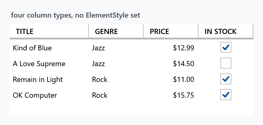
That grid declares four columns and sets no ElementStyle or EditingElementStyle anywhere:
<DataGrid ItemsSource="{Binding Albums}" AutoGenerateColumns="False">
    <DataGrid.Columns>
        <DataGridTextColumn Header="Title" Binding="{Binding Title}" />
        <DataGridComboBoxColumn Header="Genre" SelectedValueBinding="{Binding Genre}"
                                ItemsSource="{Binding Genres}" />
        <mah:DataGridNumericUpDownColumn Header="Price" Binding="{Binding Price}"
                                         StringFormat="C" Minimum="0" />
        <DataGridCheckBoxColumn Header="In stock" Binding="{Binding InStock}" />
    </DataGrid.Columns>
</DataGrid>
Why the styles arrive on their own
The MahApps DataGrid style sets a DataGridHelper.AutoGenerated*ColumnStyle pair for each column type — a display style and an editing style — and, on top of that, sets DataGridHelper.ColumnStylesHelper to {mah:DataGridColumnStylesHelper}.
That markup extension attaches to the grid, watches Columns for changes, and binds each column's ElementStyle and EditingElementStyle to the matching property. It does this for every column, not only the ones AutoGenerateColumns produced — which is why the columns above are styled although nothing was set on them.
Older documentation tells you to set ElementStyle="{DynamicResource MetroDataGridCheckBox}" on a DataGridCheckBoxColumn. Do not: that resource no longer exists — it was renamed MahApps.Styles.CheckBox.DataGrid in v2 — and setting anything by hand is unnecessary, because the helper above already did it. Set ElementStyle only when you want something other than the MahApps style, since a value of your own wins over the binding.
The styles per column type
| Column | At rest | While editing |
|---|---|---|
DataGridTextColumn |
MahApps.Styles.TextBlock.DataGrid |
MahApps.Styles.TextBox.DataGrid.Editing |
DataGridCheckBoxColumn |
MahApps.Styles.CheckBox.DataGrid |
MahApps.Styles.CheckBox.DataGrid |
DataGridComboBoxColumn |
MahApps.Styles.ComboBox.DataGrid |
MahApps.Styles.ComboBox.DataGrid.Editing |
DataGridHyperlinkColumn |
MahApps.Styles.Hyperlink.DataGrid |
MahApps.Styles.TextBox.DataGrid.Editing |
mah:DataGridNumericUpDownColumn |
MahApps.Styles.TextBlock.NumericUpDown.DataGrid |
MahApps.Styles.NumericUpDown.DataGrid.Editing |
mah:DataGridDecimalUpDownColumn |
the same | MahApps.Styles.DecimalUpDown.DataGrid.Editing |
mah:DataGridIntegerUpDownColumn |
the same | MahApps.Styles.IntegerUpDown.DataGrid.Editing |
mah:DataGridLongUpDownColumn |
the same | MahApps.Styles.LongUpDown.DataGrid.Editing |
The last three rows are new on develop, and the numeric one changed at rest. In 2.4.11 a numeric cell that is not being edited is a stripped-down NumericUpDown under MahApps.Styles.NumericUpDown.DataGrid; on develop it is a plain TextBlock, which is one control fewer per cell in a grid that can have a great many of them. The spin buttons were never shown at rest either way.
The check box column uses the same style in both, because a check box is already editable where it stands. There is also MahApps.Styles.CheckBox.DataGrid.Win10 if you want the square Windows 10 box in a grid.
The editing styles trim the control down so it fits inside a cell without the grid jumping — no outer border, tighter padding:

The numeric column
DataGridNumericUpDownColumn is a MahApps control, not a WPF one: a column whose editing element is a NumericUpDown, with the spin buttons and the numeric input rules that come with it.
Three more of them are new on develop, one per typed up-down: DataGridDecimalUpDownColumn, DataGridIntegerUpDownColumn and DataGridLongUpDownColumn. They take the same properties as the one below and differ only in what they parse and hand back, so a column over a decimal no longer goes through double on the way. NumericUpDown has the four controls behind them.
<mah:DataGridNumericUpDownColumn Header="Price"
                                 Binding="{Binding Price}"
                                 StringFormat="C"
                                 Minimum="0" />
StringFormat, Minimum, Maximum, Interval and the other NumericUpDown settings are properties of the column and are handed to the editor when the cell goes into edit mode.
Auto-generated columns
With AutoGenerateColumns="True" the same pairs apply, which is what they were built for — you get styled columns from a bound type without touching the generated columns:
<DataGrid ItemsSource="{Binding Albums}" AutoGenerateColumns="True" />
To style them differently, override the property for that column type rather than reaching for the generated column:
<DataGrid AutoGenerateColumns="True"
          mah:DataGridHelper.AutoGeneratedTextColumnStyle="{StaticResource RightAlignedCell}" />
All ten properties are listed on the DataGridHelper page.
Related
The grid itself, its Azure variant and the row, cell and header styles are on the DataGrid page.