A MahApps theme is two choices: a base theme, which decides whether the application is light or dark, and a colour scheme, which decides the accent. Two base themes times twenty-three schemes gives forty-six resource dictionaries, and picking one is a single line in App.xaml.
The colour schemes
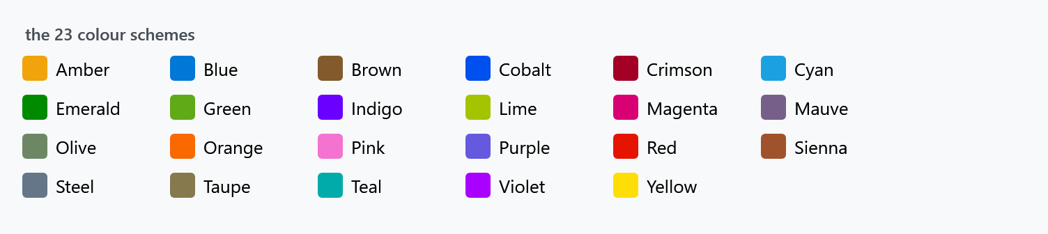
Amber, Blue, Brown, Cobalt, Crimson, Cyan, Emerald, Green, Indigo, Lime, Magenta, Mauve, Olive, Orange, Pink, Purple, Red, Sienna, Steel, Taupe, Teal, Violet, Yellow.
Each one sets six colours: MahApps.Colors.AccentBase — the swatch above — then Accent, Accent2, Accent3 and Accent4, which are the same colour at 80, 60, 40 and 20 per cent, and a darker MahApps.Colors.Highlight. Everything accent-coloured in the library comes from those six.
On develop each scheme also carries the three lighter and three darker shades Windows derives from an accent, the ones WinUI calls SystemAccentColorLight1 to Dark3: MahApps.Colors.SystemAccentLight1, Light2, Light3, SystemAccentDark1, Dark2 and Dark3, each with a brush of the same name under MahApps.Brushes. The WinUI set paints with them. MahApps.Metro.Theming.AccentPalette works them out, and you can call it yourself: AccentPalette.Create(color) gives the shades of any colour, AccentPalette.FromWindows() reads the ones Windows keeps for the accent of the user. A theme that follows the Windows accent takes those, so its shades are exactly the ones of Windows. For every other accent they are calculated the way Windows does it, which comes close but not always to the last bit.
The base themes
Light and Dark. The base theme changes the backgrounds, the greys and the text colour; it does not change the accent:
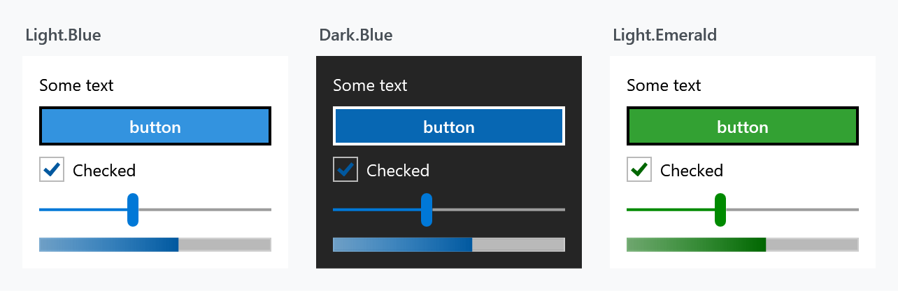
The first two panels are the same scheme on different bases — same blue, different surroundings. The third is a different scheme on the same base.
Naming
A theme is named Base.Scheme, and the dictionary is at
pack://application:,,,/MahApps.Metro;component/Styles/Themes/Light.Blue.xaml
Pack URIs are case sensitive. light.blue.xaml fails, and it fails at run time rather than at build time — the application starts and the controls come out unstyled.
Choosing one in App.xaml
The usual way. The theme dictionary goes last, after Controls.xaml and Fonts.xaml:
<Application x:Class="SampleApp"
             xmlns="http://schemas.microsoft.com/winfx/2006/xaml/presentation"
             xmlns:x="http://schemas.microsoft.com/winfx/2006/xaml"
             StartupUri="MainWindow.xaml">
  <Application.Resources>
    <ResourceDictionary>
      <ResourceDictionary.MergedDictionaries>
        <!-- MahApps.Metro resource dictionaries. Make sure that all file names are Case Sensitive! -->
        <ResourceDictionary Source="pack://application:,,,/MahApps.Metro;component/Styles/Controls.xaml" />
        <ResourceDictionary Source="pack://application:,,,/MahApps.Metro;component/Styles/Fonts.xaml" />
        <!-- Theme setting -->
        <ResourceDictionary Source="pack://application:,,,/MahApps.Metro;component/Styles/Themes/Light.Blue.xaml" />
      </ResourceDictionary.MergedDictionaries>
    </ResourceDictionary>
  </Application.Resources>
</Application>
That is enough for an application whose theme never changes. Everything beyond it — switching at run time, giving one window a theme of its own, following the Windows setting, building a scheme that is not in the list — is the ThemeManager's job, and that page covers all four.
using ControlzEx.Theming;

ThemeManager.Current.ChangeTheme(Application.Current, "Dark.Green");
Where the dictionaries come from
There is no Light.Blue.xaml in the MahApps source tree, and looking for one is a common wrong turn. The forty-six dictionaries are generated during the build by XamlColorSchemeGenerator from two files:
| File | |
|---|---|
Styles/Themes/Theme.Template.xaml |
every brush and colour a theme defines, with {{Placeholders}} for the parts that vary |
Styles/Themes/GeneratorParameters.json |
the two base themes and the twenty-three schemes, each supplying values for those placeholders |
On develop most of that has moved into a second template. Whatever does not change with the accent is the same in every theme of one base colour, and that covers most of a theme and nearly all of the Windows 10 and WinUI resources. So it is generated once per base colour, from Styles/ThemeBase/Theme.Base.Template.xaml and GeneratorParameters.Base.json, into Styles/ThemeBase/Light.xaml and Dark.xaml. Each theme merges the one of its base colour and keeps only the keys that depend on the accent. Merging Light.Blue.xaml works as before and a key is found the same way, but the theme dictionary's own Keys now hold only the accent part; walk its MergedDictionaries as well if you list them. 2.4.11 still has one self-contained file per theme.
That template is the reference for what a theme can set. It defines over four hundred keyed colours and brushes, of which seventy-nine are placeholders that vary by theme; the rest are the same everywhere. It is the file to read when you want to know which brush a control is actually using. The ThemeManager page shows how to build a theme of your own from the same template without rebuilding the library.
Related
ThemeManager for anything at run time. The quick start shows the three dictionaries in place in a new project.