Every CheckBox in a MahApps application is styled without any markup on your side. There is one alternative style with the Windows 10 look, and everything about the appearance — size, shape, glyph and the colour of each state — is reachable through attached properties.
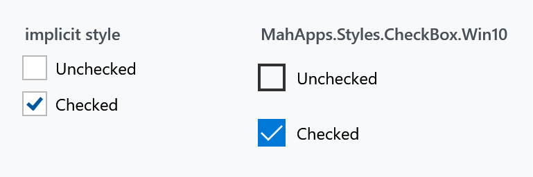
The implicit style
Styles/Controls.xaml applies MahApps.Styles.CheckBox to every CheckBox. Merging that dictionary — which the quick start does — is all it takes:
<ResourceDictionary Source="pack://application:,,,/MahApps.Metro;component/Styles/Controls.xaml" />
To extend rather than replace, base your own style on the keyed one:
<Style BasedOn="{StaticResource MahApps.Styles.CheckBox}" TargetType="{x:Type CheckBox}">
    <Setter Property="mah:CheckBoxHelper.CheckSize" Value="22" />
</Style>
The three styles
| Style | |
|---|---|
MahApps.Styles.CheckBox |
the default: an outlined box with a coloured tick inside it |
MahApps.Styles.CheckBox.Win10 |
the Windows 10 look: the box fills with the accent colour and the tick turns white |
MahApps.Styles.CheckBox.WinUI (on develop) |
the WinUI look: a rounded box a shade off the page with a hairline round it, the accent with a tick in it once it is ticked |
<CheckBox Style="{StaticResource MahApps.Styles.CheckBox.Win10}" Content="Checked" />
Both of the Windows styles differ from the default one in more than colour, which matters if you mix them in one dialog:
| default | Win10 | WinUI | |
|---|---|---|---|
CheckSize |
18 |
20 |
20 |
CheckStrokeThickness |
1 |
2 |
1 |
CheckCornerRadius |
0 |
0 |
4 |
MinHeight |
— | 32 |
32 |
MinWidth |
— | 120 |
120 |
Padding |
6 0 0 0 |
8 0 0 0 |
8 5 0 0 |
VerticalContentAlignment |
Center |
Center |
Top |
The WinUI box puts its label against the top of the row rather than in the middle of it, the way WinUI has it, so a label of several lines starts level with the box instead of being centred beside it as a block. It also stands on the default style rather than on the Windows 10 one, which is the one place the WinUI set parts company with that habit: the Windows 10 box drops the stroke of its box in the states where the fill says the state on its own, and a WinUI box keeps that stroke in every one of them.
What sits on the accent, the tick and the dot of the RadioButton, is the ideal foreground the theme works out for that accent rather than a colour of its own. WinUI writes those as black or white per theme, because its accent is a light one in the dark theme and a dark one in the light theme; the accent here is the accent of the theme and stays what it is.
MinWidth="120" is the one to watch. A Win10 check box is at least 120 pixels wide however short its label, so a row of them in a StackPanel with Orientation="Horizontal" comes out spaced far apart. Set MinWidth="0" where that is not what you want.
The states

IsThreeState="True" lets the value cycle through null, and unlike a ToggleButton the check box draws that state distinctly — a dash rather than a tick — so the user can tell the three apart.
Content on the other side
ToggleButtonHelper.ContentDirection moves the box to the right of the label. The style's own trigger switches HorizontalContentAlignment to Right and flips the padding along with it, so the label stays properly spaced:
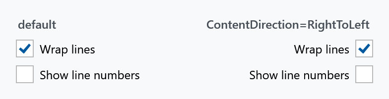
<CheckBox mah:ToggleButtonHelper.ContentDirection="RightToLeft" Content="Wrap lines" />
That is the layout for a settings list, where labels on the left with the boxes lined up on the right read better than a ragged column. This is not the control's own FlowDirection, which would mirror the text as well. See ToggleButtonHelper.
Changing the look
Everything visual comes from CheckBoxHelper, which has 81 attached properties — three for size and shape, six glyph properties, and 72 brushes following one naming scheme. The full explanation is on that page; the short version is that the box grows, rounds and recolours without touching the template:

<CheckBox mah:CheckBoxHelper.CheckSize="26"
          mah:CheckBoxHelper.CheckCornerRadius="13"
          mah:CheckBoxHelper.CheckBackgroundFillChecked="#2E7D32"
          mah:CheckBoxHelper.CheckBackgroundStrokeChecked="#2E7D32"
          mah:CheckBoxHelper.CheckGlyphForegroundChecked="White"
          Content="Checked" />
The brushes are named {Part}{CheckState}{Interaction} — so CheckBackgroundFillChecked is the inside of the box while checked, and CheckBackgroundFillCheckedMouseOver the same under the pointer. Recolouring one state changes only that state.
Both styles set all 72 brushes themselves — that is what separates them. The default points CheckBackgroundFill* at the theme background so the box stays hollow with a coloured tick; Win10 points the same twelve properties at the accent brushes so the box fills and the tick turns white. So you are always overriding a value the style already set, never filling in a blank, and a half-finished override shows up as one state looking out of place rather than as nothing happening at all.
Related
RadioButton is the same idea with a circle instead of a box; see RadioButtonHelper. For a check box that reads as a setting rather than a tick, the ToggleSwitch control has an on/off track and its own header.