GridSplitter is the bar a user drags to resize two panes of a Grid. MahApps keeps WPF's template and changes four things: the colour, both alignments, and — a behavioural one — the drag preview.
The implicit style
Styles/Controls.xaml applies MahApps.Styles.GridSplitter to every GridSplitter. Merging that dictionary — which the quick start does — is all it takes:
<ResourceDictionary Source="pack://application:,,,/MahApps.Metro;component/Styles/Controls.xaml" />
There is no second style. The whole thing is five setters:
| Property | Set to | |
|---|---|---|
Background |
MahApps.Brushes.Gray8 |
the bar itself; WPF's default is a system brush |
HorizontalAlignment |
Stretch |
|
VerticalAlignment |
Stretch |
|
ShowsPreview |
True |
drag shows a ghost bar and resizes on release |
PreviewStyle |
MahApps.Styles.GridSplitter.Preview |
what that ghost bar looks like |
Give it a Width or a Height
This is the one that catches people. GridSplitter.ResizeDirection defaults to Auto, and WPF resolves that by looking first at the alignments: a non-stretched HorizontalAlignment means it resizes columns, a non-stretched VerticalAlignment means rows. MahApps sets both to Stretch, so neither test applies and WPF falls through to comparing the rendered size — columns if it is taller than wide, rows otherwise.
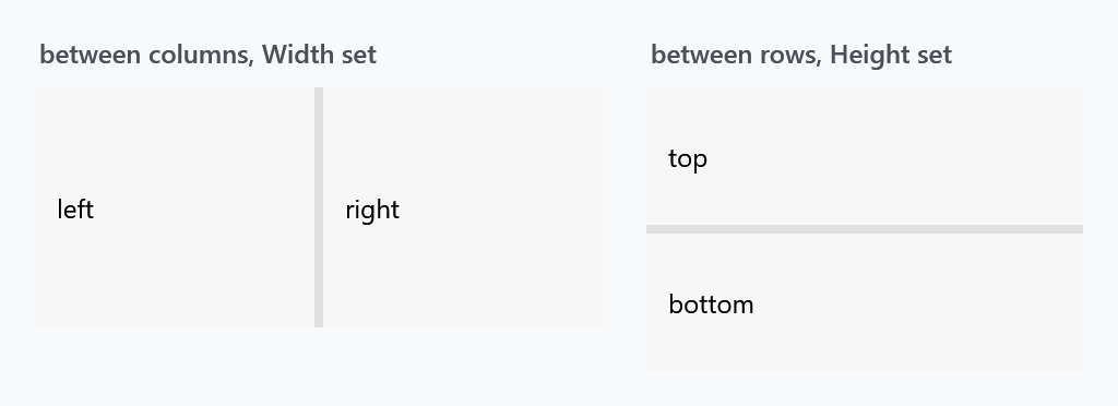
That works out only if you give the splitter a size. Set Width for a splitter between columns and Height for one between rows, as both figures here do, or set ResizeDirection explicitly.
<Grid>
    <Grid.ColumnDefinitions>
        <ColumnDefinition Width="*" />
        <ColumnDefinition Width="Auto" />
        <ColumnDefinition Width="*" />
    </Grid.ColumnDefinitions>

    <Border Grid.Column="0" />
    <GridSplitter Grid.Column="1" Width="4" />
    <Border Grid.Column="2" />
</Grid>
Note the Auto column the splitter sits in: giving the splitter its own definition rather than overlaying it on a pane keeps the two panes from resizing under it.
WPF's own default style sets HorizontalAlignment to Right, so a splitter that resized columns without a Width under the plain WPF style needs one under this style.
The drag preview
ShowsPreview is True here where WPF defaults it to False. The difference is when the panes move: with the preview on, dragging shows a translucent bar and the panes jump to the new sizes when the mouse is released; with it off, they follow the pointer live.
MahApps.Styles.GridSplitter.Preview is what that bar looks like — a rectangle in the theme foreground at half opacity. Both are ordinary properties, so either can be changed:
<GridSplitter Width="4" ShowsPreview="False" />
Changing the look
There is no template to replace: the bar is just the control's Background, and its thickness is the Width or Height you gave it.
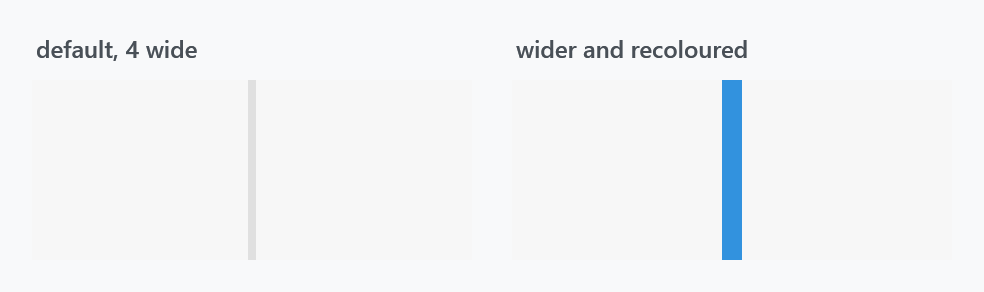
<GridSplitter Grid.Column="1"
              Width="10"
              Background="{DynamicResource MahApps.Brushes.Accent}" />
A wider bar is easier to grab. If you want a slim line that is still easy to hit, keep the Width generous and draw the line with a Border inside a template of your own rather than making the control itself thin.