A GroupBox gets an accent-filled header band and a bordered body. There are two alternative styles, and the header is reachable through attached properties rather than a template.

The implicit style
Styles/Controls.xaml applies MahApps.Styles.GroupBox to every GroupBox. Merging that dictionary — which the quick start does — is all it takes:
<ResourceDictionary Source="pack://application:,,,/MahApps.Metro;component/Styles/Controls.xaml" />
The three styles
| Style | Lives in | |
|---|---|---|
MahApps.Styles.GroupBox |
Controls.xaml |
the implicit one: accent header band, bordered body |
MahApps.Styles.GroupBox.Clean |
Styles/Clean/Controls.xaml |
no band; the header is plain text, and a hairline runs down either side of the body |
MahApps.Styles.GroupBox.VisualStudio |
Styles/VS/Controls.xaml |
the Visual Studio tool-window look |
The last two are not merged by Controls.xaml. Add the dictionary they live in before using them, or the Style reference resolves to nothing. The Visual Studio one also needs Styles/VS/Colors.xaml, and it is drawn for the dark Visual Studio theme — on a light background its header all but disappears, which is why the figure above puts it on a dark backdrop.
<GroupBox Header="Details" Style="{DynamicResource MahApps.Styles.GroupBox.Clean}">
    <GroupBox.Resources>
        <ResourceDictionary Source="pack://application:,,,/MahApps.Metro;component/Styles/Clean/Controls.xaml" />
    </GroupBox.Resources>
    <TextBlock Text="some content" />
</GroupBox>
<GroupBox Header="Details" Style="{DynamicResource MahApps.Styles.GroupBox.VisualStudio}">
    <GroupBox.Resources>
        <ResourceDictionary>
            <ResourceDictionary.MergedDictionaries>
                <ResourceDictionary Source="pack://application:,,,/MahApps.Metro;component/Styles/VS/Controls.xaml" />
                <ResourceDictionary Source="pack://application:,,,/MahApps.Metro;component/Styles/VS/Colors.xaml" />
            </ResourceDictionary.MergedDictionaries>
        </ResourceDictionary>
    </GroupBox.Resources>
    <TextBlock Text="some content" />
</GroupBox>
Merging the dictionary once in App.xaml is tidier than per control; it is shown here on the control only to keep the sample self-contained.
Header casing
The style sets ControlsHelper.ContentCharacterCasing to Upper, so a header reads as capitals whatever you typed. Set it back to have the text as written:

<GroupBox Header="Details" mah:ControlsHelper.ContentCharacterCasing="Normal" />
Restyling the header
The header's colours, font and padding come from HeaderedControlHelper, so they can be changed without replacing the template:
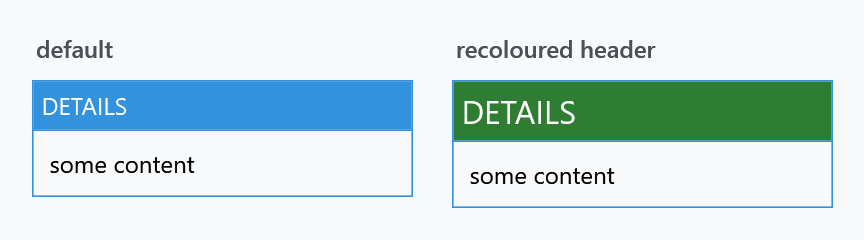
<GroupBox Header="Details"
          mah:HeaderedControlHelper.HeaderBackground="{DynamicResource MahApps.Brushes.Accent}"
          mah:HeaderedControlHelper.HeaderForeground="{DynamicResource MahApps.Brushes.IdealForeground}"
          mah:HeaderedControlHelper.HeaderFontSize="16"
          mah:HeaderedControlHelper.HeaderMargin="10 6" />
The style sets three of these itself: HeaderBackground to the accent brush, HeaderFontSize to the content size, and HeaderForeground deliberately to {x:Null} so the template can pick a foreground that reads against the band. The full list is on the HeaderedControlHelper page.
Related
Expander is the same header on a control that folds away, and uses the same helper.