Applies to HeaderedContentControl and TabControl, which covers GroupBox, Expander, Flyout, MetroHeader and the tab strip. A HeaderedContentControl gives you a Header but no way to style it — that is what this helper is for.
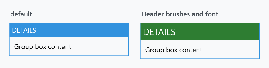
| Property | Type | Default | |
|---|---|---|---|
HeaderBackground |
Brush |
the panel default | behind the header |
HeaderForeground |
Brush |
white | the header text |
HeaderFontFamily |
FontFamily |
the system message font | |
HeaderFontSize |
double |
the system message font size | |
HeaderFontWeight |
FontWeight |
the system message font weight | |
HeaderFontStretch |
FontStretch |
Normal |
|
HeaderMargin |
Thickness |
0 |
padding around the header content |
HeaderHorizontalContentAlignment |
HorizontalAlignment |
Stretch |
|
HeaderVerticalContentAlignment |
VerticalAlignment |
Stretch |
|
HeaderBackgroundMouseOver |
Brush |
not set | behind the header while the mouse is over it |
HeaderBackgroundPressed |
Brush |
not set | behind the header while it is held down |
HeaderForegroundMouseOver |
Brush |
not set | the header text while the mouse is over it |
HeaderForegroundPressed |
Brush |
not set | the header text while it is held down |
HeaderForegroundSelected |
Brush |
not set | the header text of the tab that is showing |
<GroupBox Header="Details"
          mah:HeaderedControlHelper.HeaderBackground="{DynamicResource MahApps.Brushes.Accent}"
          mah:HeaderedControlHelper.HeaderForeground="{DynamicResource MahApps.Brushes.IdealForeground}"
          mah:HeaderedControlHelper.HeaderFontSize="16"
          mah:HeaderedControlHelper.HeaderMargin="10 6">
    <TextBlock Margin="4" Text="Group box content" />
</GroupBox>
As with the other helpers, the defaults in the table are the helper's own; a styled control shows what its style put there. The MahApps GroupBox style sets HeaderBackground to MahApps.Brushes.Accent and HeaderFontSize to the content size, and deliberately sets HeaderForeground to {x:Null} so the template picks a foreground that reads against that band. Use the theme brushes rather than fixed colours and the header keeps following the theme.
HeaderFontWeight is the one to reach for when a header should be quieter — the built-in look is deliberately loud, and dropping the weight tones a nested group box down without giving up the coloured band.
While the header is touched
The last five are on develop and ship with the next release. A released version has one background and one foreground, and a header looks the same whether somebody is on it or not.
Left unset, they hand nothing over and the header keeps the colours it has at rest, so adding them changes nothing until you fill one in. They also only reach as far as the control has a state to show:
| Control | while the mouse is over it | while it is held down |
|---|---|---|
Expander |
yes | yes, its header is a toggle button |
GroupBox |
yes | no such state |
MetroHeader |
yes | no such state |
Flyout |
yes, on the header | no such state |
TabItem |
yes | no such state |
<Expander Header="Details"
          mah:HeaderedControlHelper.HeaderBackground="{DynamicResource MahApps.Brushes.Accent}"
          mah:HeaderedControlHelper.HeaderBackgroundMouseOver="{DynamicResource MahApps.Brushes.Highlight}"
          mah:HeaderedControlHelper.HeaderBackgroundPressed="{DynamicResource MahApps.Brushes.Accent3}">
    <TextBlock Margin="8" Text="Expander content" />
</Expander>
Held down wins over the mouse being over it, because both hold while a header is pressed.
A tab item takes these off the tab control it sits in, the way it takes the rest of the header properties, so set them there and every tab follows. What answers the mouse is the strip the tab is drawn in and not the item as a whole, which counts the content below it as its own.
The tab that is showing
HeaderForegroundSelected paints the caption of the selected tab. Until it arrived the accent was written into the template, so the other header properties reached a tab only while it sat there unselected and untouched, which is #4307. Leave it unset and the accent still paints it.
<TabControl mah:HeaderedControlHelper.HeaderForeground="{DynamicResource MahApps.Brushes.Gray3}"
            mah:HeaderedControlHelper.HeaderForegroundSelected="{DynamicResource MahApps.Brushes.Accent}"
            mah:HeaderedControlHelper.HeaderForegroundMouseOver="{DynamicResource MahApps.Brushes.Highlight}" />
Set on the control it reaches every tab, and a brush on one tab beats it. The order the states beat each other is the same in both tab templates: the tab that is showing first, then the mouse, over whichever tab it is.
A header put together as an object of its own keeps the foreground of the tab, not of the header. Give a tab a StackPanel as its Header and the text in it hangs off the TabItem in the logical tree, which is where it inherits its colour from, so none of these brushes reach it. Build the same thing in a HeaderTemplate and it hangs off the header instead and follows all three.
<mah:MetroTabItem Header="Overview">
    <mah:MetroTabItem.HeaderTemplate>
        <DataTemplate>
            <StackPanel Orientation="Horizontal">
                <iconPacks:PackIconMaterial Kind="ViewDashboardOutline" />
                <TextBlock Text="{Binding}" />
            </StackPanel>
        </DataTemplate>
    </mah:MetroTabItem.HeaderTemplate>
</mah:MetroTabItem>
MetroTabItem carries the same set of brushes as the plain TabItem on develop. In a released version it reads HeaderForeground and nothing else, so a closable tab answers the mouse with a fixed grey however the rest of the strip is painted.