RangeSlider picks a range rather than a value. It has three thumbs — one at each end and one for the band between them — and derives from RangeBase, so Minimum, Maximum, SmallChange and LargeChange are the familiar ones. The range itself is LowerValue and UpperValue.

<mah:RangeSlider Width="190"
                 Minimum="0"
                 Maximum="100"
                 LowerValue="30"
                 UpperValue="70" />
Set Minimum and Maximum. Unlike the Slider styles, neither RangeSlider style sets them, so they come straight from RangeBase as 0 and 1 — a range slider without them clamps everything you give it to 1.
The two styles
| Style | |
|---|---|
MahApps.Styles.RangeSlider.Win10 |
the implicit one — a 2px track and tall rounded thumbs |
MahApps.Styles.RangeSlider |
a thicker track and small grey thumbs |
Both live in Themes/RangeSlider.xaml and the implicit one is applied through Generic.xaml, so neither needs a dictionary merged. As with the plain slider, the Win10 style additionally sets IsMoveToPointEnabled="True".
<mah:RangeSlider Style="{DynamicResource MahApps.Styles.RangeSlider}" />
MinRange and MinRangeWidth
These two sound alike and are not:
MinRange |
in value units | how close LowerValue and UpperValue may get. Default 0 |
MinRangeWidth |
in pixels | the minimum width of the middle thumb. Default 30. Obsolete and without effect on develop |
MinRangeWidth is the one that surprises people, because it is a floor on the drawn band, not on the values:

Both panels have LowerValue and UpperValue at 50. On the left, the default MinRangeWidth of 30 keeps thirty pixels of filled track between the thumbs anyway; only MinRangeWidth="0" lets them meet.
<mah:RangeSlider Minimum="0" Maximum="100"
                 LowerValue="50" UpperValue="50"
                 MinRangeWidth="0" />
It is also coerced: it can never exceed half the track length. And it is taken off the track before the values are laid out on it, so every pixel of it is a pixel both thumbs are moved away from the tick their value belongs to, and the gap grows along the track. That gap is what #4392 and #4113 are about.
Breaking change on develop: MinRangeWidth does nothing any more. It is marked obsolete, so a build that sets it still runs and warns rather than failing, but neither the values nor the drawing take any notice of it, and it will be removed. What it bought — thirty pixels of band to look at and to grab where the two values sit on the same spot — was paid for with every thumb on the control standing off its tick, and a band of thirty pixels where the range is nothing says the range is something. An empty range is drawn as nothing now, the two thumbs meet, and either of them opens the range again when it is pulled the way it can go. Drop the attribute; nothing takes its place.
On develop a thumb also hangs over the end of the track by half its width, so its middle is the point its value stands for and a click with IsMoveToPointEnabled lands on the value under the mouse.
MinRange in a released version does more than hold the values apart: it is taken off the scale the thumbs are laid out on as well, which gives the lower thumb a scale of its own that ends at Maximum minus MinRange. With MinRange="20" on a slider from 0 to 100, a lower value of 80 therefore stands at the very end of the track and the range 80 to 100 is drawn as a sliver, the same range that fills a fifth of the track at 40 to 60. On develop a range of MinRange is the same width wherever it stands.
In a released version, write MinRange after Minimum, Maximum and the two values, and after a Style that carries them. XAML sets a property as it reads it, so MinRange written first is measured against the 0 and 1 a RangeSlider starts out with, and it pins UpperValue down to fit — as a local value, which then beats everything a style has to say. A slider written this way
<mah:RangeSlider MinRange="20" Style="{StaticResource TheRange}" />
comes up at 0 to 20 rather than at the range the style asks for. Watch out for formatters: XamlStyler sorts attributes by name and puts MinRange in front of Style by itself. Fixed on develop, where MinRange coerces the values instead of assigning them, and where a later Minimum or Maximum asks all three of them again.
In a released version the XML documentation on MinRangeWidth reads "Get/sets the minimal distance between two thumbs", which describes MinRange instead, and the API reference repeats it. The comment on MinRange was rewritten on develop by #4580, and the one on MinRangeWidth now says that the property does nothing; until that ships, go by the table above.
Colours
Both styles take their brushes from SliderHelper, the same twelve as the plain slider — thumb, track and filled track, each with a hover, pressed and disabled variant. The middle thumb is painted from the TrackValue set.

<mah:RangeSlider Minimum="0" Maximum="100" LowerValue="30" UpperValue="70"
                 mah:SliderHelper.ThumbFillBrush="#FF1B5E20"
                 mah:SliderHelper.TrackValueFillBrush="#FF43A047"
                 mah:SliderHelper.TrackFillBrush="#FFC8E6C9" />
Set the Hover and Pressed variants too, or the slider goes back to the theme colour as soon as the pointer is over it.
Foreground is the tick colour here, not the track colour.
Ticks and the selection range

<mah:RangeSlider Minimum="0" Maximum="100" LowerValue="30" UpperValue="70"
                 TickFrequency="10"
                 TickPlacement="Both" />
TickFrequency, Ticks, TickPlacement and IsSnapToTickEnabled behave as they do on a Slider. IsSnapToTickEnabled makes both thumbs land on ticks.
IsSelectionRangeEnabled together with SelectionStart and SelectionEnd marks a sub-range — the grey wedges in the third panel. Those markers are drawn on the tick bars, so they are invisible unless TickPlacement is also set.
Interaction
| Property | Default | |
|---|---|---|
IsMoveToPointEnabled |
False, but True in the Win10 style |
clicking the track jumps the nearest thumb there instead of stepping |
Interval |
100 |
milliseconds between steps while the button is held, when IsMoveToPointEnabled is off |
MoveWholeRange |
False |
a click outside the range moves the whole band instead of just the near thumb |
ExtendedMode |
False |
see below |
AutoToolTipPlacement |
None |
TopLeft or BottomRight to show the value while dragging |
AutoToolTipPrecision |
0 |
decimal places in that tooltip |
On develop a thumb being dragged stops at the other value instead of pushing it along, so the value nobody is holding stays where it was put. A released version hands the drag over to the other thumb once the two meet, and carries on with that one.
On develop a click with IsSnapToTickEnabled takes the tick nearest to where it landed. A released version takes the next tick past the click in the direction of travel, so a click a hair short of a tick answers with the tick before it, a whole interval away from what was pointed at. Half way between two ticks is where the answer changes now.
Without ExtendedMode, clicking inside the range only drags the band. With it on, Ctrl + left click inside the range moves the lower thumb and Ctrl + right click moves the upper one, so both ends stay reachable without leaving the band.
The middle mouse button toggles MoveWholeRange — undocumented in the library, but it is there.
Vertical
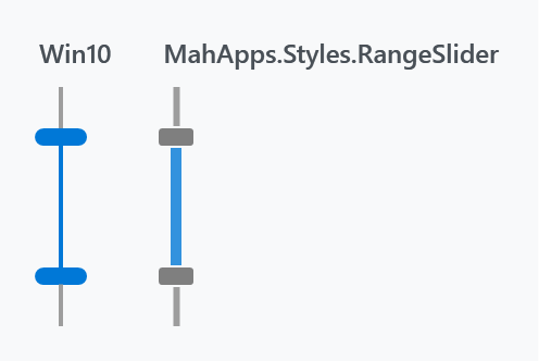
<mah:RangeSlider Height="110"
                 Orientation="Vertical"
                 Minimum="0" Maximum="100"
                 LowerValue="30" UpperValue="70" />
Each style carries a second template and swaps to it on Orientation="Vertical" through a trigger. That trigger beats a Template setter in a style derived from it — see the warning under Slider, which applies here word for word.
The drag tooltip
AutoToolTipPlacement shows the value being dragged. Three templates shape it: AutoToolTipLowerValueTemplate and AutoToolTipUpperValueTemplate for the end thumbs, and AutoToolTipRangeValuesTemplate for the middle one, whose data context is a RangeSliderAutoTooltipValues carrying both values.
<mah:RangeSlider Width="190"
                 Minimum="0" Maximum="100"
                 LowerValue="30" UpperValue="70"
                 AutoToolTipPlacement="TopLeft"
                 AutoToolTipPrecision="2">
    <mah:RangeSlider.AutoToolTipRangeValuesTemplate>
        <DataTemplate DataType="mah:RangeSliderAutoTooltipValues">
            <UniformGrid Columns="2" Rows="2">
                <TextBlock HorizontalAlignment="Right" Text="From:" />
                <TextBlock HorizontalAlignment="Right" Text="{Binding LowerValue, StringFormat='{}{0:N2}'}" />
                <TextBlock HorizontalAlignment="Right" Text="To:" />
                <TextBlock HorizontalAlignment="Right" Text="{Binding UpperValue, StringFormat='{}{0:N2}'}" />
            </UniformGrid>
        </DataTemplate>
    </mah:RangeSlider.AutoToolTipRangeValuesTemplate>
</mah:RangeSlider>
Events
LowerValueChanged and UpperValueChanged fire for the individual ends, RangeSelectionChanged for the range as a whole. Each of the three thumbs also raises its own DragStarted, DragDelta and DragCompleted — LowerThumbDragStarted, CentralThumbDragDelta, UpperThumbDragCompleted and so on — which is what to hang expensive work off, rather than recomputing on every value change while a thumb is moving.
Mouse wheel
SliderHelper applies here as well:
<mah:RangeSlider mah:SliderHelper.EnableMouseWheel="MouseHover"
                 mah:SliderHelper.ChangeValueBy="LargeChange"
                 SmallChange="1"
                 LargeChange="10" />
Keyboard
A range slider has two values, so a key has to be told which one it means: the thumb that was last touched is the one the keyboard talks to. Click a thumb, or tab onto the control, and the keys move that value.
| Left and right, up and down on an upright slider | by SmallChange |
| Page up and page down | by LargeChange |
| Home and End | to Minimum or Maximum, as far as the other value allows |
MinRange holds against the keyboard as well, and a thumb pressed against the other one stops there instead of pushing it along. A ring around the thumb says which one has the keyboard. Tabbing onto the control hands the keys to the lower thumb.
New on develop. In a released version a RangeSlider does nothing at all when a key is pressed.
Driving one from a test
A range slider holds two values, and no automation pattern holds two. What a client is handed is the control for the range and one of the outer thumbs for each end of it:
| the control | a slider, reading out both ends at once as its item status |
PART_LeftThumb |
the lower value, to read and to set |
PART_RightThumb |
the upper value, the same way |
PART_MiddleThumb |
moves the whole range, so it carries no value |
Setting one end through a client goes through the same rules as dragging it: MinRange holds, and neither end passes the other.
In a released version the control is not in the automation tree at all. Only the three thumbs of its template are, hanging off the window with nothing to say what they belong to, so a tool can drag a handle but cannot read a value or set one. New on develop, which is #4454.
Origin
The control came from the Avalon Controls Library (MS-PL) by way of this fork; the original CodePlex site is gone. It has been rewritten considerably since.