MetroDialogSettings is the one object every built-in dialog takes. It is the last argument of each Show...Async method, and it decides the button labels, the colours, the font sizes, the animations and how the dialog can be cancelled.
var settings = new MetroDialogSettings
               {
                   AffirmativeButtonText = "Delete",
                   NegativeButtonText = "Keep",
                   ColorScheme = MetroDialogColorScheme.Accented
               };

var result = await this.ShowMessageAsync("Delete the file?", "This cannot be undone.",
                                         MessageDialogStyle.AffirmativeAndNegative, settings);
Not every dialog type reads every setting — a progress dialog has no affirmative button to label. The reference below says which reads what, and each dialog page repeats the part that applies to it.
Where the settings come from
Pass null — or leave the argument off — and the dialog falls back to the window's MetroDialogOptions, which every MetroWindow creates for itself in its constructor. So the order is: the argument, then the window's options, then the defaults.
That makes MetroDialogOptions the place for defaults that should hold across a window:
<mah:MetroWindow x:Class="MyApp.MainWindow"
                 xmlns:mah="http://metro.mahapps.com/winfx/xaml/controls">

    <mah:MetroWindow.MetroDialogOptions>
        <mah:MetroDialogSettings AffirmativeButtonText="Yes"
                                 NegativeButtonText="No"
                                 ColorScheme="Accented" />
    </mah:MetroWindow.MetroDialogOptions>

</mah:MetroWindow>
or from code:
this.MetroDialogOptions.ColorScheme = MetroDialogColorScheme.Accented;
Settings are read when the dialog is created, so changing the object after a dialog is up has no effect on it.
In a released version, login dialogs do not use MetroDialogOptions. ShowLoginAsync takes a LoginDialogSettings and falls back to new LoginDialogSettings() when you pass none, so the window's defaults never reach it, while every other type does fall back to the window. That is fixed on develop by #4577, where both login entry points build their settings from MetroDialogOptions. Until it ships, hand the window's options in yourself:
await this.ShowLoginAsync("Sign in", "Message", new LoginDialogSettings(this.MetroDialogOptions));
Reference
| Setting | Type | Default | Read by |
|---|---|---|---|
AffirmativeButtonText |
string |
OK |
message, input, login (Login) |
NegativeButtonText |
string |
Cancel |
message, input, login, progress |
FirstAuxiliaryButtonText |
string |
null |
message |
SecondAuxiliaryButtonText |
string |
null |
message |
ColorScheme |
MetroDialogColorScheme |
Theme |
all |
MessageForeground |
Brush |
null |
message, input, login, progress (develop only) |
DialogTitleFontSize |
double |
26 |
all |
DialogMessageFontSize |
double |
15 |
all |
DialogButtonFontSize |
double |
the system message font size | all |
AnimateShow |
bool |
true |
all |
AnimateHide |
bool |
true |
all |
CancellationToken |
CancellationToken |
None |
all, but see below |
OwnerCanCloseWithDialog |
bool |
false |
all, but see below |
CustomResourceDictionary |
ResourceDictionary |
null |
all |
DefaultText |
string |
empty | input |
DefaultButtonFocus |
MessageDialogResult? |
nothing | message, input, login |
DialogResultOnCancel |
MessageDialogResult? |
null |
message |
MaximumBodyHeight |
double |
NaN, unlimited |
message |
The three font sizes are only applied when they are not NaN, which is what they start as — leaving one alone keeps the theme's value rather than setting it to zero.
Buttons
The one a press of return stands for
DefaultButtonFocus names the button that is marked in the accent colour, the one somebody is being nudged towards.
Left alone it holds nothing, and each dialog then marks what it has always marked: the one that says no in a message dialog, the one that carries on in an input or a login dialog. Name a button and that one is marked instead.
await this.ShowInputAsync("Delete", "Which file?",
                          new MetroDialogSettings { DefaultButtonFocus = MessageDialogResult.Negative });
The caret waits in the field of an input or a login dialog whichever button is marked, since filling that in is what somebody has come to do.
In a released version only the message dialog reads this, and the setting starts out at Negative rather than holding nothing. An input dialog marks its OK button come what may, which is #4358. Both are fixed on develop. Code that reads the setting into a plain MessageDialogResult needs a line changed there, since it is now a MessageDialogResult?; assigning to it and comparing against it are unchanged.
The four button labels cover the most a dialog can show. A message dialog uses as many as its MessageDialogStyle asks for, an input and a login dialog use the first two, and a progress dialog uses only NegativeButtonText for its cancel button.
Nothing here controls whether a button appears. That is the MessageDialogStyle argument for a message dialog, NegativeButtonVisibility in LoginDialogSettings, and the isCancelable argument of ShowProgressAsync.
Colour scheme
MetroDialogColorScheme has three values. Theme draws the dialog in the current theme's background and foreground, Inverted in the inverse theme — light-on-dark under a light theme — and Accented fills it with the accent colour.
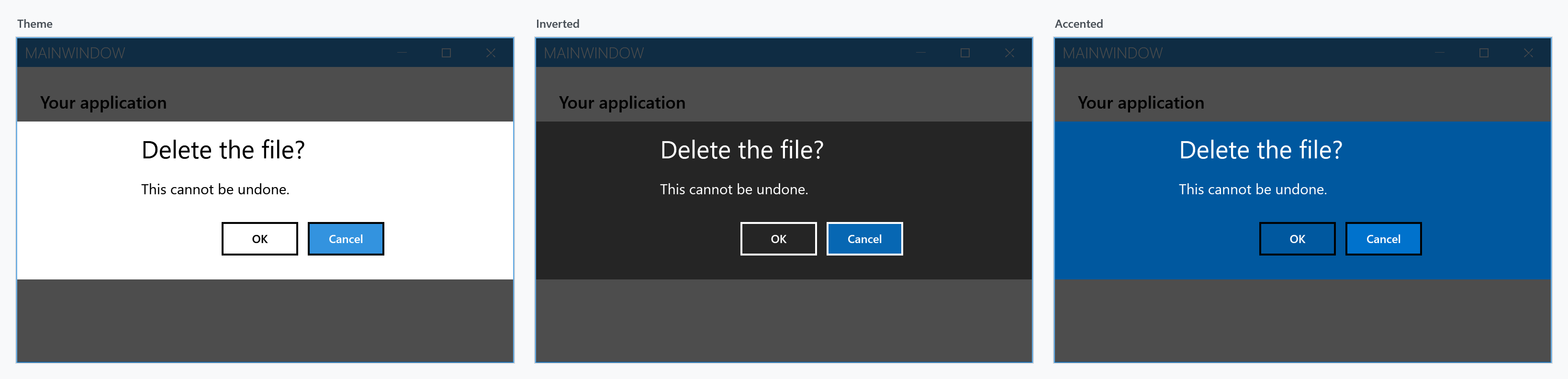
Inverted throws if the current theme has no inverse to switch to, which is the case for a custom theme that was never registered as part of a light/dark pair.
The colour of the message
MessageForeground is on develop and ships with the next release. It is not in 2.4.11.
The message and the title of a dialog both take its Foreground, so setting that colours the whole
dialog. MessageForeground colours the message alone, which is what a warning usually wants:
await this.ShowMessageAsync("Careful", "This cannot be undone.",
                            MessageDialogStyle.AffirmativeAndNegative,
                            new MetroDialogSettings { MessageForeground = Brushes.Red });
All four dialogs that show a message read it. Left unset, the message goes with the rest of the dialog, the way it always has.
Font sizes
DialogTitleFontSize, DialogMessageFontSize and DialogButtonFontSize override the theme's MahApps.Font.Size.Dialog.* resources for one dialog.
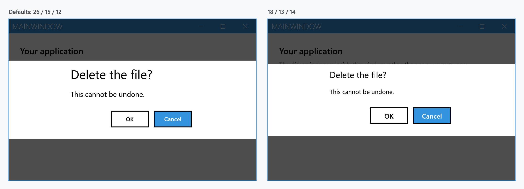
var settings = new MetroDialogSettings
               {
                   DialogTitleFontSize = 18,
                   DialogMessageFontSize = 13,
                   DialogButtonFontSize = 14
               };
To change them for every dialog in the application, override the resources instead:
<system:Double x:Key="MahApps.Font.Size.Dialog.Title">18</system:Double>
Animations
AnimateShow and AnimateHide cover both the dialog and the overlay that dims the window behind it. Turning them off makes the dialog appear and disappear in one frame, which is what you want in a test that would otherwise race the animation.
Cancellation
CancellationToken closes a message, input or login dialog from code, without the user pressing anything. The call then returns the same result it would have returned for a cancel.
A progress dialog is the exception: the token marks it cancelled and raises Canceled, but does not close it. See Progress Dialog.
Closing the window while a dialog is open
By default a MetroWindow refuses to close while one of its dialogs is up, and the close button in the title bar is greyed out. OwnerCanCloseWithDialog = true allows it.
This only takes effect when the window's ShowDialogsOverTitleBar is False. That property defaults to True, and while it is on both the closing guard and the close button ignore OwnerCanCloseWithDialog — the dialog is drawn across the title bar, so the window stays closed to the user either way.
<mah:MetroWindow ShowDialogsOverTitleBar="False">
    <mah:MetroWindow.MetroDialogOptions>
        <mah:MetroDialogSettings OwnerCanCloseWithDialog="True" />
    </mah:MetroWindow.MetroDialogOptions>
</mah:MetroWindow>
Custom resources
CustomResourceDictionary is merged into the dialog's own resources, so it can override any brush, style or template the dialog resolves dynamically — without touching the rest of the application.
var settings = new MetroDialogSettings
               {
                   CustomResourceDictionary = new ResourceDictionary
                                              {
                                                  Source = new Uri("pack://application:,,,/MyApp;component/DialogStyles.xaml")
                                              }
               };
The message dialog page shows what this looks like in practice.
The Windows 10 and the WinUI look
The two looks are new on develop. They are not in 2.4.11.
Next to the Metro band there is a look after the content dialog of Windows 10 and one after WinUI: a card in the middle of the window, with the buttons sharing one row. An application that merges Styles/Win10/Controls.xaml or Styles/WinUI/Controls.xaml gets that look for every dialog. A single call gets it by handing the matching dictionary over as its custom resources:
var settings = new MetroDialogSettings
               {
                   CustomResourceDictionary = new ResourceDictionary
                                              {
                                                  Source = new Uri("pack://application:,,,/MahApps.Metro;component/Styles/WinUI/Dialogs.xaml")
                                              }
               };

await this.ShowMessageAsync("Deep Thought", "Come back in seven and a half million years.", settings: settings);
Styles/Win10/Dialogs.xaml does the same for Windows 10. Both dictionaries hold only the styles of the dialogs and take everything they stand on from the application, so the application has to merge Styles/Controls.xaml or one of the two sets, as every MahApps application does. A few settings behave differently in these two looks:
ColorScheme.Accentedlooks likeTheme.Invertedworks as before.DialogContentWidthandDialogContentMarginbelong to the Metro band. The card is between 320 and 548 wide, like the content dialog. A dialog that needs more room, a custom dialog with a grid in it for instance, puts a larger width underMahApps.Sizes.Dialogs.Card.MaxWidthinto its own resources or into the dictionary it hands over.EnablePasswordPreviewdecides whether the password box of a login dialog shows its eye, throughPasswordBoxHelper.ShowRevealButton.- The overlay behind the dialog is still the one of the window, set through
OverlayBrushon theMetroWindow.
Login dialogs
LoginDialogSettings derives from MetroDialogSettings and adds the username, password and remember-checkbox settings. Everything on this page applies to it as well, with the fallback caveat noted above. One thing stays true either way: the constructor sets AffirmativeButtonText to Login after copying, so that label comes from the login settings and not from the window. See Login Dialog.