MetroHeader puts a header above a piece of content — usually a label above an input control. It derives from GroupBox, so Header, HeaderTemplate, HeaderTemplateSelector and HeaderStringFormat all come from HeaderedContentControl and behave as usual. What MahApps adds is the template: a plain two-row grid with no border and no chrome.
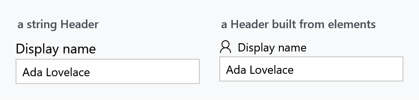
<mah:MetroHeader Header="Display name">
    <TextBox Text="{Binding DisplayName}" />
</mah:MetroHeader>
Header takes any object. Give it a string and it is rendered as text; give it elements and they are rendered as they are:
<mah:MetroHeader>
<mah:MetroHeader.Header>
<StackPanel Orientation="Horizontal">
<mah:FontIcon Margin="0 0 6 0" FontSize="13" Glyph="" />
<TextBlock VerticalAlignment="Center" Text="Display name" />
</StackPanel>
</mah:MetroHeader.Header>
<TextBox Text="{Binding DisplayName}" />
</mah:MetroHeader>
For a header bound to something that is not a string, use HeaderTemplate:
<mah:MetroHeader Header="{Binding Field}">
    <mah:MetroHeader.HeaderTemplate>
        <DataTemplate>
            <TextBlock Text="{Binding Title}" />
        </DataTemplate>
    </mah:MetroHeader.HeaderTemplate>
</mah:MetroHeader>
Content is stretched both ways, so the TextBox above fills the width without being told to.
BorderBrush and BorderThickness do nothing. The template binds neither, which is deliberate — MetroHeader is a layout wrapper, not a frame. For a bordered, titled container use a GroupBox, which is what MetroHeader derives from and what carries the MahApps group-box chrome.
Styling the header

Everything about the header is a HeaderedControlHelper attached property, read by the template through TemplateBinding:
| Property | Default |
|---|---|
HeaderBackground |
the control's own Background |
HeaderForeground |
the control's own Foreground |
HeaderFontSize |
MahApps.Font.Size.Default |
HeaderMargin |
0 0 0 2 |
HeaderFontFamily, HeaderFontWeight, HeaderFontStretch |
inherited |
HeaderHorizontalContentAlignment, HeaderVerticalContentAlignment |
<mah:MetroHeader Header="Display name"
                 mah:HeaderedControlHelper.HeaderFontWeight="Bold"
                 mah:HeaderedControlHelper.HeaderForeground="{DynamicResource MahApps.Brushes.Accent}">
    <TextBox Text="{Binding DisplayName}" />
</mah:MetroHeader>
Note the two defaults that bind back to the control: HeaderBackground follows Background and HeaderForeground follows Foreground. So setting Foreground on the MetroHeader recolours the header and not the content, which is the opposite of what you might expect — set the header property directly when you mean only the header.
The header is presented by a ContentControlEx, so ControlsHelper.ContentCharacterCasing and ControlsHelper.RecognizesAccessKey work on it too.
The layout is fixed — for now
In a released version the template is a two-row Grid: header on top, content below, always. There is no way to put the header beside the content.
Two additions are on develop and ship with the next release. They are not in 2.4.11, and older documentation listed the first of them as though it already existed.
Orientation — an Orientation property defaulting to Vertical, where Vertical keeps the header above the content and Horizontal puts it beside:
<mah:MetroHeader Header="Display name" Orientation="Horizontal">
    <TextBox Text="{Binding DisplayName}" />
</mah:MetroHeader>
An empty header collapses. MetroHeader overrides OnHeaderChanged and hides the header presenter when Header is null, or an empty string:
headerPresenter.Visibility = string.IsNullOrEmpty(headerText)
    ? Visibility.Collapsed
    : Visibility.Visible;
Until then, an empty header still occupies its row plus the 2px HeaderMargin.
Accessibility
MetroHeader supplies a MetroHeaderAutomationPeer, so screen readers announce the header as the labelled name of the content rather than as a separate element.
Related
HeaderedControlHelper for the header properties, shared with the other headered controls. GroupBox when you want a border around the pair, and ContentControlEx for the casing and access-key behaviour of the header itself.