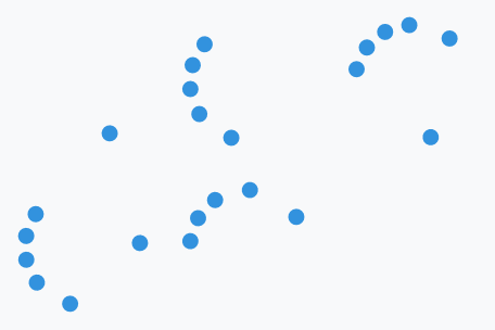
ProgressRing is the Windows 8 activity indicator: dots chasing each other around a circle. It shows that something is happening, not how far along it is — there is no Value, and it derives from Control, not from ProgressBar.
<mah:ProgressRing />
That is the whole minimum. IsActive defaults to True, so a ring you place starts spinning; the style gives it a size and the accent colour. The loop runs four and a bit seconds: the dots appear one after another, chase each other round, and fade out again before it starts over.
The figures below are single frames of that loop, which is why the dots always sit part-way round rather than evenly spaced.
The style
Themes/ProgressRing.xaml holds it, and it is applied as the control's default style, so nothing needs merging and nothing needs a Style reference.
| Property | Set to |
|---|---|
Foreground |
MahApps.Brushes.Accent |
Width, Height |
60 |
MinWidth, MinHeight |
20 |
HorizontalAlignment, VerticalAlignment |
Center |
IsTabStop |
False |
The style is written without an x:Key, unlike the rest of the library — there is no MahApps.Styles.ProgressRing to reference. To derive from it, base your style on the type instead:
<Style BasedOn="{StaticResource {x:Type mah:ProgressRing}}" TargetType="{x:Type mah:ProgressRing}">
    <Setter Property="Width" Value="32" />
    <Setter Property="Height" Value="32" />
</Style>
Because the style sets Width and Height outright, the ring does not grow to fill its container. Set both yourself when you want another size.
IsLarge is a dot count
IsLarge does not change the size. It switches the sixth dot on and off — six dots when True (the default), five when False. The ring is exactly as big either way.
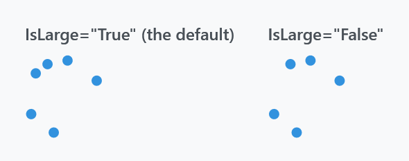
<mah:ProgressRing IsLarge="False" />
Size is Width and Height, and the dots scale with them:
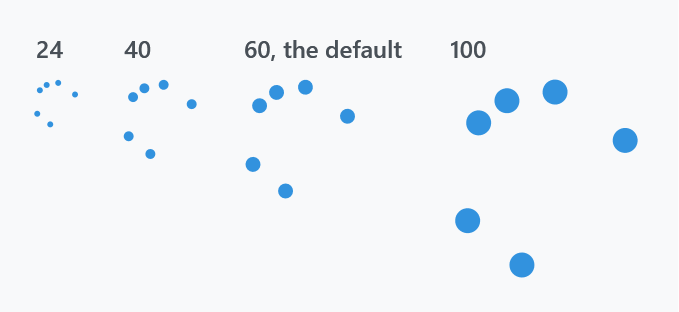
<mah:ProgressRing Width="24" Height="24" />
Everything about the geometry is derived from the control's width alone, through read-only properties the control keeps up to date as it is resized:
EllipseDiameter |
width ÷ 8, times EllipseDiameterScale |
EllipseOffset |
a top margin of width ÷ 2, which is what puts each dot on its orbit |
MaxSideLength |
the width, but never below 20 — it keeps the ring square |
BindableWidth |
the current ActualWidth, which the other three are computed from |
Since the height plays no part in that, keep Width and Height equal.
EllipseDiameterScale is the one of the five you can set, and the way to make the dots heavier or finer without changing the ring:
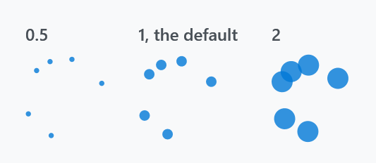
<mah:ProgressRing Width="60" Height="60" EllipseDiameterScale="2" />
MetroProgressBar has properties called EllipseDiameter and EllipseOffset too, but there they are writable, EllipseOffset is a plain gap between dots rather than an orbit radius, and there is no EllipseDiameterScale. The two controls only look related.
Stopping it
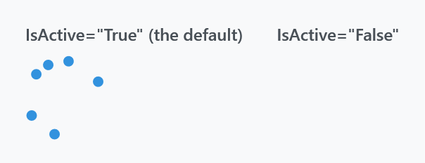
<mah:ProgressRing IsActive="{Binding IsBusy}" />
An inactive ring is not a still ring — the template collapses it, so nothing is drawn. The control keeps its 60×60 of layout, though, so the space stays reserved and the surrounding layout does not jump when the work starts.
Visibility and IsActive are wired together: whenever Visibility changes, the control writes the matching value into IsActive, so hiding a ring also stops its animation. The link runs one way only — an inactive ring is still Visible as far as layout is concerned — and it writes with SetCurrentValue, so a binding on IsActive survives it but will be overridden until the source pushes a new value. Drive one or the other, not both.
Colours
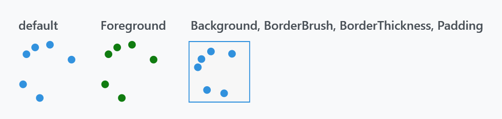
<mah:ProgressRing Foreground="#FF107C10" />
Foreground fills the dots. Background, BorderBrush and BorderThickness paint the box the ring sits in — the control is a Border around the ring, so they frame it rather than touching the dots.
Padding shrinks the ring inside that box, but the offsets that place the dots are still computed from the control's full width, so a padded ring is both smaller and no longer centred. Prefer a smaller Width and Height over padding.
Related
MetroProgressBar is the same idea as a strip rather than a circle, and ProgressBar is the determinate one.