Tile is a square button that looks like a tile from the Windows 8 or 10 Start screen: a coloured block with a caption in a corner and room for an icon in the middle.
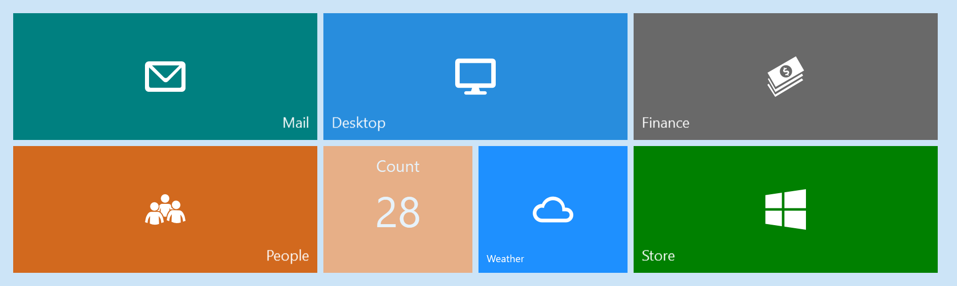
That is the tile wall from the main demo, reproduced markup for markup. A WrapPanel and two sizes of tile is all there is to it:
<WrapPanel Width="924">
    <mah:Tile Title="Mail"
              Background="Teal"
              HorizontalTitleAlignment="Right"
              Style="{StaticResource LargeTileStyle}"
              mah:ControlsHelper.MouseOverBorderBrush="{DynamicResource MahApps.Brushes.ThemeForeground}">
        <iconPacks:PackIconModern Width="40" Height="40" Kind="Email" />
    </mah:Tile>
    <mah:Tile Title="Finance" Background="DimGray" Style="{StaticResource LargeTileStyle}">
        <iconPacks:PackIconModern Width="40" Height="40" Kind="Money" />
    </mah:Tile>
    <mah:Tile Title="Count"
              Background="#FF842D"
              Count="28"
              CountFontSize="42"
              HorizontalTitleAlignment="Center"
              IsEnabled="False"
              Style="{StaticResource SmallTileStyle}"
              TitleFontSize="16"
              VerticalTitleAlignment="Top" />
    <!--  …  -->
</WrapPanel>
<Style x:Key="LargeTileStyle" TargetType="mah:Tile">
    <Setter Property="Width" Value="300" />
    <Setter Property="Height" Value="125" />
    <Setter Property="TitleFontSize" Value="14" />
</Style>

<Style x:Key="SmallTileStyle" TargetType="mah:Tile">
    <Setter Property="Width" Value="147" />
    <Setter Property="Height" Value="125" />
    <Setter Property="TitleFontSize" Value="10" />
</Style>
The icons come from MahApps.Metro.IconPacks, a separate package, with
xmlns:iconPacks="http://metro.mahapps.com/winfx/xaml/iconpacks"
The Count tile is the faded one: it has no content of its own, just a Count, and IsEnabled="False" drops it to 55% opacity.
A single tile
<mah:Tile Title="Mail" Command="{Binding OpenMailCommand}">
<mah:FontIcon FontSize="40" Glyph="" />
</mah:Tile>
It derives from Button, so Click, Command, CommandParameter and IsEnabled all work exactly as on any button — there is no tile-specific way to react to a press.
Left alone it is square: the style sets Width and Height to 140, with a Margin of 3, the accent brush as Background and MahApps.Brushes.IdealForeground as Foreground. Override any of them, as the demo's two styles above do.
Title, content and count
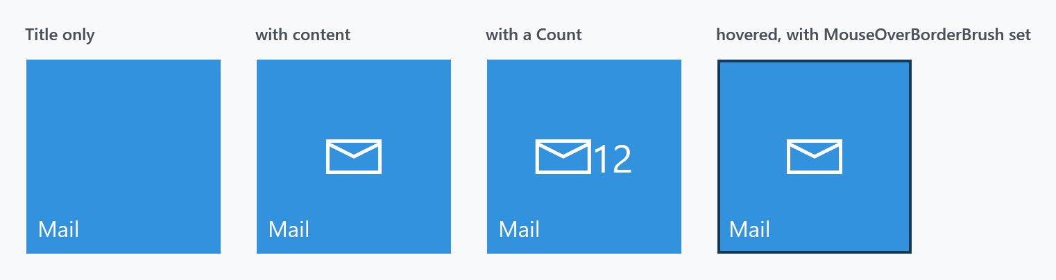
A tile has three separate places to put something:
Content |
the button's own content, centred — usually an icon |
Count |
a string drawn immediately after the content, at CountFontSize (default 28) |
Title |
the caption, positioned in a corner, at TitleFontSize (default 16) |
Content and Count share a horizontal StackPanel with no spacing between them, so a count sits flush against the icon — the third panel above. Add a right margin to the content if you want a gap.
The title is rendered in an AccessText, so Title="_Mail" gives it an access key, and it wraps rather than clipping when it does not fit.
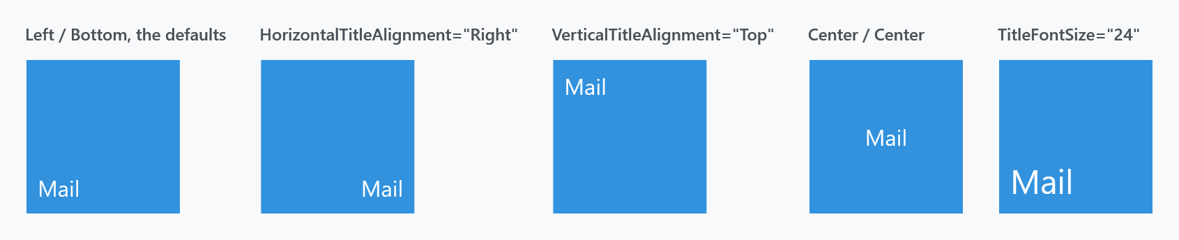
HorizontalTitleAlignment (default Left) and VerticalTitleAlignment (default Bottom) place the title independently of the content, which is aligned by the usual HorizontalContentAlignment and VerticalContentAlignment — both Center in the style.
A tile with nothing but a title reaches a screen reader as a button with no caption, in a released version. The name of a button comes from its content, and a title is not content, so Title="Mail" on its own leaves the name empty. The caption is in the tree as a piece of text, but it does not belong to the button.
On develop the tile is named after its title whenever the content leaves the name empty, and it tells a client it is a tile rather than a plain button. AutomationProperties.Name still beats both. In a released version, set that name by hand.
Hover and press
There is no hover effect until you ask for one. The style sets ControlsHelper.MouseOverBorderBrush to {x:Null}, and the template's trigger requires it to be non-null before the border is shown:
<Condition Binding="{Binding … Path=(mah:ControlsHelper.MouseOverBorderBrush), Converter={x:Static converters:IsNullConverter.Instance}}" Value="False" />
<Condition Binding="{Binding … Path=IsMouseOver}" Value="True" />
So an untouched tile does nothing at all under the pointer. Give it a brush and a 2px border fades in at 60% opacity:
<mah:Tile Title="Mail" mah:ControlsHelper.MouseOverBorderBrush="{DynamicResource MahApps.Brushes.ThemeForeground}" />
The last panel of the four-tile figure above shows that border. It is what the demo's Mail and Desktop tiles set, and why only those two react to the mouse.
Pressing a tile scales it to 0.98 about its centre, which is the small "push" the Start screen tiles had. That comes from a trigger on Button.IsPressed and needs no setting up.
Two properties that do nothing
Tile declares KeepDragging and TiltFactor, and neither has any effect. Nothing in the library reads either one: TiltFactor appears only at its own declaration in Tile.cs, and the tile template contains no behaviour, no Interaction.Behaviors and no tilt code at all.
The tilt effect they look like they control lives in TiltBehavior, which has its own KeepDragging and TiltFactor properties and has to be attached explicitly:
<mah:Tile Title="Mail">
    <i:Interaction.Behaviors>
        <mah:TiltBehavior TiltFactor="10" />
    </i:Interaction.Behaviors>
</mah:Tile>
Both dead properties are removed on develop (in bc0c0560), so they will be gone from the next release. Do not start using them.
Related
TiltBehavior for the tilt-on-press effect. FontIcon is a convenient thing to put inside a tile, and Badged is the alternative when you want a count as a badge rather than beside the icon.