Applies to RadioButton. Like CheckBoxHelper it is three sizes plus one naming scheme for the brushes.
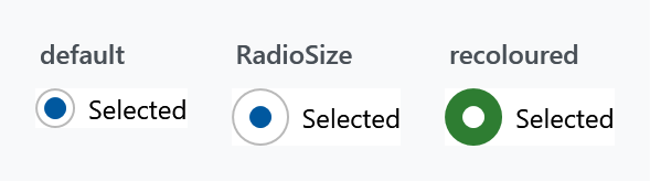
Size
| Property | Type | Default | |
|---|---|---|---|
RadioSize |
double |
18 |
diameter of the outer circle |
RadioCheckSize |
double |
10 |
diameter of the dot inside it |
RadioStrokeThickness |
double |
1 |
thickness of the outline |
RadioBoxHeight |
double |
18 |
height of the box the circle sits in |
<RadioButton mah:RadioButtonHelper.RadioSize="26"
             mah:RadioButtonHelper.RadioCheckSize="14"
             Content="Selected" />
RadioBoxHeight is the odd one out: it does not change what you see, it decides where the circle lands. The template puts the three ellipses in a box of that height, aligned to the top of the control, and centres them inside it. Centring them in the control itself instead would put them on half a device pixel as soon as the display is scaled, and the ring would then be drawn half a pixel off the dot it surrounds.
It is a minimum, so a RadioSize larger than the box grows the box with it and the example above needs no second property. Raise it when you want the circle further down a tall row: the Win10 style ships 32 for its 32 pixel row, the default style 18 for its own height.
The same grid decides the diameters. Windows scales in quarter steps, so a diameter lands on whole device pixels at every step only if it is a multiple of four. That is why the Win10 style pairs a RadioSize of 20 with a RadioCheckSize of 12: both are, and ring and dot stay concentric on a scaled display. Pick your own pair by the same rule if you care about that, 18 and 10 for instance keep the gap between them whole but land on half pixels at 125 and 175 per cent.
RadioBoxHeight is on develop and ships with the next release. In a released version the ellipses are centred in the control, which is where the half pixel comes from.
The brushes
Named {Part}{Interaction}, where interaction is nothing at all for the resting state, or PointerOver, Pressed or Disabled.
| Part | |
|---|---|
Foreground |
the label |
Background |
behind the whole control |
BorderBrush |
around the whole control |
OuterEllipseFill |
inside the circle, while unselected |
OuterEllipseStroke |
its outline, while unselected |
OuterEllipseCheckedFill |
inside the circle, while selected |
OuterEllipseCheckedStroke |
its outline, while selected |
CheckGlyphFill |
the dot |
CheckGlyphStroke |
the dot's outline |
Foreground, Background and BorderBrush have no resting variant — that is the control's own property. The other six times four combinations make up the rest of the 36.
<RadioButton mah:RadioButtonHelper.OuterEllipseCheckedFill="#2E7D32"
             mah:RadioButtonHelper.OuterEllipseCheckedStroke="#2E7D32"
             mah:RadioButtonHelper.CheckGlyphFill="White"
             mah:RadioButtonHelper.CheckGlyphStroke="White"
             Content="Selected" />
Note there is one set of ellipse brushes for unselected and another for selected, but only one set for the dot — the dot is not drawn when nothing is selected, so it needs no unselected variant.
This helper says PointerOver where CheckBoxHelper says MouseOver. The two were written at different times and the naming was never reconciled, so a check box and a radio button that should match need different property names for the same state.
Related
ToggleButtonHelper.ContentDirection puts the circle on the right of the label. See ToggleButtonHelper.