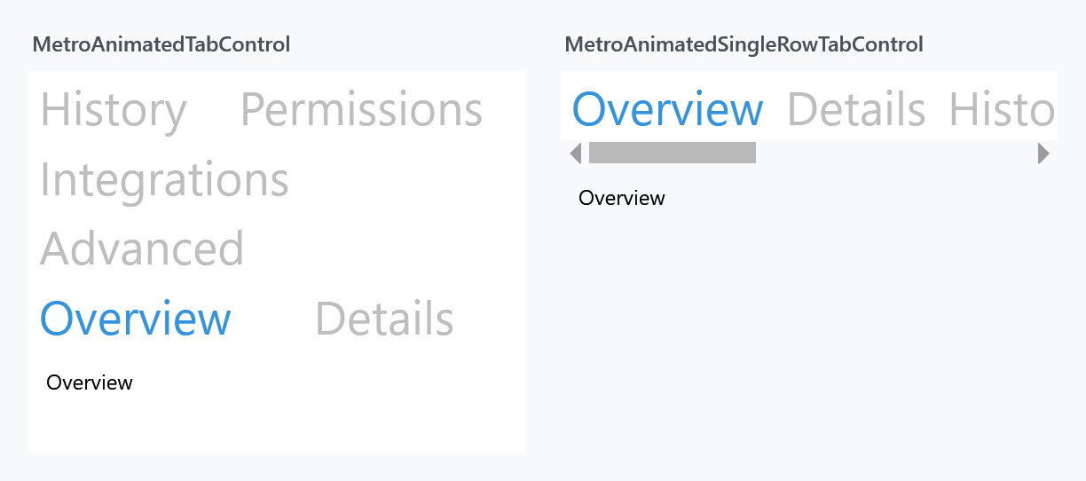
MetroAnimatedSingleRowTabControl is MetroAnimatedTabControl with one difference: its tab headers stay on a single row and scroll, instead of wrapping onto further rows.
<mah:MetroAnimatedSingleRowTabControl>
    <TabItem Header="Overview">
        <!--  content  -->
    </TabItem>
    <TabItem Header="Details">
        <!--  content  -->
    </TabItem>
</mah:MetroAnimatedSingleRowTabControl>
Both controls hold six headers in 280px. The left one folds them onto three rows and gives up most of its height to do it; this one keeps one row and offers a horizontal scrollbar, so the content area stays the size you designed.
What is actually different
The class is four lines, identical to its sibling apart from the default style key. In the template, the tab panel is wrapped:
<ScrollViewer x:Name="HeaderPanelScroll"
              mah:ScrollViewerHelper.IsHorizontalScrollWheelEnabled="{TemplateBinding mah:ScrollViewerHelper.IsHorizontalScrollWheelEnabled}"
              ... >
    <Grid x:Name="HeaderPanelGrid">
        <TabPanel x:Name="HeaderPanel" ... />
    </Grid>
</ScrollViewer>
and the style turns the horizontal wheel on by default:
<Setter Property="mah:ScrollViewerHelper.IsHorizontalScrollWheelEnabled" Value="True" />
So the mouse wheel scrolls the header row sideways without holding Shift. See ScrollViewerHelper.
Everything else is shared: the same BaseMetroTabControl API as MetroTabControl, and the same TransitioningContentControl driving the content animation.
Two templates, one per orientation
Both controls react to TabStripPlacement, but they do it differently. MetroAnimatedTabControl has one template and rearranges its own grid from ControlTemplate.Triggers. This control instead ships two templates and swaps between them from Style.Triggers:
TabStripPlacement |
Template |
|---|---|
Top, Bottom |
MahApps.Templates.MetroAnimatedSingleRowTabControl.Horizontal |
Left, Right |
MahApps.Templates.MetroAnimatedSingleRowTabControl.Vertical |
A trigger outranks a plain setter anywhere in the style chain, so a derived style that sets Template is beaten by the inherited TabStripPlacement trigger the moment the strip is not on top.
To replace the template, repeat the triggers in your own style:
<Style BasedOn="{StaticResource {x:Type mah:MetroAnimatedSingleRowTabControl}}"
       TargetType="{x:Type mah:MetroAnimatedSingleRowTabControl}">
    <Setter Property="Template" Value="{StaticResource MyHorizontalTemplate}" />
    <Style.Triggers>
        <Trigger Property="TabStripPlacement" Value="Left">
            <Setter Property="Template" Value="{StaticResource MyVerticalTemplate}" />
        </Trigger>
        <Trigger Property="TabStripPlacement" Value="Right">
            <Setter Property="Template" Value="{StaticResource MyVerticalTemplate}" />
        </Trigger>
    </Style.Triggers>
</Style>
SplitButton and the Slider styles have the same shape and the same trap.
Choosing the transition
As with MetroAnimatedTabControl, TabControlHelper.Transition picks the animation and defaults to Left:
<mah:MetroAnimatedSingleRowTabControl mah:TabControlHelper.Transition="Up">
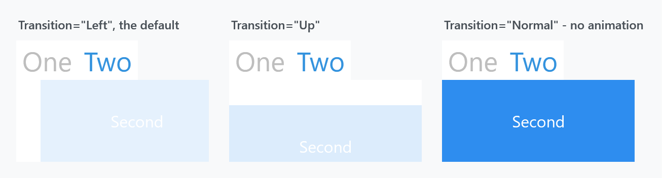
Normal turns the animation off while keeping the rest of the template.
Related
MetroAnimatedTabControl for the wrapping-header version, MetroTabControl for the shared API, ScrollViewerHelper for the horizontal wheel, and TransitioningContentControl for the transitions.