A Flyout is a panel that slides in over a MetroWindow from any of its four sides. It derives from HeaderedContentControl, so it has a Header and arbitrary content.
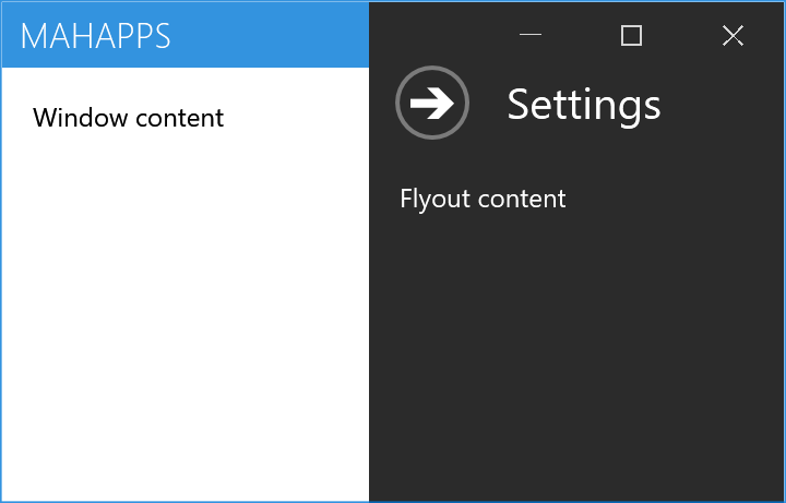
<mah:MetroWindow.Flyouts>
    <mah:FlyoutsControl>
        <mah:Flyout Header="Settings" Position="Right" Width="190" IsOpen="{Binding IsSettingsOpen}">
            <!--  content  -->
        </mah:Flyout>
    </mah:FlyoutsControl>
</mah:MetroWindow.Flyouts>
Every figure on this page is a real MetroWindow, because a Flyout only behaves like one inside one: it looks up its parent window to position itself, to dim the modal overlay and to adapt its theme.
FlyoutsControl
FlyoutsControl is the ItemsControl that holds the flyouts for one window, and it belongs in the window's Flyouts property. A flyout outside one will not work properly.
It is a real items control, so ItemsSource works and each item is wrapped in a Flyout container. ItemTemplate, ItemTemplateSelector and ItemStringFormat are pushed onto each container's content properties, and HeaderTemplate, HeaderTemplateSelector and HeaderStringFormat set on a flyout are preserved when the container is prepared.
It adds exactly two properties of its own, both of which override every flyout below it:
| Property | Type | Default | |
|---|---|---|---|
OverrideIsPinned |
bool |
False |
when True, every flyout behaves as if IsPinned were False |
OverrideExternalCloseButton |
MouseButton? |
null |
when set, every flyout closes on that button, whatever its own ExternalCloseButton says |
Opening and closing
IsOpen is the switch, and it is the one to bind. IsShown is a read-only companion, and Owner is the read-only back-reference to the FlyoutsControl.
Three routed events mark the stages:
| Event | |
|---|---|
IsOpenChanged |
IsOpen has changed; the animation is just starting |
OpeningFinished |
the slide-in has finished |
ClosingFinished |
the slide-out has finished |
A flyout does not close when you click outside it — by default. IsPinned defaults to True, which means pinned, which means clicks elsewhere in the window are ignored. The old documentation never mentioned the property.
The window's handler reads:
foreach (var flyout in Flyouts.GetFlyouts()
                              .Where(x => x.IsOpen
                                          && x.ExternalCloseButton == e.ChangedButton
                                          && (!x.IsPinned || Flyouts.OverrideIsPinned)))
{
    flyout.IsOpen = false;
}
So for click-away-to-close, set IsPinned="False" on the flyout, or OverrideIsPinned="True" on the FlyoutsControl to do it for all of them.
ExternalCloseButton picks which button counts, and defaults to MouseButton.Left. Clicks on a flyout, on the modal overlay, on a dialog, on the window icon or on the window commands never count as "outside".
The close button
CloseCommand runs when the close button is clicked, with CloseCommandParameter. It does not run when IsOpen is set to false in code or by a binding — the XML documentation says so explicitly, and it is easy to trip over if you expect it as a general "flyout closed" hook. Use ClosingFinished for that.
CloseButtonIsCancel makes the button respond to Esc. Although CloseCommand is registered with RegisterAttached, there are no static GetCloseCommand/SetCloseCommand accessors, so it cannot actually be used as an attached property in XAML — set it on the flyout.
Closing itself
| Property | Type | Default | |
|---|---|---|---|
IsAutoCloseEnabled |
bool |
False |
close after a delay |
AutoCloseInterval |
long |
5000 |
milliseconds |
The timer starts when the flyout is open and the property is switched on, and stops when it is switched off.
Position

Position is Left, Right, Top or Bottom, and defaults to Left. Left and right flyouts take their Width, top and bottom ones their Height. The header row and its arrow button flip to match, so the arrow always points the way out.
AnimateOnPositionChange (default True) animates a change of Position while the flyout is open.
Themes

| Value | |
|---|---|
Dark |
the default |
Light |
|
Adapt |
follows the host window's theme |
Inverse |
follows it, inverted |
Accent |
the accent colour; you have to pick readable foregrounds yourself |
The figure is rendered against a light application theme, which is why Adapt matches Light and Inverse matches Dark.
BorderThickness on MahApps.Styles.Flyout is 0. A Light or Adapt flyout over a light window therefore has no visible edge at all — in the figure above you can only tell where those two are by the text inside them. If that matters, give the flyout a BorderThickness and BorderBrush.
Modal
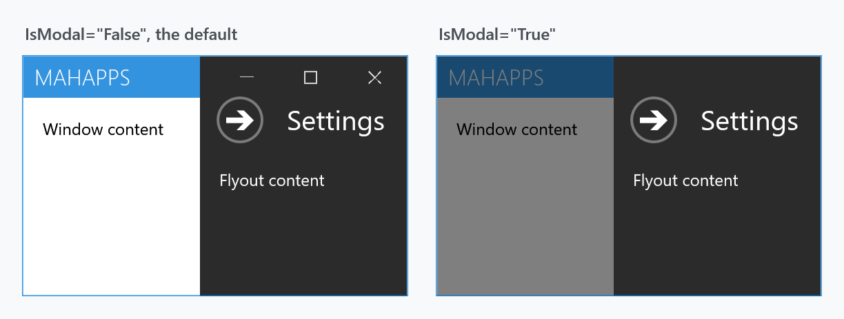
IsModal (default False) dims the rest of the window and blocks input to it. It also pushes the window icon and all three sets of window commands behind the overlay, which is why the minimise, maximise and close buttons are gone in the right-hand panel.
Header, title and close button
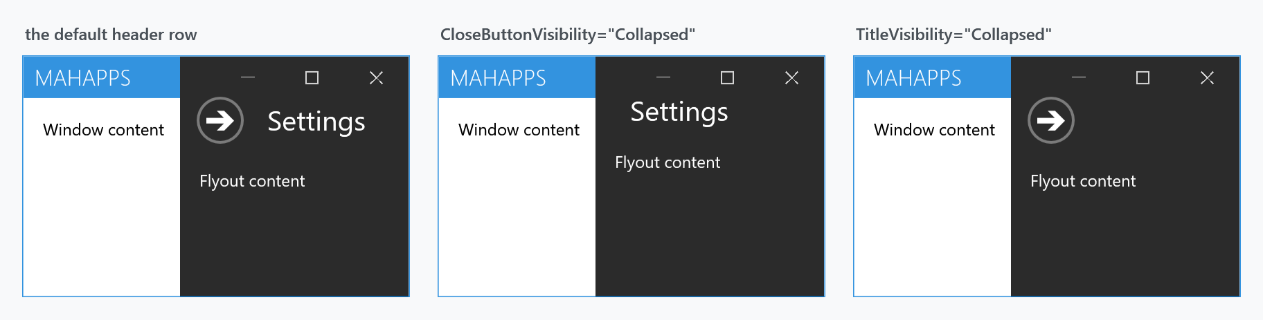
CloseButtonVisibility and TitleVisibility are both Visible by default and each hides one part of the header row. Hiding the close button without giving the user another way out — a binding on IsOpen, IsPinned="False", or auto-close — leaves the flyout stuck open.
Shadow
New on develop.
ShadowEffect throws a shadow onto whatever the flyout covers. Nothing is thrown until one is set:
<mah:Flyout Position="Left" Header="Settings">
    <mah:Flyout.ShadowEffect>
        <DropShadowEffect BlurRadius="24" Direction="0" ShadowDepth="8" Opacity="0.45" />
    </mah:Flyout.ShadowEffect>
</mah:Flyout>
It takes any Effect, so a blur or a glow works the same way. Direction counts anticlockwise from the right, which for a flyout on the left means 0.
The effect is given to a pane of its own behind the content rather than to the flyout, and that is worth knowing if you are tempted to set Effect instead. An effect on a control takes everything inside it through a bitmap on the way to the screen: the text loses ClearType and every frame of the slide costs more to draw. ShadowEffect leaves the content alone.
The shadow is drawn inside the window, so it falls on the page rather than past the window edge. #3306 asked for this, and until it shipped the answer was to copy the whole control template.
Animation and focus
| Property | Type | Default | |
|---|---|---|---|
AreAnimationsEnabled |
bool |
True |
turn the slide off entirely |
AnimateOpacity |
bool |
False |
fade as well as slide |
AllowFocusElement |
bool |
True |
move focus into the flyout when it opens |
FocusedElement |
FrameworkElement |
null |
which element gets that focus |
Overlay behaviour on the window
These four live on the MetroWindow, not on the flyout, and decide what stays visible above an open flyout:
| Property | Type | Default |
|---|---|---|
LeftWindowCommandsOverlayBehavior |
WindowCommandsOverlayBehavior |
Never |
RightWindowCommandsOverlayBehavior |
WindowCommandsOverlayBehavior |
Never |
WindowButtonCommandsOverlayBehavior |
OverlayBehavior |
Always |
IconOverlayBehavior |
OverlayBehavior |
Never |
WindowCommandsOverlayBehavior is Never or HiddenTitleBar. OverlayBehavior is a [Flags] enum, and Always is not a state of its own but the combination of the other two:
[Flags]
public enum OverlayBehavior
{
    Never = 0,
    Flyouts = 1 << 0,
    HiddenTitleBar = 1 << 1,
    Always = ~(-1 << 2)
}
The minimise, maximise and close buttons default to Always, which carries the Flyouts flag, so they stay visible above an open flyout.
The left and right window commands can never be drawn over an open flyout — WindowCommandsOverlayBehavior has no value for it.
The icon can, though, which older documentation denied. IconOverlayBehavior is an OverlayBehavior, and the window checks it per flyout:
this.icon?.SetValue(Panel.ZIndexProperty,
    flyout.IsModal && flyout.IsOpen
        ? 0
        : (this.IconOverlayBehavior.HasFlag(OverlayBehavior.Flyouts) ? zIndex : 1));
So IconOverlayBehavior="Flyouts" does put the icon above one. A modal flyout still wins over both.
What it means for an inspection tool
The FlyoutsControl lies over the whole window, so a flyout can come in from any side. It paints nothing while every flyout is shut, and a mouse click goes straight through it to the content underneath.
On .NET 8 and later, in a released version, this leaves nothing in the window reachable for a UI automation tool. Accessibility Insights, inspect.exe, FlaUInspect and WinAppDriver all ask Windows what sits under the pointer, and that question goes by the box an element occupies rather than by what a click would hit. Point at a button in a MetroWindow and the answer is the flyouts control, whatever is actually drawn there. On .NET 7 the same window answers with the button, and so does a plain Window on either.
Fixed on develop by #4454: the control answers a point only while a flyout is open, and reports itself off screen while none is. An open flyout is found the way it always was. Until that ships, a tool that picks the element by keyboard focus rather than by pointer gets through.
Related
MetroWindow hosts them and owns the overlay behaviour. CustomValidationPopup suppresses itself while a flyout is animating, which is what Flyout's animation state is used for elsewhere.