The Visual Studio variant is the library's broad one: a dark palette, tabs with close buttons, flat menus and thin scrollbars — the look of a tool-window application rather than a document one.
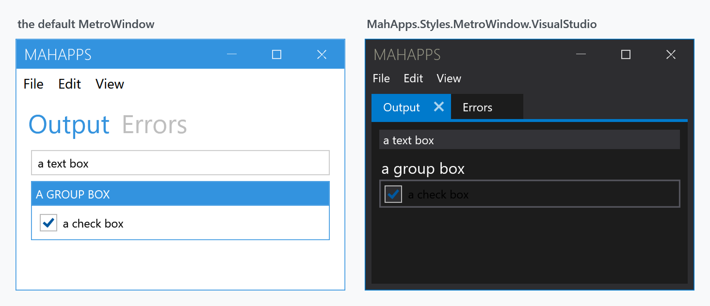
Both windows above hold the same markup: a Menu, a TabControl with two tabs, a TextBox, a GroupBox and a CheckBox.
Opting in
The variant goes on top of the ordinary style set rather than in place of it, so App.xaml keeps what it always had:
<Application.Resources>
    <ResourceDictionary>
        <ResourceDictionary.MergedDictionaries>
            <ResourceDictionary Source="pack://application:,,,/MahApps.Metro;component/Styles/Controls.xaml" />
            <ResourceDictionary Source="pack://application:,,,/MahApps.Metro;component/Styles/Fonts.xaml" />
            <ResourceDictionary Source="pack://application:,,,/MahApps.Metro;component/Styles/Themes/Dark.Blue.xaml" />
        </ResourceDictionary.MergedDictionaries>
    </ResourceDictionary>
</Application.Resources>
Then the window, and here two dictionaries, not one is what catches people out:
<mah:MetroWindow x:Class="MyApp.MainWindow"
                 xmlns:mah="http://metro.mahapps.com/winfx/xaml/controls"
                 Style="{DynamicResource MahApps.Styles.MetroWindow.VisualStudio}">
    <mah:MetroWindow.Resources>
        <ResourceDictionary>
            <ResourceDictionary.MergedDictionaries>
                <ResourceDictionary Source="pack://application:,,,/MahApps.Metro;component/Styles/VS/Controls.xaml" />
                <ResourceDictionary Source="pack://application:,,,/MahApps.Metro;component/Styles/VS/Colors.xaml" />
            </ResourceDictionary.MergedDictionaries>
        </ResourceDictionary>
    </mah:MetroWindow.Resources>
</mah:MetroWindow>
Controls.xaml brings the templates; Colors.xaml brings the dark palette. Merge only the first and the variant applies but keeps the ordinary theme colours, so a window comes out looking barely different from the default — the templates are there, the darkness is not.
The demo's VSDemo merges both, and so should you.
Leave Styles/Controls.xaml out of App.xaml and every control the variant does not cover keeps the plain WPF look, so a ToolBar or a ComboBox comes out light grey in front of the dark window. The variant restyles the twelve controls below, the ordinary set restyles the rest.
What it restyles
VS/Controls.xaml merges twelve dictionaries and declares an implicit style for each:
| Implicit style | Target |
|---|---|
MahApps.Styles.MetroWindow.VisualStudio |
MetroWindow |
MahApps.Styles.Menu.VisualStudio, …MenuItem…, …ContextMenu… |
Menu, MenuItem, ContextMenu |
MahApps.Styles.TabControl.VisualStudio, …TabItem… |
TabControl, TabItem |
MahApps.Styles.Button.VisualStudio |
Button |
MahApps.Styles.TextBox.VisualStudio |
TextBox |
MahApps.Styles.ListBox.VisualStudio, …ListBoxItem… |
ListBox, ListBoxItem |
MahApps.Styles.ScrollBar.VisualStudio |
ScrollBar |
MahApps.Styles.GroupBox.VisualStudio |
GroupBox |
MahApps.Styles.Expander.VisualStudio |
Expander |
VS/Shadows.xaml is merged too, for the drop shadows the variant uses.
Because these are implicit styles, merging the dictionary restyles every one of those controls in scope — you do not opt in per control. Set a Style explicitly on a control to keep it out.
Tabs
The tab look is the most distinctive part: the selected tab is accent-filled and carries a close button, as in the figure. That comes from MahApps.Styles.TabItem.VisualStudio — see TabControl and MetroTabItem for how closeable tabs work generally.
Related
Clean is the other window variant, and a much smaller one. Win10 and WinUI are a different kind of thing: whole style sets you merge in place of Controls.xaml, rather than chrome on top of it.