An Expander gets the same accent header band as a GroupBox, plus a toggle arrow and a fade when it opens. Its header is a ToggleButton, and which way that button points depends on ExpandDirection — which is why the style carries four header styles rather than one.
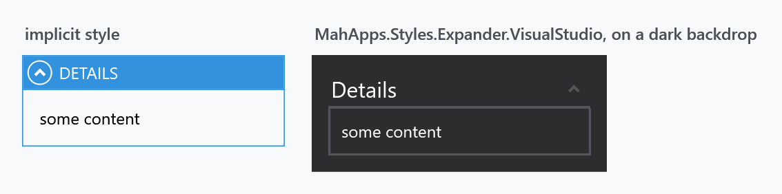
The implicit style
Styles/Controls.xaml applies MahApps.Styles.Expander to every Expander. Merging that dictionary — which the quick start does — is all it takes:
<ResourceDictionary Source="pack://application:,,,/MahApps.Metro;component/Styles/Controls.xaml" />
The two styles
| Style | Lives in | |
|---|---|---|
MahApps.Styles.Expander |
Controls.xaml |
the implicit one |
MahApps.Styles.Expander.VisualStudio |
Styles/VS/Controls.xaml |
the Visual Studio tool-window look |
As with the GroupBox, the Visual Studio style is not merged by Controls.xaml — add Styles/VS/Controls.xaml and Styles/VS/Colors.xaml first — and it is drawn for the dark Visual Studio theme, which is why the figure shows it on a dark backdrop.
Open and closed
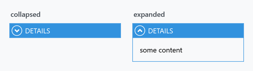
Opening and closing is animated: the style points ExpanderHelper.ExpandStoryboard and CollapseStoryboard at MahApps.Storyboard.Expander.Expand and .Collapse, a quarter-second opacity fade on the content. Setting those properties replaces that animation rather than adding one, and setting them to {x:Null} makes the content switch over in a single frame.
The four directions
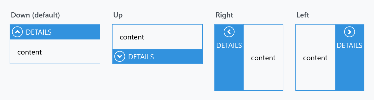
ExpandDirection decides which edge the content unfolds from, and the header rotates to match:
Turning the header text on its side
Look at the last two panels above: with Left and Right the band is vertical but the text stays horizontal, so a longer header runs out of room. The built-in styles do not rotate it — that is left to you, with a LayoutTransform on the header content:
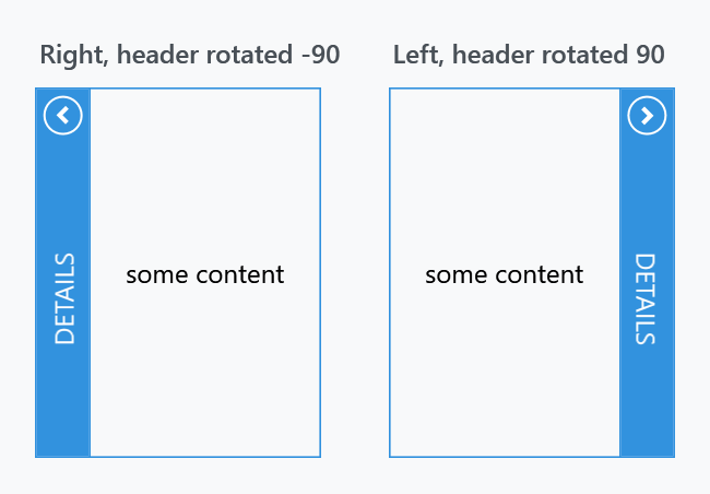
<Expander ExpandDirection="Right" IsExpanded="True" Height="170" Header="Details">
    <Expander.HeaderTemplate>
        <DataTemplate>
            <TextBlock VerticalAlignment="Center" Text="{Binding}">
                <TextBlock.LayoutTransform>
                    <RotateTransform Angle="-90" />
                </TextBlock.LayoutTransform>
            </TextBlock>
        </DataTemplate>
    </Expander.HeaderTemplate>
    <TextBlock Margin="12" VerticalAlignment="Center" Text="some content" />
</Expander>
For ExpandDirection="Left" — the band on the right-hand side — use Angle="90" instead, so the text reads downwards rather than upwards.
Use LayoutTransform rather than RenderTransform: the former rotates before layout, so the band ends up as narrow as the rotated text is tall. A RenderTransform would turn the text but leave the band sized for the horizontal version.
Rotate through HeaderTemplate, not by assigning a TextBlock to Header. Both put a rotated text block in the band, but a template keeps the header a string, so the style's upper-casing still applies and the white foreground still inherits — the figure above sets neither, and Header="Details" still comes out as DETAILS in white. Hand Header an element instead and you lose both: the casing no longer applies, and the text falls back to the dark default, which then has to be set back to MahApps.Brushes.IdealForeground by hand.
Each direction has its own header style, and the Expander style fills in all four:
| Property | Applies when | Style it is given |
|---|---|---|
ExpanderHelper.HeaderDownStyle |
ExpandDirection="Down" |
MahApps.Styles.ToggleButton.ExpanderHeader.Down |
ExpanderHelper.HeaderUpStyle |
Up |
...ExpanderHeader.Up |
ExpanderHelper.HeaderLeftStyle |
Left |
...ExpanderHeader.Left |
ExpanderHelper.HeaderRightStyle |
Right |
...ExpanderHeader.Right |
Replacing one changes only that direction, so an expander whose direction is bound needs the matching styles set for every value it can take:
<Expander Header="Details"
          mah:ExpanderHelper.HeaderDownStyle="{StaticResource QuietExpanderHeader}">
    <TextBlock Margin="8" Text="some content" />
</Expander>
Base your own on the built-in one for that direction, or the arrow and the layout go with it:
<Style x:Key="QuietExpanderHeader"
       BasedOn="{StaticResource MahApps.Styles.ToggleButton.ExpanderHeader.Down}"
       TargetType="{x:Type ToggleButton}">
    <Setter Property="Background" Value="{DynamicResource MahApps.Brushes.Gray10}" />
    <Setter Property="Foreground" Value="{DynamicResource MahApps.Brushes.Text}" />
</Style>
The four all derive from MahApps.Styles.ToggleButton.ExpanderHeader.Base, so a change meant for every direction belongs there instead.
Header casing and colours
As on a GroupBox, the style sets ControlsHelper.ContentCharacterCasing to Upper, and the header's colours and font come from HeaderedControlHelper:
<Expander Header="Details"
          mah:ControlsHelper.ContentCharacterCasing="Normal"
          mah:HeaderedControlHelper.HeaderBackground="{DynamicResource MahApps.Brushes.Gray10}"
          mah:HeaderedControlHelper.HeaderForeground="{DynamicResource MahApps.Brushes.Text}" />
See HeaderedControlHelper for the full list, and ExpanderHelper for the header styles and storyboards.
Related
GroupBox is the same header on a control that does not fold, and a DataGrid group header uses MahApps.Styles.ToggleButton.ExpanderHeader.Down.DataGrid.GroupItem, a fifth variant of the same base — see DataGrid.