Two implicit styles, one for the list and one for the items in it. Styles/Controls.xaml applies both, so the quick start is the whole setup.
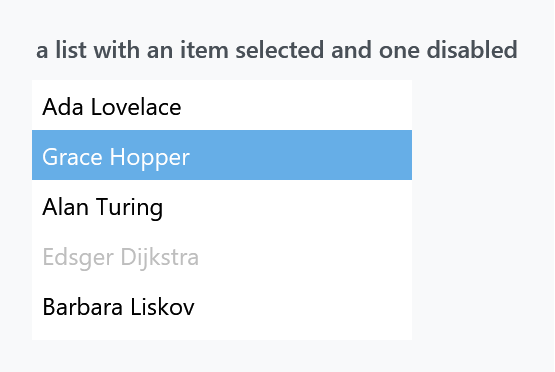
<ListBox>
    <ListBoxItem Content="Ada Lovelace" />
    <ListBoxItem Content="Grace Hopper" IsSelected="True" />
    <ListBoxItem Content="Alan Turing" />
    <ListBoxItem Content="Edsger Dijkstra" IsEnabled="False" />
    <ListBoxItem Content="Barbara Liskov" />
</ListBox>
| Style | |
|---|---|
MahApps.Styles.ListBox |
the implicit one |
MahApps.Styles.ListBoxItem |
the implicit item style |
MahApps.Styles.ListBox.Virtualized |
the same list with recycling virtualisation switched on |
No border
BorderThickness is 0 — the source even says so in a comment. A MahApps list has no frame, which surprises people coming from WPF's default. BorderBrush, meanwhile, is MahApps.Brushes.ThemeForeground, so switching the border on gives you a black box rather than the grey hairline you probably wanted. Set both.
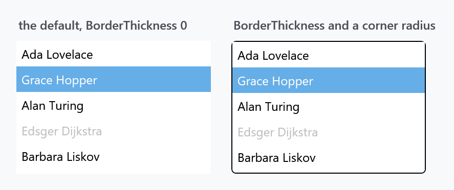
<ListBox BorderThickness="1"
         BorderBrush="{DynamicResource MahApps.Brushes.Control.Border}"
         mah:ControlsHelper.CornerRadius="4" />
ControlsHelper.CornerRadius is template-bound on the border, so a rounded list costs one attached property — with a caveat.
Rounded corners are bitten out at the top. The template root is a plain Border, and a Border clips its own background to its CornerRadius but not its child. The item style paints an opaque MahApps.Brushes.ThemeBackground behind every item, so the first item's square corners cover the arc:
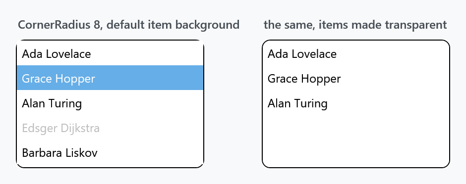
The bottom corners survive in the figure only because the last item ends above them.
The one-line fix is to stop the items painting, and let the list's own background show through:
<ListBox.ItemContainerStyle>
    <Style BasedOn="{StaticResource MahApps.Styles.ListBoxItem}" TargetType="{x:Type ListBoxItem}">
        <Setter Property="Background" Value="Transparent" />
    </Style>
</ListBox.ItemContainerStyle>
Or wrap the list in a Border that clips what it holds, and leave the ListBox square:
<Border x:Name="ListBorder"
        BorderBrush="{DynamicResource MahApps.Brushes.Control.Border}"
        BorderThickness="1"
        CornerRadius="4">
    <Grid x:Name="ListGrid">
        <Grid.Clip>
            <MultiBinding Converter="{x:Static mah:ClipGeometryConverter.Instance}">
                <Binding ElementName="ListGrid" Path="ActualWidth" />
                <Binding ElementName="ListGrid" Path="ActualHeight" />
                <Binding ElementName="ListBorder" Path="CornerRadius" />
                <Binding ElementName="ListBorder" Path="BorderThickness" />
                <Binding ElementName="ListBorder" Path="Padding" />
            </MultiBinding>
        </Grid.Clip>
        <ListBox BorderThickness="0" />
    </Grid>
</Border>
A clip lives in the coordinates of the element carrying it, which is why the geometry is built from the size of the grid rather than from the border around it. mah:ClipBorder did the same job in one element and is obsolete on develop.
ListView and TreeView have the same template shape and the same caveat.
Two selection colours
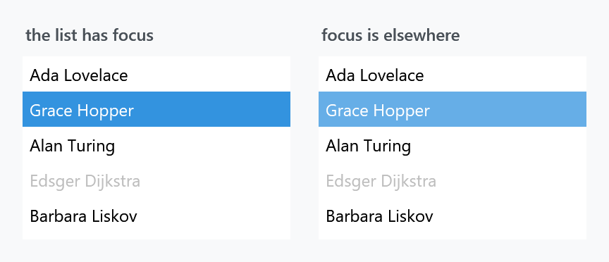
A selected item is drawn one way while the list has focus and another way when focus is elsewhere — the accent proper against a lighter tint of it. That is WPF's Selector.IsSelectionActive and MahApps gives the two states different brushes:
| State | Brush | Default |
|---|---|---|
| selected, list focused | ItemHelper.ActiveSelectionBackgroundBrush |
MahApps.Brushes.Accent |
| selected, focus elsewhere | ItemHelper.SelectedBackgroundBrush |
MahApps.Brushes.Accent2 |
Recolouring only one of the two is the usual mistake: the list looks right until the user clicks somewhere else.
The item states
Everything the item template draws comes from ItemHelper — a pair of brushes, background and foreground, for each state. The style fills in eleven of them:
| Set by the style | |
|---|---|
ActiveSelection* |
accent, ideal foreground |
Selected* |
Accent2 |
Hover* |
Accent3, ordinary text colour |
HoverSelected* |
accent |
DisabledForegroundBrush |
MahApps.Brushes.Gray |
DisabledSelected* |
Gray7 |
Five are deliberately left unset: DisabledBackgroundBrush and the two pairs for MouseLeftButtonPressed* and MouseRightButtonPressed*. That is not an oversight — ItemHelper only attaches the mouse handlers that track the pressed state when one of those brushes is set, so an item that does not want a pressed colour costs nothing:
<ListBox.ItemContainerStyle>
    <Style BasedOn="{StaticResource MahApps.Styles.ListBoxItem}" TargetType="{x:Type ListBoxItem}">
        <Setter Property="mah:ItemHelper.MouseLeftButtonPressedBackgroundBrush" Value="{DynamicResource MahApps.Brushes.AccentBase}" />
        <Setter Property="mah:ItemHelper.MouseLeftButtonPressedForegroundBrush" Value="{DynamicResource MahApps.Brushes.IdealForeground}" />
    </Style>
</ListBox.ItemContainerStyle>
Set these on the item, through ItemContainerStyle, not on the ListBox. The properties inherit, so setting them on the list looks like it should work — but the item style already sets most of them, and a style setter on the item beats a value inherited from its parent. ItemHelper has the full list of twenty-odd brushes.
Scrolling and virtualisation
The style bakes in the scroll settings, so a ScrollViewer of your own around a ListBox is never needed: both bars are Auto, CanContentScroll is True — item-by-item scrolling — and PanningMode is Both for touch, with Stylus.IsFlicksEnabled off.
MahApps.Styles.ListBox.Virtualized sets four properties on the list, and virtualisation is not what they switch on: a ListBox under the MahApps style already realises only the rows it shows. What the variant brings is the recycling. VirtualizationMode goes from Standard to Recycling, so the container of a row leaving the view is handed to the row coming in rather than thrown away, and IsVirtualizingWhenGrouping keeps that going once the list is grouped:
<ListBox Style="{StaticResource MahApps.Styles.ListBox.Virtualized}" ItemsSource="{Binding ManyItems}" />
The panel is not where those settings count. The base style swaps in a VirtualizingStackPanel carrying all three of them as soon as VirtualizingStackPanel.IsVirtualizing is True, which it is unless somebody turns it off, but WPF reads them off the list rather than off the panel. Without the variant the mode therefore stays Standard, whatever the panel says.
Grouping is the exception the template handles for you: with IsGrouping on and IsVirtualizingWhenGrouping off, it turns CanContentScroll back off, because item-based scrolling and non-virtualised groups do not mix.
Visual Studio
Styles/VS/ListBox.xaml holds MahApps.Styles.ListBox.VisualStudio and MahApps.Styles.ListBoxItem.VisualStudio. As with the other Visual Studio styles they are not merged by Controls.xaml — add Styles/VS/Controls.xaml and Styles/VS/Colors.xaml — and they are drawn for the dark shell.
Related
ListView is the same idea with columns, and ComboBox drop-downs use ListBoxItem too, so the brushes above colour them as well. The HamburgerMenu pane is a ListBox with its own item styles.