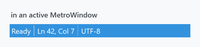
Two implicit styles, applied by Styles/Controls.xaml. A MahApps status bar is not a grey strip at the bottom of the window — it is a second title bar, in the accent colour, and it dims with the window.
<mah:MetroWindow>
    <DockPanel>
        <StatusBar DockPanel.Dock="Bottom">
            <StatusBarItem Content="Ready" />
            <Separator Style="{StaticResource MahApps.Styles.Separator.StatusBar}" />
            <StatusBarItem Content="Ln 42, Col 7" />
            <Separator Style="{StaticResource MahApps.Styles.Separator.StatusBar}" />
            <StatusBarItem Content="UTF-8" />
        </StatusBar>
        <!-- content -->
    </DockPanel>
</mah:MetroWindow>
| Style | |
|---|---|
MahApps.Styles.StatusBar |
the implicit one |
MahApps.Styles.StatusBarItem |
the implicit item style |
MahApps.Styles.Separator.StatusBar |
the separator between items — keyed, see below |
MahApps.Styles.StatusBar.Clean |
the Clean variant, dark text instead of light |
It borrows the window title colour
The style has no Background setter. Two MultiDataTriggers supply one by reaching up to the MetroWindow:
| Window | Background |
|---|---|
| active | the window's WindowTitleBrush |
| not active | its NonActiveWindowTitleBrush |
So the bar matches the title bar, accent and all, and greys out with it when the window loses focus. That is also why Foreground is MahApps.Brushes.IdealForeground — the colour picked to read against the accent — and why the separator and the item border use it too.
Outside a MetroWindow the bar disappears. The two triggers bind through FindAncestor to a MetroWindow; with none above it they supply nothing, the background stays unset, and light text is left on the page:

Both panels are the same markup. If you need a status bar in a plain Window, in a dialog, or anywhere else outside the window chrome, set Background and Foreground yourself:
<StatusBar Background="{DynamicResource MahApps.Brushes.Accent}"
           Foreground="{DynamicResource MahApps.Brushes.IdealForeground}" />
The separator is not applied for you

A <Separator/> inside a StatusBar takes its style from StatusBar.SeparatorStyleKey, and MahApps does not define that key. The bar therefore gets the separator the system theme supplies, which is inset from the top and bottom of the strip and drawn for a grey one rather than for an accent-coloured one. The MahApps separator is IdealForeground at 0.75 opacity over the whole height of the bar, which is what belongs there.
MahApps.Styles.Separator.StatusBar exists; it just has to be asked for, on every separator:
<Separator Style="{StaticResource MahApps.Styles.Separator.StatusBar}" />
An implicit style will not do it for all of them. While it prepares the containers, a StatusBar hands every separator a resource reference to SeparatorStyleKey, and that beats an implicit TargetType="{x:Type Separator}" style, so one put in the bar's resources without a key changes nothing. Under the key it does, and then the one line really is all of them:
<StatusBar.Resources>
    <Style x:Key="{x:Static StatusBar.SeparatorStyleKey}"
           BasedOn="{StaticResource MahApps.Styles.Separator.StatusBar}"
           TargetType="{x:Type Separator}" />
</StatusBar.Resources>
The same style under the same key in App.xaml covers every status bar in the application. Naming the style on the separator itself keeps working either way, since a style set there is a local value and the bar leaves that alone.
Fonts
Like menus, the status bar takes its font family, style and weight from the Windows shell settings rather than from Fonts.xaml:
<Setter Property="FontFamily" Value="{DynamicResource {x:Static SystemFonts.StatusFontFamilyKey}}" />
Only the size is the library's, MahApps.Font.Size.StatusBar, which is 12. MahApps redefines the system colour keys in its themes but not the system font keys, so this really is the user's status-bar font.
Items
MahApps.Styles.StatusBarItem is short: Padding of 3, content left-aligned and vertically centred, a BorderBrush of IdealForeground with no thickness, and a disabled foreground of Gray2.
A StatusBarItem is a ContentControl, so anything goes in it — a ProgressBar for a background job is the usual second inhabitant of a status bar:
<StatusBarItem>
    <ProgressBar Width="120" Height="10" IsIndeterminate="True" />
</StatusBarItem>
Something at the right end
A status bar arranges its items in a DockPanel, so DockPanel.Dock="Right" is what moves one to the other side. That alone does not do it: the panel a status bar brings has LastChildFill on, the last item therefore takes everything that is left over, and its content stays where it started. Hand the bar a panel of its own and the docking works:
<StatusBar>
    <StatusBar.ItemsPanel>
        <ItemsPanelTemplate>
            <DockPanel LastChildFill="False" />
        </ItemsPanelTemplate>
    </StatusBar.ItemsPanel>
    <StatusBarItem Content="Ready" />
    <StatusBarItem DockPanel.Dock="Right" Content="Ln 42, Col 7" />
</StatusBar>
That is WPF's doing rather than the library's: a status bar with no style at all behaves the same way.
The Clean variant
Styles/Clean/StatusBar.xaml holds MahApps.Styles.StatusBar.Clean and MahApps.Styles.Separator.Clean. Each is the ordinary style with one setter changed — the foreground and the separator colour move from IdealForeground to MahApps.Brushes.ThemeForeground, so the text is dark rather than light.
The dictionary is not merged by Controls.xaml; add Styles/Clean/StatusBar.xaml first. And note that the variant does not change the background — the window-title triggers are inherited along with everything else, so on a dark accent you would be putting dark text on it. It is meant for the Clean style set, where the title brush is light.
<StatusBar Style="{DynamicResource MahApps.Styles.StatusBar.Clean}" />