Every ComboBox in a MahApps application is styled without any markup on your side, drop-down and items included. On top of that come a watermark, a clear button and the editable variant with auto-completion.

The implicit style
Styles/Controls.xaml contains keyless styles for ComboBox and ComboBoxItem. Merging that dictionary — which the quick start does — is all it takes:
<ResourceDictionary Source="pack://application:,,,/MahApps.Metro;component/Styles/Controls.xaml" />
To extend rather than replace, base your own style on the keyed one:
<Style BasedOn="{StaticResource MahApps.Styles.ComboBox}" TargetType="{x:Type ComboBox}">
    <Setter Property="mah:TextBoxHelper.ClearTextButton" Value="True" />
</Style>
The styles
| Style | Target | |
|---|---|---|
MahApps.Styles.ComboBox |
ComboBox |
the box. What the implicit style applies |
MahApps.Styles.ComboBox.Virtualized |
ComboBox |
the same with UI virtualization switched on |
MahApps.Styles.ComboBox.Win10 |
ComboBox |
the Windows 10 look (on develop) |
MahApps.Styles.ComboBox.WinUI |
ComboBox |
the WinUI look (on develop) |
MahApps.Styles.ComboBoxItem |
ComboBoxItem |
one row in the drop-down |
MahApps.Styles.ComboBoxItem.Win10 |
ComboBoxItem |
one row in the Windows 10 list (on develop) |
MahApps.Styles.ComboBoxItem.WinUI |
ComboBoxItem |
one row in the WinUI list (on develop) |
MahApps.Styles.TextBox.ComboBox.Editable |
TextBox |
the text box an editable combo box types into |
MahApps.Styles.TextBox.ComboBox.Editable.Win10, …WinUI |
TextBox |
the same with the caret and the selection of that set (on develop) |
MahApps.Styles.ToggleButton.ComboBoxDropDown |
ToggleButton |
the arrow that opens it |
MahApps.Styles.ToggleButton.ComboBoxDropDown.Win10 |
ToggleButton |
the same with the chevron both Windows sets draw (on develop) |
The last four are building blocks of the template rather than something to set yourself.
The two Windows looks
On develop the box has a style in each of the two Windows sets, and either one is the text box of that set with a list behind a chevron instead of the filled triangle the Metro box draws.
MahApps.Styles.ComboBox.Win10 is MahApps.Styles.TextBox.Win10 with a list behind the chevron, and it is that box down to the detail: the same fill, the same two units of frame, the same padding, the same delete button and the same watermark standing against the text rather than four units off it. The accent runs round the frame while the caret is in it, and an editable one types into the text box of that set through MahApps.Styles.TextBox.ComboBox.Editable.Win10. Its rows are MahApps.Styles.ComboBoxItem.Win10: the full width of the list, square, and the one that is picked carries the accent turned right down behind it rather than the accent itself, which is what keeps the text on it readable without a colour of its own.
MahApps.Styles.ComboBox.WinUI stands on that one and does the same with MahApps.Styles.TextBox.WinUI: rounded corners, and a border that is a touch stronger along its bottom edge and turns into the accent there once the caret is in. That edge is a border of its own in the template and two units thick either way, so the box stays as tall as it was and nothing under it moves. Its rows are MahApps.Styles.ComboBoxItem.WinUI, rounded tiles with air around them, and the row that is picked carries the accent as a short bar along its left edge. The list itself is rounded a little more than the box, the way a Fluent flyout is.
Both sets set their own ItemContainerStyle, so a single box in the Windows look brings its rows with it and nothing else has to be merged. The Win10 and WinUI sets apply both styles to every ComboBox in the tree they are merged into. One box at a time:
<ComboBox Style="{StaticResource MahApps.Styles.ComboBox.WinUI}" />
A box of either set that is switched off says so with the disabled colours of that set instead of with a veil drawn over it, which is ControlsHelper.DisabledVisualElementVisibility set to Collapsed along with ControlsHelper.DisabledBorderBrush. The Metro box asks for neither and looks the way it always has.
The template behind all three keeps its inner grid inside the frame and clips it to the corners that frame leaves over, so with a corner radius the fill of a button no longer runs over the rounding. The text box, the password box, the rich text box and the date picker are built the same way.
Watermark
<ComboBox mah:TextBoxHelper.Watermark="Pick someone" />
The watermark shows while nothing is selected. UseFloatingWatermark keeps it above the box afterwards, which works for the editable variant too:

Clear button
ClearTextButton adds an ✕ that empties the box. Unlike a DatePicker — where the button hangs off ButtonCommand — the ComboBox binds its visibility straight to this property, so the button is there whenever the flag is set:
<ComboBox mah:TextBoxHelper.ClearTextButton="True" mah:TextBoxHelper.Watermark="Pick someone" />
Clearing sets SelectedItem to null and, on an editable box, empties Text as well — pushing both back through their bindings.
Only when something is selected
A permanently visible ✕ next to an empty box is noise. A trigger on the style hides it again while nothing is selected:

<Style BasedOn="{StaticResource MahApps.Styles.ComboBox}" TargetType="{x:Type ComboBox}">
    <Setter Property="mah:TextBoxHelper.ClearTextButton" Value="True" />
    <Style.Triggers>
        <DataTrigger Binding="{Binding SelectedItem, RelativeSource={RelativeSource Self}, Converter={x:Static mah:IsNullConverter.Instance}}"
                     Value="True">
            <Setter Property="mah:TextBoxHelper.ClearTextButton" Value="False" />
        </DataTrigger>
    </Style.Triggers>
</Style>
IsNullConverter is a singleton in the library, so it needs no resource of its own — {x:Static mah:IsNullConverter.Instance} is the whole reference. It reports whether the value is null, which is why the trigger switches the button off rather than on.
A button of your own
ButtonContent, ButtonContentTemplate, ButtonWidth and ButtonCommand reshape the same button:
<ComboBox mah:TextBoxHelper.ClearTextButton="True"
          mah:TextBoxHelper.ButtonCommand="{Binding SearchCommand}"
          mah:TextBoxHelper.ButtonContent="M42.5,22A12.5,12.5 0 0,1 55,34.5A12.5,12.5 0 0,1 42.5,47C40.14,47 37.92,46.34 36,45.24L26.97,54.27C25.8,55.44 23.9,55.44 22.73,54.27C21.56,53.1 21.56,51.2 22.73,50.03L31.8,40.96C30.66,39.08 30,36.86 30,34.5A12.5,12.5 0 0,1 42.5,22Z">
    <mah:TextBoxHelper.ButtonContentTemplate>
        <DataTemplate>
            <mah:PathIcon Width="16" Height="16" Padding="3"
                          Data="{Binding Mode=OneWay}" />
        </DataTemplate>
    </mah:TextBoxHelper.ButtonContentTemplate>
</ComboBox>
Two things to know before building on this. The button's visibility is bound to ClearTextButton alone, so a ButtonCommand without that flag leaves the button invisible and the command unreachable. And the click handler runs your command and then clears the box, because clearing is what ClearTextButton also switches on — there is no way to have one without the other on a ComboBox.
Editable
IsEditable="True" lets the user type, which with an ItemsSource gives auto-completion:
<ComboBox IsEditable="True"
          ItemsSource="{Binding Albums}"
          DisplayMemberPath="Title"
          mah:TextBoxHelper.Watermark="Album" />
ComboBoxHelper adds the two things a ComboBox lacks compared with a TextBox:
| Property | Type | Default | |
|---|---|---|---|
MaxLength |
int |
0 |
how many characters may be typed; 0 means no limit |
CharacterCasing |
CharacterCasing |
Normal |
Upper or Lower converts as the user types |
Both only do something while IsEditable is True. See ComboBoxHelper.
The drop-down
The drop-down is a list of ComboBoxItems, styled by MahApps.Styles.ComboBoxItem:
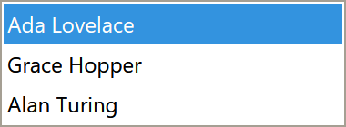
That style is where the item colours come from, and it sets eleven ItemHelper brushes — selected, hovered, disabled and the combinations. To recolour them, derive a container style rather than setting the properties on the ComboBox; a style setter on the item beats a value inherited from the box:
<ComboBox.ItemContainerStyle>
    <Style BasedOn="{StaticResource MahApps.Styles.ComboBoxItem}" TargetType="{x:Type ComboBoxItem}">
        <Setter Property="mah:ItemHelper.ActiveSelectionBackgroundBrush" Value="#2E7D32" />
    </Style>
</ComboBox.ItemContainerStyle>
ItemHelper has the full list of states.
Long lists
MahApps.Styles.ComboBox.Virtualized is the base style plus VirtualizingStackPanel.IsVirtualizing, IsVirtualizingWhenGrouping and recycling mode. The drop down virtualises without it as well, so what the key really buys is the recycling: the containers of the rows scrolled past are handed on instead of left behind, which is what stops a long list from stuttering the further it is scrolled:
<ComboBox Style="{StaticResource MahApps.Styles.ComboBox.Virtualized}"
          ItemsSource="{Binding Albums}"
          DisplayMemberPath="Title"
          IsEditable="True" />
Grouping
Grouping is WPF's own GroupStyle, and works on the virtualized style because of IsVirtualizingWhenGrouping. The headers come out styled to match the rest of the drop-down:
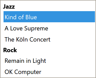
<ComboBox Style="{StaticResource MahApps.Styles.ComboBox.Virtualized}"
          ItemsSource="{Binding GroupedAlbums}"
          DisplayMemberPath="Title">
    <ComboBox.GroupStyle>
        <GroupStyle>
            <GroupStyle.HeaderTemplate>
                <DataTemplate>
                    <TextBlock Margin="4 2" FontWeight="Bold" Text="{Binding Name}" />
                </DataTemplate>
            </GroupStyle.HeaderTemplate>
        </GroupStyle>
    </ComboBox.GroupStyle>
</ComboBox>
The grouping itself is not something the ComboBox does — it comes from the bound collection being a grouped view:
var view = new CollectionViewSource { Source = this.Albums };
view.GroupDescriptions.Add(new PropertyGroupDescription(nameof(Album.Genre)));

this.GroupedAlbums = view.View;
{Binding Name} in the header template is the group key — the genre string, in this case — not a property of your item type.
Helper properties
Four helpers reach a ComboBox, and their full property tables are on their own pages: TextBoxHelper for the watermark and the button, ComboBoxHelper for the typing rules, ControlsHelper for the border and corner radius, and ItemHelper for the drop-down rows.
What the styles themselves set:
| Property | Set by | To |
|---|---|---|
TextBoxHelper.ButtonWidth |
MahApps.Styles.ComboBox |
22 |
TextBoxHelper.ButtonFontSize |
MahApps.Styles.ComboBox |
MahApps.Font.Size.Button.ClearText |
ControlsHelper.FocusBorderBrush |
MahApps.Styles.ComboBox |
MahApps.Brushes.ComboBox.Border.Focus |
ControlsHelper.MouseOverBorderBrush |
MahApps.Styles.ComboBox |
MahApps.Brushes.ComboBox.Border.MouseOver |
ComboBoxHelper.DropDownBackground |
MahApps.Styles.ComboBox |
MahApps.Brushes.ComboBox.PopupBackground |
ComboBoxHelper.DropDownBorderBrush |
MahApps.Styles.ComboBox |
MahApps.Brushes.ComboBox.PopupBorder |
eleven ItemHelper brushes |
MahApps.Styles.ComboBoxItem |
the theme's selection and hover colours |
Note the focus and mouse-over brushes are the ComboBox ones, not the TextBox ones the other input controls use.
Validation
Validation.ErrorTemplate is set to MahApps.Templates.ValidationError, so a failing rule on SelectedItem or Text is drawn the way it is on every other MahApps input control. How the popup behaves is ValidationHelper.