Two ways to put a line of text on screen, and MahApps treats them very differently: Label gets a full style and a template, TextBlock deliberately gets almost nothing.
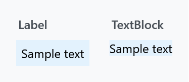
The colour and the size match, because both come from the window rather than from either style. The Label is a ContentControl and brings WPF's five units of padding with it; the TextBlock sits flush.
TextBlock
MahApps.Styles.TextBlock is empty. It has no setters at all:
<!--  never ever make a default style for TextBlock in App.xaml !!!  -->
<Style x:Key="MahApps.Styles.TextBlock" TargetType="{x:Type TextBlock}" />
That comment, capitals and all, is in Styles/Controls.TextBlock.xaml, and it is the reason there is no implicit TextBlock style. A TextBlock is not just your text — it is inside almost every control template in WPF, in combo box items, data grid cells, headers, menu items, tooltips. An implicit style reaches all of them and there is no way to scope it back out. MahApps will not do that to you, and neither should you.
So why does plain text look right without a style? Because the MetroWindow style sets two inherited values and every TextBlock under it picks them up:
Foreground |
MahApps.Brushes.ThemeForeground |
TextElement.FontSize |
MahApps.Font.Size.Content, which is 12 |
A plain Window sets neither, which is worth knowing if a dialog of yours comes out in the wrong size or colour. On develop the Windows 10 and the WinUI set bring a window style of their own, which sets 14 and the font of the set instead; Typography has it, together with the type ramps of all three looks.
To style your own text blocks, give them an x:Keyed style and apply it where you mean to. MahApps.Styles.TextBlock exists to be the BasedOn for those:
<Style x:Key="MyCaption" BasedOn="{StaticResource MahApps.Styles.TextBlock}" TargetType="{x:Type TextBlock}">
    <Setter Property="FontSize" Value="{DynamicResource MahApps.Font.Size.Default}" />
    <Setter Property="Opacity" Value="0.7" />
</Style>
The two variants

| Style | |
|---|---|
MahApps.Styles.TextBlock.Watermark |
Opacity 0.6 and IsHitTestVisible="False", so it sits behind whatever it labels without swallowing clicks |
MahApps.Styles.TextBlock.AutoCollapsing |
Opacity 0.6, FontSize from MahApps.Font.Size.FloatingWatermark, and collapses itself when Text is empty |
<TextBlock Text="{Binding Hint}" Style="{DynamicResource MahApps.Styles.TextBlock.AutoCollapsing}" />
The fourth panel above is an AutoCollapsing block with Text="" — nothing at all, not blank space, because the trigger sets Visibility="Collapsed". That is what makes it useful for optional captions: the layout closes up instead of leaving a gap.
Both are what the TextBox watermark and floating watermark are drawn with.
Label
MahApps.Styles.Label is applied implicitly by Styles/Controls.xaml, so every Label gets it. Beyond Foreground and SnapsToDevicePixels the style is one template, and what that template adds over WPF's own is four things.
Character casing
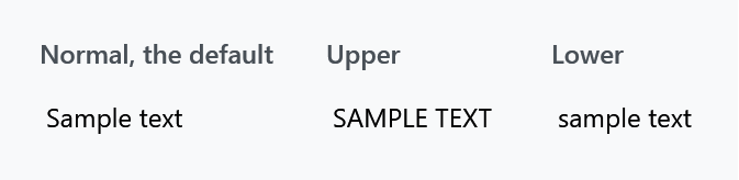
<Label Content="Sample text" mah:ControlsHelper.ContentCharacterCasing="Upper" />
Unlike the GroupBox and Expander headers, a Label is left at Normal, so this one only does something when you ask for it.
Access keys

ControlsHelper.RecognizesAccessKey defaults to True, which is what makes the underscore in Content="_Name" an access key rather than a character — WPF underlines the N while Alt is held, and Alt+N moves focus to whatever the Target points at. This is the one thing a Label does that a TextBlock cannot, and the reason to use one for form captions:
<Label Content="_Name" Target="{Binding ElementName=nameBox}" />
<TextBox x:Name="nameBox" />
Set it to False when the text is data rather than a caption and an underscore should stay an underscore.
Corners and the disabled colour
ControlsHelper.CornerRadius rounds the border the template draws, which — with a Background and a little Padding — turns a Label into a serviceable chip or badge without a control of its own:

<Label Content="Draft"
       Background="{DynamicResource MahApps.Brushes.Accent}"
       Foreground="{DynamicResource MahApps.Brushes.IdealForeground}"
       Padding="10 3"
       mah:ControlsHelper.CornerRadius="8" />
A disabled Label goes to the system grey-text colour. Note that this is one of the few places MahApps reaches for a SystemColors brush rather than a theme one, so it does not follow the accent or the light/dark base.
See ControlsHelper for the three attached properties in full.
Fonts and sizes
Styles/Fonts.xaml holds the font families and the size scale. The quick start merges it, and it has to be merged — the keys are not reachable from your own XAML otherwise.
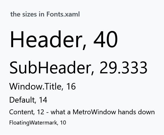
The general-purpose sizes are MahApps.Font.Size.Header (40), .SubHeader (29.333), .Window.Title (16), .Default (14), .Content (12) and .FloatingWatermark (10). The rest are per control — .Button, .Menu, .StatusBar, .Dialog.Title and so on — and are there so a control can be resized in one place rather than so you can use them directly.
<TextBlock Text="Settings" FontSize="{DynamicResource MahApps.Font.Size.SubHeader}" />
Families are MahApps.Fonts.Family.Control and .Button (Segoe UI), .Header and .Window.Title (Segoe UI Light), and MahApps.Fonts.Family.SymbolTheme, which is the Segoe MDL2 Assets icon font the library ships so the icons work on Windows versions that do not have it — see FontIcon.
MahApps sets no font family for ordinary text, only the size, so plain text uses whatever the window inherits from the system.
Which to use
Reach for a Label when the text is a caption for another control and should carry its access key, or when you want the border, background and rounded corners its template gives you. Reach for a TextBlock for everything else: it is lighter, it wraps and trims, and it is what the rest of WPF expects inside item templates.