WPF marks a control whose binding failed validation by drawing an adorner over it, and which adorner is up to Validation.ErrorTemplate. MahApps supplies one — MahApps.Templates.ValidationError — and sets it on the input controls it styles.
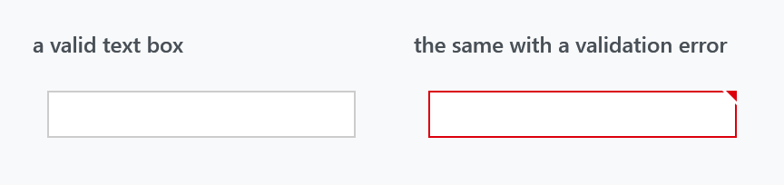
<TextBox Text="{Binding Age, ValidatesOnDataErrors=True, UpdateSourceTrigger=PropertyChanged}" />
Nothing to switch on: the template is already set. It draws two things — a border in MahApps.Brushes.Control.Validation around the control, and a small red triangle in the top-right corner, which is the handle for the message.
Which controls have it
Validation.ErrorTemplate is set to the MahApps template by the styles for TextBox, RichTextBox, PasswordBox, ComboBox, DatePicker, DateTimePicker, TimePicker, NumericUpDown, HotKeyBox, ToggleSwitch and the ColorPicker.
DataGrid is the exception, and deliberately so: its style sets Validation.ErrorTemplate to {x:Null}. A grid draws its own row-level error indicator, and an adorner per cell on top of that would be noise. See DataGrid.
Anything else — a control of your own, a CheckBox, a panel — gets WPF's default red rectangle unless you set the template yourself:
<Slider Validation.ErrorTemplate="{DynamicResource MahApps.Templates.ValidationError}" />
The popup
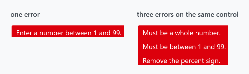
The message is not printed next to the control; it appears in a popup, and the popup is a mah:CustomValidationPopup placed to the right of the control. Five borders stacked with one-unit offsets and shrinking corner radii — MahApps.Brushes.Validation1 through Validation5 — give it its layered edge, and the text is MahApps.Brushes.Text.Validation, wrapping at 250 units.
It opens on any of three conditions, all of which also require the control to actually have an error:
| the control has keyboard focus within it | the default: tab into a bad field and the message appears |
| the pointer is over the red triangle | opt in with ValidationHelper.ShowValidationErrorOnMouseOver on the control or with ShowValidationErrorOnMouseOver on the popup, either one is enough |
ValidationHelper.AlwaysShowValidationError is on |
the message stays up whatever the focus and the pointer do |
AlwaysShowValidationError is new in develop and not in 2.4.11, and so is ValidationHelper.ShowValidationErrorOnKeyboardFocus, which is how the first row is switched off. On develop that row wants both the property on the control, True unless somebody says otherwise, and ShowValidationErrorOnKeyboardFocus on the popup.
<TextBox Text="{Binding Age, ValidatesOnDataErrors=True}"
         mah:ValidationHelper.ShowValidationErrorOnMouseOver="True" />
ValidationHelper also has CloseOnMouseLeftButtonDown, which dismisses the popup on any click.
Hover the popup itself and it fades to 15% opacity over a tenth of a second, then back when you leave. That is deliberate: the message sits to the right of the field, often over something you were about to read or click, and moving the pointer onto it gets it out of the way rather than requiring a dismissal.
Every error, not just the first
The right-hand panel above is one text box with three errors. The popup's content is an ItemsControl bound to the whole Validation.Errors collection with a DataTemplate for ValidationError, so each one gets its own line. WPF's own habit of binding to (Validation.Errors)[0] — and the debug spew that comes with it when the collection is empty — is avoided here.
Getting several errors at once takes a source that offers them. A binding stops at the first ValidationRule that fails, so rules give you one message; INotifyDataErrorInfo can return a whole list for one property, and every entry becomes a ValidationError:
public IEnumerable GetErrors(string propertyName)
{
    if (propertyName == nameof(this.Age))
    {
        if (!int.TryParse(this.Age, out var value))
        {
            yield return "Must be a whole number.";
        }
        else if (value < 1 || value > 99)
        {
            yield return "Must be between 1 and 99.";
        }
    }
}
<TextBox Text="{Binding Age, ValidatesOnNotifyDataErrors=True, UpdateSourceTrigger=PropertyChanged}" />
The popup grows with the list, so a control with a long set of rules is worth collapsing into one message rather than five.
Restyling it
MahApps.Templates.ValidationError is a keyed ControlTemplate, so the whole adornment can be replaced at once by defining that key again after the MahApps dictionaries:
<ControlTemplate x:Key="MahApps.Templates.ValidationError">
    <AdornedElementPlaceholder>
        <Border BorderBrush="{DynamicResource MahApps.Brushes.Control.Validation}" BorderThickness="2" />
    </AdornedElementPlaceholder>
</ControlTemplate>
For a change of colour only, the six brushes are enough: MahApps.Brushes.Control.Validation for the border, Validation1 to Validation5 for the popup's layers, and MahApps.Brushes.Text.Validation for the message.
The template also reads ControlsHelper.CornerRadius from the adorned control and rounds its top-right corner to match, so a rounded text box keeps its shape when it goes red.
Related
TextBox, ComboBox and DatePicker are the controls that carry the template; ValidationHelper has the switches.