Three implicit styles cover a ListView: the list, its rows, and the column headers a GridView puts above them. Styles/Controls.xaml applies all three.
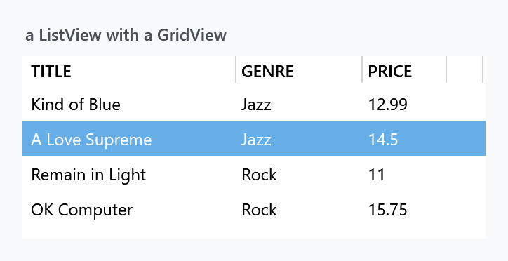
<ListView ItemsSource="{Binding Albums}">
    <ListView.View>
        <GridView>
            <GridViewColumn Width="150" Header="Title" DisplayMemberBinding="{Binding Title}" />
            <GridViewColumn Width="90" Header="Genre" DisplayMemberBinding="{Binding Genre}" />
            <GridViewColumn Width="60" Header="Price" DisplayMemberBinding="{Binding Price}" />
        </GridView>
    </ListView.View>
</ListView>
| Style | |
|---|---|
MahApps.Styles.ListView |
the implicit one |
MahApps.Styles.ListViewItem |
the implicit row style |
MahApps.Styles.GridViewColumnHeader |
the implicit header style |
MahApps.Styles.ListView.Virtualized |
the same list with recycling virtualisation |
MahApps.Styles.ListViewItem.NonSelectable |
rows that cannot be selected |
Everything about the row states — the two selection colours, hover, disabled — works exactly as it does on a ListBox, through the same ItemHelper brushes, with the same defaults. That page has the detail; only what is different here is below.
Column headers
The headers are upper-cased. MahApps.Styles.GridViewColumnHeader sets ControlsHelper.ContentCharacterCasing to Upper and the weight to SemiBold, so Header="Title" comes out as TITLE. Set the casing back if you would rather it did not:
<GridViewColumn Header="Title">
    <GridViewColumn.HeaderContainerStyle>
        <Style BasedOn="{StaticResource MahApps.Styles.GridViewColumnHeader}" TargetType="{x:Type GridViewColumnHeader}">
            <Setter Property="mah:ControlsHelper.ContentCharacterCasing" Value="Normal" />
        </Style>
    </GridViewColumn.HeaderContainerStyle>
</GridViewColumn>
The header content sits in a mah:ContentControlEx, which is what makes the casing work, and a Thumb on the right edge is the resize gripper.
The list's own template wraps everything in MahApps.Styles.ScrollViewer.GridView rather than the ordinary scroll viewer — that is the one that keeps the header row in place while the rows scroll under it. See ScrollBar.
Dragging a column into another place
Dragging a header shows a line where the column would land. WPF draws that line navy and gives you no say in it, which on a dark theme is a navy line on a dark ground.
New on develop. The template uses GridViewHeaderRowPresenterEx rather than WPF's own presenter, which colours the line with ItemHelper.GridViewHeaderIndicatorBrush. The list style sets it to the accent, and setting it on the ListView is how you pick another colour.
<ListView mah:ItemHelper.GridViewHeaderIndicatorBrush="{DynamicResource MahApps.Brushes.Gray2}" />
In 2.4.11 the line is navy and stays navy.
Pixel scrolling by default
In a released version a ListView does not virtualise at all. 2.4.11 sets ScrollViewer.CanContentScroll to False on MahApps.Styles.ListView, where ListBox sets it to True, so the list scrolls by pixel, which is smooth and right for rows of differing heights, and every row is realised up front. On develop that setter is True and a list view virtualises the way a list box does.
MahApps.Styles.ListView.Virtualized is worth having either way. In the released version it is what turns virtualisation on at all; on develop it is what makes the containers recycle, since VirtualizationMode stays at Standard until something sets it on the list itself:
<ListView Style="{StaticResource MahApps.Styles.ListView.Virtualized}" ItemsSource="{Binding ManyRows}" />
The rest of the list style is the same as the ListBox one: BorderThickness 0 with BorderBrush on ThemeForeground, ControlsHelper.CornerRadius on the border, both scrollbars Auto.
A rounded corner is bitten out at the top for the same reason it is on a ListBox — the template root is a plain Border and the opaque item background covers the arc. That page has the two workarounds.
Rows that cannot be selected
MahApps.Styles.ListViewItem.NonSelectable is for a grid that only displays. It drops the selection triggers, sets IsTabStop to False and leaves one hover colour:
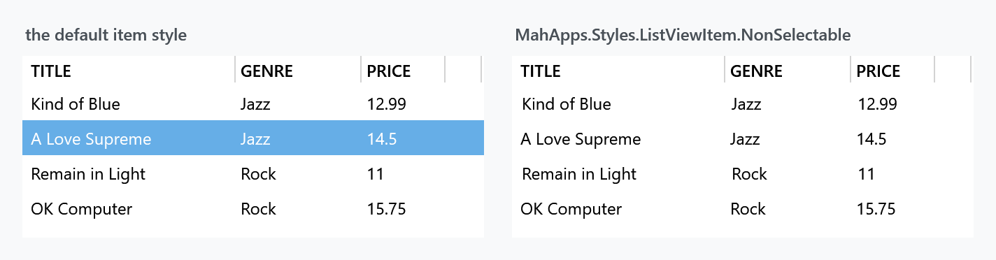
<ListView ItemContainerStyle="{StaticResource MahApps.Styles.ListViewItem.NonSelectable}" />
Two things about this style are worth knowing before you reach for it.
Its hover colour is the literal #e0eff8 — a pale blue written into the template rather than a theme brush. Under the dark base theme it stays pale blue.
It also carries AlternationIndex triggers meant to shade every other row, and they point at AlternateRow1BackgroundBrush and AlternateRow2BackgroundBrush — resource keys that do not exist anywhere in MahApps.Metro v2. They are v1.x names that survived the rename. The DynamicResource finds nothing, so the rows are not striped.
Both are already fixed in develop and will arrive with the next release: MahApps.Styles.ListViewItem.NonSelectable is now based on MahApps.Styles.ListViewItem and uses theme brushes throughout, which removes the hardcoded colour and the two dead keys along with the triggers that used them.
Striping the rows
AlternationCount is 2 on the list style, so the index is being counted for you — the ordinary row style simply has no trigger reading it. Two routes get you stripes:

The middle panel adds a trigger of its own, which is the one to use — it works today and after the fix above:
<ListView.ItemContainerStyle>
    <Style BasedOn="{StaticResource MahApps.Styles.ListViewItem}" TargetType="{x:Type ListViewItem}">
        <Style.Triggers>
            <Trigger Property="ItemsControl.AlternationIndex" Value="1">
                <Setter Property="Background" Value="{DynamicResource MahApps.Brushes.Gray8}" />
            </Trigger>
        </Style.Triggers>
    </Style>
</ListView.ItemContainerStyle>
The right-hand panel is the non-selectable style with the two missing keys defined, which brings its own triggers to life and is what pins the diagnosis:
<ListView.Resources>
    <SolidColorBrush x:Key="AlternateRow1BackgroundBrush" Color="Transparent" />
    <SolidColorBrush x:Key="AlternateRow2BackgroundBrush" Color="{StaticResource MahApps.Colors.Gray8}" />
</ListView.Resources>
That second route stops working once the fix ships, since the triggers go with it. Prefer the first.
Pick the grey with care. MahApps.Brushes.Gray10 is the obvious-looking choice and it is #F7F7F7 under the light theme — eight steps off white, which is invisible on most screens. Gray8 is #E0E0E0 and reads as a stripe, and it inverts sensibly in the dark theme, where it is #454545.
Note in the middle panel that the selected row keeps its selection colour: Background is what the trigger sets, and the selection brushes are applied on top of it by the template.
Related
ListBox is the same list without columns, and DataGrid is the editable, sortable one — reach for that when the rows are data rather than a list of things.