Version 1.6.1
13 Mar 2018As part of this release we had 4 commits which resulted in 2 issues being closed.
Bugs
Where to get it
You can download this release from MahApps.Metro

As part of this release we had 4 commits which resulted in 2 issues being closed.
Bugs
You can download this release from MahApps.Metro
As part of this release we had 362 commits which resulted in 153 issues being closed.
Features / Changes / Improvements (most interesting)
MahApps.Metro.Styles.MetroWatermarkTextBlock style to make it easier to set custom properties like FontFamily or FontSize for all Watermarks.WindowChrome and related things with reference to ControlzEx #3021
NumericUpDown
SnapToMultipleOfInterval property for NumericUpDown which indicates if the NumericUpDown should round the value to the nearest possible interval when the focus moves to another element. #2952 @xxMUROxx
NumericInputMode property with the new flag enumeration NumericInput (default is NumericInput.All)HasDecimals as obsoleteNumericUpDown, HotKeyBox and TimerPickerBase doesn’t focus for the first time when the FocusManager will be used.ComboBox via resource keys
ComboBoxBorderThemeThickness (default 1)ComboBoxPopupBorderThemeThickness (default 1)ComboBoxPopupBorderThemePadding (default 1)GroupBox and Expander via resource keys
GroupBoxHeaderThemePadding (default 4)ExpanderHeaderThemePadding (default 2)ExpanderToggleButtonEllipseThemeSize (default 18)Badged control has now a different look when disabled. thx @xxMUROxx
MahApps.Metro.Brushes.Badged.DisabledBackgroundBrush
Watermark
TextBoxHelper.Watermark for HotKeyBox instead own DependencyProperty (marked as obsolete).TextBoxHelper.AutoWatermark for HotKey DependencyProperty of HotKeyBox.TextBoxHelper.WatermarkTrimming attached property to set the text trimming behavior to employ when (floating) watermark overflows the content area. thx to @amkuchta
TextBoxHelper.WatermarkWrapping attached property (only for TextBox) to set how the watermark should wrap text. Default is binded to TextWrapping property. thx to @amkuchta
VS Theme
StandardGroupBox styleStandardExpander styleTabControlHelper
TabControlHelper.CloseButtonEnabled attached property to show / hide the close button (default is true).TabControlHelper.CloseTabCommand attached property which executes if the TabItem will be closed.TabControlHelper.CloseTabCommandParameter attached property which will be passed to the CloseTabCommand.TextBoxHelper.ButtonsAlignment support for PasswordBox styles #3074 @waleswood
MetroHeader control which can contains any other content and can display a header on top of this content.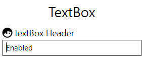
  <Controls:MetroHeader Margin="2" Header="TextBox Header">
      <Controls:MetroHeader.HeaderTemplate>
          <DataTemplate>
              <StackPanel VerticalAlignment="Center" Orientation="Horizontal">
                  <iconPacks:PackIconMaterial VerticalAlignment="Center" Kind="FaceProfile" />
                  <TextBlock Margin="2 0 0 0"
                             VerticalAlignment="Center"
                             Text="{Binding}" />
              </StackPanel>
          </DataTemplate>
      </Controls:MetroHeader.HeaderTemplate>
      <TextBox Text="Enabled" />
  </Controls:MetroHeader>
ScrollViewerHelper class
IsHorizontalScrollWheelEnabled attached property. If it’s set to true and a horizontal ScrollBar is visible then the mouse wheel scrolls to left and right.VerticalScrollBarOnLeftSide attached property from ScrollBarHelper to ScrollViewerHelper. ScrollBarHelper is now marked as obsolete.FlatButtonForegroundBrush in the new MahApps.Metro.Styles.FlatButtonFocusVisualStyle which is used now for MetroFlatButton and MetroFlatToggleButton
PasswordBoxHelper
RevealButtonContent and RevealButtonContentTemplate attached propertiesDefaultRevealButtonIcon ContentControl to RevealButtonContent attached propertyMahApps.Metro.Styles.WindowButton.Close.Light.Win10 and MahApps.Metro.Styles.WindowButton.Close.Dark.Win10 styles


ItemHelper class with some Brush attached properties for mouse interaction. These properties can be used with HamburgerMenuItem, ListBoxItem, ListViewItem, TreeViewItem and ComboBoxItem.
ItemHelper.ActiveSelectionBackgroundBrush default AccentColorBrush
ItemHelper.ActiveSelectionForegroundBrush default AccentSelectedColorBrush
ItemHelper.DisabledBackgroundBrush default x:Null
ItemHelper.DisabledForegroundBrush default GrayNormalBrush
ItemHelper.DisabledSelectedBackgroundBrush default GrayBrush7
ItemHelper.DisabledSelectedForegroundBrush default AccentSelectedColorBrush
ItemHelper.HoverBackgroundBrush default AccentColorBrush3
ItemHelper.HoverSelectedBackgroundBrush default AccentColorBrush
ItemHelper.SelectedBackgroundBrush default AccentColorBrush2
ItemHelper.SelectedForegroundBrush default AccentSelectedColorBrush
ToggleSwitch
ContentPadding dependency property to change the padding of the inner content in an easy way.HamburgerMenu
HamburgerListBoxItemStyle -> HamburgerMenuItemStyle
HamburgerListBoxStyle -> HamburgerMenuListStyle
UWPCommunityToolkit style (update template to keep options visible)
HamburgerMenuTemplate resource dictionaryItemContainerStyle and OptionsItemContainerStyle properties. This makes it easier to change the inner styles for the items (and option items)0
HamburgerMenuImageItem: Downgrade thumbnail property from BitmapImage to subclass ImageSource
ItemInvoked event (as an alternative to ItemClick and OptionsItemClick)SelectionIndicator (rectangle) which can be enabled with the new ShowSelectionIndicator dependency property
HamburgerMenuSelectionIndicatorThemeWidth default 6
HamburgerMenuSelectionIndicatorThemeHeight default 24
FocusVisualStyle
ItemFocusVisualStyle dependency property which will be re-created if one of these properties are changed: OpenPaneLength, CompactPaneLength and IsPaneOpen. Default template is HamburgerMenuItemFocusVisualTemplate.HamburgerMenuItem style by setting the FocusVisualStyle property.HamburgerMenu resources to Control styles to allow style manipulation and fix binding expression infosPanePlacement handling for right alignedToolTip DependencyProperty for HamburgerMenuItem


Dialogs
MahApps.Metro.Styles.MetroDialog and set this as defaultBaseMetroDialog resources to Control styles to allow easier dialog style manipulationProgressDialogController.SetProgressBarForegroundBrush(Brush) so that you can customize a progress dialog’s progress bar foreground Brush.MetroWindow (Dialogs)
IsAnyDialogOpen dependency property. This property will be updated if a dialog is shown or not.OwnerCanCloseWithDialog property at MetroDialogSettings which can be used to handle how the owner of the dialog can be closed.IsCloseButtonEnabledWithDialog property at MetroWindow which indicates if the close button should be enabled or not if a dialog is shown.HandleOverlayOnHide and HandleOverlayOnShow methods sets the IsCloseButtonEnabledWithDialogPropertyKey and restores focus if neededOverlayFadeIn and OverlayFadeOut properties to set/override the overlay fade in/out Storyboards which are used for the Dialogs
HideMetroDialogAsync fails sometimes to close dialog (async call order)Slider style: MahApps.Metro.Styles.Slider.Win10
MahApps.Metro.Styles.Slider.HorizontalTemplate.Win10, MahApps.Metro.Styles.Slider.VerticalTemplate.Win10
MahApps.Metro.Styles.Slider.HorizontalTrack.Win10, MahApps.Metro.Styles.Slider.VerticalTrack.Win10
MahApps.Metro.Styles.Slider.Thumb.Win10

Slider style: MahApps.Metro.Styles.Slider (mark old as obsolete)
MahApps.Metro.Styles.Slider.HorizontalTemplate, MahApps.Metro.Styles.Slider.VerticalTemplate
MahApps.Metro.Styles.Slider.HorizontalTrack, MahApps.Metro.Styles.Slider.VerticalTrack
MahApps.Metro.Styles.Slider.Thumb
RangeSlider style: MahApps.Metro.Styles.RangeSlider.Win10
MahApps.Metro.Styles.RangeSlider.HorizontalTemplate.Win10, MahApps.Metro.Styles.RangeSlider.VerticalTemplate.Win10
MahApps.Metro.Styles.Slider.HorizontalTrack.Win10, MahApps.Metro.Styles.Slider.VerticalTrack.Win10
MahApps.Metro.Styles.Slider.Thumb.Win10, MahApps.Metro.Styles.RangeSlider.HorizontalMiddleThumb.Win10, MahApps.Metro.Styles.RangeSlider.VerticalMiddleThumb.Win10
RangeSlider style: MahApps.Metro.Styles.RangeSlider
SliderHelper brush properties also for RangeSlider
MahApps.Metro.Styles.RangeSlider.HorizontalMiddleThumb, MahApps.Metro.Styles.RangeSlider.VerticalMiddleThumb
MetroThumb instead Thumb
ReservedSpace for all TickBar controls instead Margin
SliderHelper: Add new attached properties for all possible Brushes
SliderHelper.EnableMouseWheel and SliderHelper.ChangeValueBy for RangeSlider too.Slider brushes
SliderHelper.ThumbFillBrush default AccentBaseColorBrush
SliderHelper.ThumbFillHoverBrush default GrayBrush3
SliderHelper.ThumbFillPressedBrush default AccentBaseColorBrush
SliderHelper.ThumbFillDisabledBrush default GrayBrush1
SliderHelper.TrackFillBrush default GrayBrush2
SliderHelper.TrackFillHoverBrush default AccentBaseColorBrush
SliderHelper.TrackFillPressedBrush default GrayBrush6
SliderHelper.TrackFillDisabledBrush default GrayBrush3
SliderHelper.TrackValueFillBrush default AccentBaseColorBrush
SliderHelper.TrackValueFillHoverBrush default GrayBrush6
SliderHelper.TrackValueFillPressedBrush default GrayBrush6
SliderHelper.TrackValueFillDisabledBrush default GrayBrush6
Slider brushes
SliderHelper.ThumbFillBrush default GrayBrush2
SliderHelper.ThumbFillHoverBrush default GrayBrush3
SliderHelper.ThumbFillPressedBrush default AccentColorBrush
SliderHelper.ThumbFillDisabledBrush default GrayBrush5
SliderHelper.TrackFillBrush default GrayBrush3
SliderHelper.TrackFillHoverBrush default AccentColorBrush
SliderHelper.TrackFillPressedBrush default GrayBrush2
SliderHelper.TrackFillDisabledBrush default GrayBrush3
SliderHelper.TrackValueFillBrush default AccentColorBrush
SliderHelper.TrackValueFillHoverBrush default GrayBrush6
SliderHelper.TrackValueFillPressedBrush default GrayBrush6
SliderHelper.TrackValueFillDisabledBrush default GrayBrush6
DatePicker
ControlsHelper.IsReadOnly. This property sets the IsReadOnly property on the inner TextBox and the IsEnabled on the inner popup button.Strong naming
MahApps will no longer be strong-named beginning with this version. #3029
Why?
Strong-named assemblies are only useful in some rare scenarios. If you need strong-named assembly then you can compile the source by yourself ore use the Strong Namer from Daniel Plaisted @dsplaisted or Strong-Name Signer from Werner van Deventer @brutaldev.
More informations about the reason of this decision can be found here:
Commits without PRs/Issues
SpellCheck.IsEnabled changes from MaterialDesignInXamlToolkit @ButchersBoy #650 Removes the extra hidden classes and enables flexible style changes, it’s more WPF now.CalendarDayButton and CalendarButton from Calendar.MetroProgressBar
MetroProgressBar does not work inside ControlTemplateGlowWindowBehavior
ResizeBorderThickness must also be set to 0 on maximizePropertyChangeNotifier from ControlzEx
ResizeBorderThickness as it’s handled by ControlzEx
ComboBoxItem, if a ComboBox is inside a ContentControl.FlipView: Bind ItemStringFormat to ContentStringFormat
TimePicker and DateTimePicker after changing the cultureDialogTitleFontSize and DialogMessageFontSize via DynamicResource at the base MetroDialog styleHorizontalScrollBarVisibility and VerticalScrollBarVisibility for HotKeyBox and NumericUpdDown to Hidden, cause the inner TextBox has this as default tooSlider: remove linear gradient brush from horizontal and vertical track value style. RangeSlider: fix margin of the middle thumb.Bugs
Features
Feature Requests
You can download this release from MahApps.Metro
OwningWindow will be used if available to detect the theme. #2840
DateTimePicker when the time is cleared if a date is selected #2837
HamburgerMenu changes and improvements
HamburgerMenuIconItem helper class which can be used to put any object icon to the menu item.ItemCommand and OptionsItemCommand
Command for HamburgerMenuItem
PaneForeground for HamburgerMenu and Splitview and new Foreground/Background brushes MahApps.Metro.HamburgerMenu.PaneBackgroundBrush, MahApps.Metro.HamburgerMenu.PaneForegroundBrush
VerticalScrollBarOnLeftSide to show the vertical scrollbar on the left sideHamburgerVisibility property UWPCommunityToolkit #1020
Content for HamburgerMenu only if one of the inner ListBox controls has a selected item.HamburgerMenuHeaderTemplate property to set a header right of the HamburgerMenu button. @SilverDragon135 #2917
ICommandSource and handle Command binding change to hook or unhook command executable.
MahApps.Metro.Styles.HamburgerMenu style key to the HamburgerMenu.ShowInTaskbar = false, when double click on the title bar of a minimized window, the window will be restored instead of maximized. #2854 @hausenism
MetroTabItem #2803
Badged control. Thx to @ButchersBoy
ControlsHelper.CornerRadius can now used for SplitButton and DropDownButton.TabControl and MetroTabControl #2902
Underlined attached property to TabControlHelper which controls the type of the underline type. The old IsUnderlined property is now obsolete.
  /// <summary>
  /// Specifies the underline position of a TabControl.
  /// </summary>
  public enum UnderlinedType
  {
  None, // nothing
  TabItems, // the old behavior with `IsUnderlined="True"`
  SelectedTabItem, // selected TabItem underlined + underline hover effect for unselected items
  TabPanel // underlined TabPanel and selected/hovered TabItem
  }
Brush attached properties to enable easy changing the underline brushes.
  TabControlHelper.UnderlineBrush
  TabControlHelper.UnderlineSelectedBrush
  TabControlHelper.UnderlineMouseOverBrush
  TabControlHelper.UnderlineMouseOverSelectedBrush

AnimatedTabControl and AnimatedSingleRowTabControl styles and for MetroAnimatedTabControl and MetroAnimatedSingleRowTabControl #2905
AnimatedSingleRowTabControl styles
ClearTypeHint and wrong Margin for ComboBox and ComboBoxItem #2903
ListView style issues
CheckBox
Flyout changes and improvements
Flyout modal usage. All title bar commands are now hidden if a Flyout is modal.Flyout if user changes theme on the fly. #2337 The Flyout has a different background, so we should override some background and foreground brushes and colors.Flyout from ContentControl to HeaderedContentControl which has the correct properties for headers.Border for Flyout
GrayBrush7 and WhiteBrush for menu Separator instead fixed colors.DropDownButton. Don’t set ItemTemplateto ContentTemplate, ItemTemplateSelector to ContentTemplateSelector and ItemStringFormat to ContentStringFormat. This breaks the whole usage of the content stuff and shows a BindingExpression path error. #2883
UsernameCharacterCasing property for LoginDialogSettings #2683
SelectionChanged event of SplitButton which fires now only once.TransitionCompleted event to MetroContentControl and WindowTransitionCompleted event to MetroWindow which will be fired after the loaded Storyboard is completed.WatermarkAlignment attached property to TextBoxHelper which indicates the horizontal alignment of the watermark (incl. floating watermark).
DataGridHelper with EnableCellEditAssist attached property which enabled direct editing for CheckBox and ComboBox cells. (default to false) Thx to @ButchersBoy (taken from MaterialDesignInXamlToolkit)HotKeyBox (thx @thoemmi)ButtonHelper.PreserveTextCase, ButtonHelper.CornerRadius and ControlsHelper.ButtonWidth
SelectedDate is set to the DisplayDate if the SelectedDate is DateTime.MinValue. This issue appears when binding to a property of DateTime and the date is DateTime.MinValue.MetroWindow is ignoring the Taskbar and maximized. This fix and the main Taskbar z-Order issue only happens with Windows 10 anniversary update 1607. Hopefully fixed in the future. #2780
FlyoutsControl
TopMost issue: If the window is top most and you switch to another window the top most will be gone.IconScalingMode to MetroWindow. It’s forwarded to MultiFrameImage.MultiFrameImageMode to set the icon scaling.
MultiFrameImageMode.ScaleDownLargerFrame
MultiFrameImageMode.NoScaleSmallerFrame
DateTimePicker and TimePicker #2710
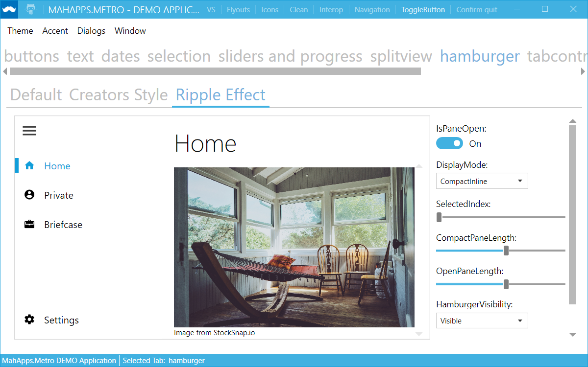
DateTimePicker.SelectedDate to BindsTwoWayByDefault. The reason is that we do not have to use Mode=TwoWay explicit, and DatePicker.SelectedDate has BindsTwoWayByDefault too.null but 00:00:00 and 0001.01.01 00.00.00 respectivelyTimePicker #2700 (@p76984275)DateTimePicker and TimePicker on lost focus. Fix also Shift+Tab focus moving.SplitView and HamburgerMenu control #2704
SplitView source comes from the UniversalWPF GitHub repo (from @dotMorten) with some changes from @Evangelink and @punker76.HamburgerMenu source comes from the UWPCommunityToolkit GitHub repo.
MetroWindow to set the brush and opacity for the overlay if a dialog is shown.
OverlayBrush sets the brush used for the dialog overlay.OverlayOpacity sets the opacity used for the dialog overlay (0 = disabled, 1 = full overlay).TextBox’s with the styles MetroButtonTextBox and SearchMetroTextBox can now use the button also if IsReadOnly="True" (only if the button command is set)AutoWatermark attached property at TextBoxHelper #2722 (@xxMUROxx) which is able to get the DisplayAttribute from the bound property in following cases:
"{Binding Path=Property}""{Binding Path=Property.SubProperty}""{Binding Path=CollectionProperty}""{Binding Path=CollectionProperty[0].SubProperty}""{Binding Path=CollectionProperty[0]}"TextBox, ComboBox, NumericUpDown, DatePicker, TimePicker and DateTimePicker
Flyout changes for better Margin usage
FlyoutsControl actual width and a Margin for the Flyout
Margin or HorizontalContentAlignemnt for Left/Right and VerticalContentAnlignment for Top/Bottom Flyout.
Margin="200 30 0 0" and Position="Right" Flyout with left an top MarginHorizontalContentAlignment="Stretch" and Position="Right" Flyout which covers the whole windowButton (ButtonBase) -> MahApps.Metro.Styles.MetroButton
ToggleButton -> MahApps.Metro.Styles.MetroToggleButton
Expander closing animation and make it possible to change both animations (expand and collapse). #2769 (@ Alkalinee)TabControl and TabItem style for VS #2768
TextBox ContextMenu changes #2772, #2758 by @Deadpikle
  + If you want to use your own context menu items with the spell checker items then you must do this
  ```xaml
  <TextBox Margin="{StaticResource ControlMargin}"
          Controls:TextBoxHelper.IsSpellCheckContextMenuEnabled="True"
          Text="Enabled">
      <TextBox.ContextMenu>
          <ContextMenu>
              <MenuItem Header="This is only a Test-Item" />
          </ContextMenu>
      </TextBox.ContextMenu>
  </TextBox>
```
CustomDialog improvements #2775
ShowMetroDialogAsync to create and show custom dialogs (self created dialogs which are inherited from CustomDialog)
```csharp
// create and show a new custom dialog of the given type with the default dialog settings
var customBaseMetroDialog = await this.ShowMetroDialogAsync// create and show a new custom dialog of the given type with own settings
var customBaseMetroDialog = await this.ShowMetroDialogAsync
  + Better handling for dialogs settings also with the already available `ShowMetroDialogAsync` method
  ```csharp
  // create and show custom dialog with default settings
  await this.ShowMetroDialogAsync(new CustomBaseMetroDialog());

  // create and show custom dialog with own settings
  await this.ShowMetroDialogAsync(new CustomBaseMetroDialog(this.metroDialogSettings));
  // or
  await this.ShowMetroDialogAsync(new CustomBaseMetroDialog(this, this.metroDialogSettings));
  protected override MetroDialogSettings ConfigureSettings(MetroDialogSettings settings)
  {
  return new MyCustomDialogSettings();
  }
  ```csharp
  namespace ShowMetroDialogAsyncIssue
  {
      using System.Windows;
      using MahApps.Metro.Controls;
      using MahApps.Metro.Controls.Dialogs;

      public partial class CustomBaseMetroDialog : CustomDialog
      {
          public CustomBaseMetroDialog()
          {
              InitializeComponent();
          }

          public CustomBaseMetroDialog(MetroDialogSettings settings) : base(settings)
          {
              InitializeComponent();
          }

          public CustomBaseMetroDialog(MetroWindow parentWindow, MetroDialogSettings settings) : base(parentWindow, settings)
          {
              InitializeComponent();
          }

          private void Close_OnClick(object sender, RoutedEventArgs e)
          {
              (this.OwningWindow ?? (MetroWindow)Application.Current.MainWindow).HideMetroDialogAsync(this);
          }
      }
  }
DateTimePicker and TimePicker controls #2299 #2510 (@xxMUROxx)HotKeyBox #2322 (@thoemmi)LoginDialog #2308 #2305 (@manekovskiy)IconPacks for MahApps: PackIconMaterial, PackIconModern, PackIconFontAwesome and PackIconEntypo #2328 availabe at MahApps.Metro.IconPacks<iconPacks:PackIconMaterial Kind="EmoticonCool" Height="32" Width="32" /><iconPacks:PackIconModern Kind="Cupcake" Height="24" Width="24" /><iconPacks:PackIconFontAwesome Kind="FontAwesome" Height="16" Width="16" /><iconPacks:PackIconEntypo Kind="ThumbsUp" />
Auto Close feature for Flyout #2228 #1710 (@Sikta)
IsAutoCloseEnabled to trueAutoCloseInterval (default 5000 ms)PasswordBoxBindingBehavior and IsWaitingForData #2355
StylizedBehaviors should be detached on unloadPasswordBoxBindingBehavior, it doesn’t work e.g. in TabControl TabItemsIsWaitingForData for MetroButtonTextBox, MetroPasswordBox, MetroButtonPasswordBox, MetroButtonRevealedPasswordBox
Eye and ClearTextButton feature for MetroButtonRevealedPasswordBox
ContentStringFormat TemplateBinding to ToolTip #2359 (@nrpog) #2363ControlsHelper.ButtonWidth for ComboBox and other stuff #2365
ChromelessButtonStyle Padding to 0ButtonContentTemplate in TextBoxHelper
IsPressed, IsMouseOver)MetroComboBoxDropDownToggleButtonStyle for ComboBox toggle buttonEllipseDiameterScale to ProgressRing #2204 #2382 (@petvetbr)WindowButtonCommands enhancements #2378
MahApps.Metro.Styles.WindowButtonCommands.Win10 and MahApps.Metro.Templates.WindowButtonCommands.Win10

Flyouts and NumericUpDown #2381 #2166 (@petvetbr)DialogTitleFontSize and DialogMessageFontSize
TextButton in TextBoxHelper which handles the visibility of the button in MetroButtonPasswordBox and MetroButtonTextBoxstyles #2387ToggleSwitch and ToggleSwitchButton #2410
ToggleSwitch is now inherited from HeaderedContentControl
HeaderFontFamily for ToggleSwitch
MahApps.Metro.Styles.ToggleSwitchButton.Win10, MahApps.Metro.Styles.ToggleSwitch.Win10
MahApps.Metro.Styles.ToggleSwitchButton, MahApps.Metro.Styles.ToggleSwitch
ToggleSwitchFontFamily.Win10, ToggleSwitchHeaderFontFamily.Win10
ToggleSwitchFontSize.Win10, ToggleSwitchHeaderFontSize.Win10
IsPressed stateMahApps.Metro.Brushes.ToggleSwitchButton.PressedBrush.Win10MahApps.Metro.Brushes.ToggleSwitchButton.OffBorderBrush.Win10MahApps.Metro.Brushes.ToggleSwitchButton.OffMouseOverBorderBrush.Win10MahApps.Metro.Brushes.ToggleSwitchButton.OffDisabledBorderBrush.Win10MahApps.Metro.Brushes.ToggleSwitchButton.OffSwitchBrush.Win10MahApps.Metro.Brushes.ToggleSwitchButton.OnSwitchBrush.Win10MahApps.Metro.Brushes.ToggleSwitchButton.OnSwitchDisabledBrush.Win10MahApps.Metro.Brushes.ToggleSwitchButton.OnSwitchMouseOverBrush.Win10MahApps.Metro.Brushes.ToggleSwitchButton.ThumbIndicatorBrush.Win10MahApps.Metro.Brushes.ToggleSwitchButton.ThumbIndicatorMouseOverBrush.Win10MahApps.Metro.Brushes.ToggleSwitchButton.ThumbIndicatorCheckedBrush.Win10MahApps.Metro.Brushes.ToggleSwitchButton.ThumbIndicatorPressedBrush.Win10MahApps.Metro.Brushes.ToggleSwitchButton.ThumbIndicatorDisabledBrush.Win10
AccentBaseColor and AccentBaseColorBrush (full color)Flyout changes
CloseCommandParameter dependency propertyFlipView changes
MouseOverGlowEnabled is now obsolete, use MouseHoverBorderEnabled insteadMouseHoverBorderBrush and MouseHoverBorderThickness dependency propertyCircularNavigation for the FlipView #2389BindsTwoWayByDefault removed from IsActiveProperty of ProgressRing #2438 (@xxMUROxx)Caliburn.Micro sampleTile control: HorizontalTitleAlignment and VerticalTitleAlignment #2293TextBoxHelper.ButtonFontSize #2345 Also add a new font size ClearTextButtonFontSize (default to 16) for all ‘ClearText’ buttonsMetroFlatToggleButton style like MetroFlatButton #2481 (@Koopakiller)MetroThumbContentControl for MetroWindow title #2487
TitleCaps with TitleCharacterCasing (marked as obsolete). Now title can be Upper, Lower or Normal
MahApps.Metro.Styles.ContentControlEx and MahApps.Metro.Styles.MetroThumbContentControl
Flyout improvement caused by #2485 #2523
ContentControlEx for header, so it’s now possible to use ControlsHelper attached properties ContentCharacterCasing, HeaderFontSize, HeaderFontWeight and HeaderFontStretch
ControlsHelper.HeaderMargin to handle the Margin from Flyout sideShowDialogsOverTitleBar for `MetroWindow? which allows showing title bar while showing dialogs (fixes #2109) #2534 (@Deadpikle)ShowModalInputExternal, ShowModalLoginExternal and ShowModalMessageExternal. #2518 (@adeniltonbs)NonActiveWindowTitleColorBrush and NonActiveBorderColorBrush
ArrowMouseOverBrush, ArrowPressedBrush
ContentTemplate, ContentTemplateSelector and ContentStringFormat for DropDownButton, if this proeprties are empty DropDownButton will be use the ItemXYZ propertiesprotected virtual void SetContextMenuPlacementTarget(ContextMenu contextMenu) to DropDownButtonMahApps.Metro.Styles.MetroCircleButtonStyleMahApps.Metro.Styles.MetroCircleToggleButtonStyleMahApps.Metro.Styles.MetroCircleFocusVisualTextBoxHelper.SelectAllOnFocus="True" #2307 (@sachokFoX)RangeSlider for lower and upper value tooltip #1833 (@Alkalinee)MetroListBoxItem #1892 (@ye4241)WaitUntilUnloadedAsync for custom dialogs #1910 #1910 (@IsNull)Culture dependency property for NumericUpDown #1874 (@panastas91)WindowCommands height span now the entire height of the title bar #1902 (@Dotnetifier)FontSize in Dialogs is now changeable #1941Dialog:DialogParticipation.Register="{Binding}"
IDialogCoordinator / DialogCoordinator.Instance to launch dialogs from inside a VMToggleSwitch improvements and fixes #1945
ToggleSwitchButtonStyle and style key MetroToggleSwitchButton
BorderThickness and BorderBrush for toggle button style now customizableToggleSwitchFontFamily and ToggleSwitchHeaderFontFamily
ToggleSwitchFontSizeand ToggleSwitchHeaderFontSize
OnSwitchBrush and OffSwitchBrush
ThumbIndicatorBrush and ThumbIndicatorDisabledBrush
ThumbIndicatorWidth
Validation.ErrorTemplate support #1917ToggleSwitch itself or the toggle button was clickedCheckChangedCommand, CheckedCommand and UnCheckedCommand
CheckChangedCommandParameter, CheckedCommandParameter and UnCheckedCommandParameter
ComboBoxHelper attached properties MaxLength and CharacterCasing #1949 #1948ButtonStyle dependency property and new style key ButtonDropDownStyle for the defaultArrowBrush and ArrowVisibility dependency propertiesMenuStyle dependency propertyIconTemplate dependency propertyComboBox where IsEditable="False" #1958 #1953SelectAllOnFocus dependency property for NumericUpDown (with default to true like ComboBox does)NumericUpDown up and down buttons #1962 (@Prophetebe)ButtonStyle, ButtonArrowStyle dependency properties and new style keys ButtonSplitStyle, ButtonSplitArrowStyle
ArrowBrush and ArrowVisibility dependency propertiesListBoxStyle dependency propertyIconTemplate dependency propertyMahApps #1985 (@DaCheeseMan)ExpanderHelper with
HeaderUpStyle, HeaderDownStyle and HeaderLeftStyle, HeaderRightStyle. So it’s now possible to create your own header toggle styles without rewriting the Expander style.BorderThickness property, the Expander uses now the new value converter ThicknessBindingConverter, so setting the BorderThickness is much better than before.GroupBox
BorderThickness property.DataGrid row and cell color styling #2004DisabledVisualElementVisibility for TextBox, PasswordBox, RichTextBox and NumericUpDown, this makes it easier to hide this element if we don’t want/need it in special cases (inside other controls or using in a DataGrid).ProgressDialogController #2013 #1702ButtonsAlignment (attached) property to have possibility to set NumericUpDown (TextBox) buttons on the left side #2024 (@QuantumDeveloper)CancellationToken to cancel dialogs #2022 #2018 (@thoemmi)ProgressRing.IsActive to true #2029MetroDialogs fixes and changes #2032 #1149
DialogSettings property is now publicCustomResourceDictionary for DialogSettings
OnLoaded
TreeView style enhancements #2041
VirtualisedMetroTreeView
MetroValidationPopup style and new CloseOnMouseLeftButtonDown dependency property #2058 #1469ProgressDialog is not set to Indetermined by default anymore, must be set explicitly by calling ProgressDialogController.SetIndeterminate() #2097Closed event to ProgressDialogController #2097ConfigurationErrorsException if the user.config file is corrupt #2112 (@Remolutionary)Canceled event (and IsCanceled property) for ProgressDialogController #2150 (@bigworld12)Controls:ControlsHelper.ContentCharacterCasing for ContentControl, DropDownButton and in the future for WindowCommands
PreserveTextCase attached property from ControlsHelper (it was introduced in alpha version)PreserveTextCase attached property as obsoleteContentCharacterCasing for MetroDataGridColumnHeader and MetroGridViewColumnHeader tooStatusBar’s background color now matches the title bar #2173 #2174 (@thoemmi)Slidervalue on MouseWheel event. #2171 (@xxMUROxx)MetroThumb in order to be better in Touch environment #1853 (@ycaoyang)NumericUpDown with Integer only option #2065 (@feinstein)CornerRadius for ComboBox #2207DataGridNumericUpDownColumn #2205
DataCell foreground inheritenceContentControlEx to reduce some boilerplate XAML code
ContentCharacterCasing usage (Button, GroupBox, Expander, ListView columns, DataGrid columns, DropDownButton, SplitButton, WindowCommands, TabItem)MessageDialog #2223 (@akinyooa)LoginDialog #2230 (@mgnslndh)Thumb for Window DragMove #2226ComboBox style respects textbox helper button content property #2264 (@ButchersBoy)Tile as disabled #2263 #2262 (@xxMUROxx)CloseButtonIsCancel for Flyout close button #2256 (@BlythMeister)DefaultButtonFocus for default focused button in MessageDialog #2265 (@BlythMeister)UseFloatingWatermark for NumericUpDown #2202 #2245 (@xxMUROxx)SplitButton /DropDownButton is disabled #2272 (@p76984275)MetroProgressBar performance issue #1855 #1860 (@zandrei007)Invalid window handle thrown when IgnoreTaskbarOnMaximize bound to a true value #1880 #1883NumericUpDown IsReadonly issue #1840 (@xxMUROxx)ThemeManager issue if resource source case in App.xaml does not match #1759 (@sickboy)FlowDirection="RightToLeft" #1927 #1924System.NullReferenceException for HandleTheme in BaseMetroDialog #1933 #1931TreeView #1934 #1907ShowInTaskbar=False #1940 #1912IsReadOnly usage/binding for NumericUpDown (and TextBox…) #1942 #1914ToggleSwitch validation shows red border but doesn’t show error text #1917 #1945OnLabel/OffLabel at ToggleSwitch #1867 #1945NumericUpDown #1903 #1959CheckBox, RadioButton, and GroupBox #1979DataGrid row conditional foreground #1939 (@spaccabit)DataGridRow style (e.g. row selection) #1876, #1492, #1243, #809DataGridNumericUpDownColumn styling #1878DataGridRow validation #1930MetroProgressBar #2012RangeSlider with binding and values between ticks #2006 (@drayde)ScrollBarHelper.VerticalScrollBarOnLeftSide usage #2025Pivot’s header selected item when modify the Selected-Pivot-Item by code #2010 (@ycaoyang)ProgressDialog cannot find the AccentColorBrush resources #1149NumericUpDown won’t rise its value changed event #2031MetroCircleToggleButtonStyle BorderBrush not using TemplateBinding #1573TreeViewItem does not respond to changes when inside MahApps window. #2038TextmarkHelper.Watermark with Caliburn.Micro #1059Padding usage for MetroTabItem: How to increase the spacing between Tab Items? #2074NumericUpDown #1818DatePicker and NumericUpDown controls #1683RangeSlider memory leak #2064MetroTabItem added from a child #1278OverrideDefaultWindowCommandsBrush #2086ProgressBar ignoring ‘IsIndeterminate’ value #2180 #2184WindowCommands.ShowSeparators="False" is ignored #2188 #2195ContentCharacterCasing for ToggleButton #2197ComboBox watermark padding issue with IsEditable states #2210ContentCharacterCasing for TabItem #2209MetroAnimatedTabControl style #2219NumericUpDown culture problem #2149 #2199 (@fredericoregateiro)AvalonDock anchorables could not be dragged inside MetroWindow #2036 #2226NumericUpDown value as hexidecimal #1375 #2245 (@xxMUROxx)NumericUpDown when setting maximum in code behind #1885 #2245 (@xxMUROxx)This is a bug fix release of MahApps.Metro.
MetroDataGridRowHeader style #1819MetroDataGridRowHeader style #1822IgnoreTaskbarOnMaximize with a maximized window (there was a bug with the frame) #1823 (39a7e05)WindowPlacementSettings on version change #1787 #1736 (ada352b)Topmost bug: Window is going behind other windows on program start #1251 (6b0a8fa)This is a bug fix release of MahApps.Metro.
UpgradeSettings (IWindowPlacementSettings) (509bd77)This is a bug fix and fetaure release of MahApps.Metro.
ColorScheme = MetroDialogColorScheme.Inverted
MouseOverGlowEnabled to FlipView
AreAnimationsEnabled property for Flyout to show the Flyout directly or with animationMaximumBodyHeight for MetroDialogSettings, so we can get a ScrollViewer for tall dialog contentIsMinButtonEnabled, IsMaxRestoreButtonEnabled and IsCloseButtonEnabled to enable/disable the window buttons at WindowButtonCommands @romerod #1562IdealForegroundDisabledBrush to set the foreground for disabled window buttons at WindowButtonCommands #1581MetroWindow animates now on minimize/maximize/restore window action (limited by ignoring the taskbar) #1756TabstripPlacement property of TabControl. (ControlsHelper.IsUnderlined) #1737 #1478WindowPlacementSettings on version change (minor breaking change) #1787 #1736ShowSeparators for WindowCommands, so it’s possible to hide the WindowCommands seperatorsMetroTabItem now supports the TabControlHelper.IsUnderlined attached property #1795 #1796FocusedElement and AllowFocusElement to enable focusing mechanism
AllowFocusElement is set to True the Flyout tries to focus the first focusable element, if there is no focusable element, it tries to focus an element in the header section.FocusedElement is set the Flyout focus this element.PasswordBox SHA
ShowIconOnTitleBar #1810, so we can hide the icon e.g. after window is loaded #1688CornerRadiuis property for MetroButton and ToggleButton style SHA, SHA, SHA
PasswordBox, TextBox, DatePicker, CheckBox, RadioButton, SquareButton, MetroButton, ToggleButton, ComboBox, ComboBoxItem
IdealForegroundColor for AccentSelectedColorBrush (for better results in ListBox, ListView, DataGrid and ComboBox)UseLayoutRounding for MetroWindow for better pixel stuff SHA
IdealForegroundDisabledBrush to handle this) #1581ProgressDialog #1763UseNoneWindowStyle SHA
ClearTextButton doesnt show the button #1718TextboxHelper.ClearTextButton="True" after visibilty change #1268 #1809PasswordBox SHA and DatePicker SHA
ComboBox style (looks now like other controls) SHA
DatePicker style and wrong showing watermark SHA
This is the first stable release of MahApps.Metro.
We removed everything marked as obsolete and made some API changes, but from now on MahApps.Metro follows Semantic Versioning, at least API wise. Please note that minor visual changes can still occur if there’s a need for them.
A migration guide for the breaking changes is available here: https://github.com/MahApps/MahApps.Metro/blob/master/docs/v1.0-Migration-Guide.md
TitleVisibility and CloseButtonVisibility properties to the flyouts to control the visibility of the header.ButtonHelper.PreserveTextCase attached property to control the automatic upper and lower casing of certain buttons. #1622MetroWindow now automatically selects the optimal icon size. #1242 #1628ShowMetroDialogAsync now accepts MetroDialogSettings as argument so custom dialogs derived from the CustomDialog class can have a fade-in and fade-out animationToggleSwitch control can now be dragged with the mouse to change the enabled state #1652 #1595CleanWindow’s close button now has a red background when hovering with the mouse.IsOpenChangedEvent of the Flyout control is now a routed eventFlyout control matches the Windows 8 flyout behavior more closely #1460ControlsHelper class into multiple more granular helper classes #1520 #1582SimpleDialog has been renamed to CustomDialog #1613BaseMetroDialog now inherits from ContentControl instead of Control.
The DialogBody property has effectively been replaced by the Content property. #1615IdealForegroundBrush for a better contrast to the accent color. #1611BaseMetroTabControl to MetroTabItem #1624TextBoxHelper is now written with an uppercase B to match TextBox.TabItem close button requiring MahApps.Metro.Resources #1524ToggleSwitch control not respecting the height and width properties. #1652 #1466MetroProgressBar System.Windows.Media.Animation Warning 6 #1664WindowSettings SaveWindowPosition saves to position 0,0 if window not shown #1671 #1672We’re nearly ready to release version 1.0 of MahApps.Metro, so this may be the last unstable release.
There are no known breaking changes in this release, but we had to deprecate some things, particularly around the titlebar overlay behavior.
Please note that everything that is know deprecated will be removed in the 1.0 release, so you should prepare your applications soon.
Since we’re following semantic versioning, we promise to not break anything from version 1.0 to 2.0.
The MetroWindow now has the NonActiveWindowTitleBrush property that sets the window brush for an inactive window.
See PR #1320
The overlay behavior of the elements of the window titlebar can now be controlled individually.
There are is now an enum with four values:
NeverOverlayFlyoutOverlayHiddenTitleBarAlwaysFor more info, see PR #1427.
Added the attached property ControlsHelper.IsUnderlined="True" for the TabControl control that adds an underline.
See PR #1425 for reference.
The default ScrollBar width and height can now be set manually.
See PR #1387for more infos.
Previously you had to include the FlatButton resource dictionary to add a FlatButton.
Now you can just set it at style of a button.
It is now possible to set the EdgeMode of the window icon.
DropDownButton now works less like a SplitButton #1442 #1459Flyoutcontrol opening again when clicking on a control under the overlay #1411 #1428TextboxHelper.Watermark should respect padding #1247MetroButton and MetroToggleButton styleComboBox `CanContentScroll usageComboBoxvirtualization #1132 #1394There are some more fixes, for a detailed list look into the commit log.
The 0.13 release of MahApps.Metro marks a very important change in the MetroWindow infrastructure along with several other fixes and improvements.
We’ve also updated the MahApps.Metro.Resources NuGet package with the latest icons.
MahApps.Metro now allows to define custom themes for the application. We’ve rewritten the ThemeManager for this (don’t worry, your old code should still work, but most old methods are now marked as Obsolete)
To add a theme, use the new AddAppTheme theme method.
BorderlessWindowBehavior
The BorderlessWindowBehavior has been completely rewritten, to fix a number of issues that have accumulated over time.
For a complete list of fixes, see PR #1156
Flyouts now have an option to be automatically closed when the user clicks outside of the flyout.
We renamed the property IsPinnable (that had no use) to IsPinned for this.
IsPinned is true by default and, if set to false, enables the auto-closing feature.
The RangeSlider control has been completely rewritten because it was unusably broken before.
See PR #1055 for more info.
LeftWindowCommands
This means that the normal WindowCommands property is now obsolete and is called RightWindowCommands
ToggleButtons in the window commands #954RangeSlider by new RangeSlider - #885 - see PR #920 / #1055Flyouts’ IsPinnable property doesn’t seem to do anything - #866 - #1000ButtonCommandMetroPasswordBox ( @punker76 ) #993 PR #1097MetroWindow issues with multiple monitors #1099 #1136OverflowException in the clean window #897TextOptions.TextFormattingMode="Display" #889FocusVisualStyle from the window command buttons #833 #1012OverflowException that could occur with multiple monitors #624 #1014InvalidOperationException occuring if a dialog was opened after an external dialog #994 #996FlatSlider ignoring custom dimensions #858InvalidOperationException occuring in the GlowWindow #1044MetroProgressBar and ProgressRing issue Perfomance GPU” #812FlipView HideBanner uses height, which is often NaN, should probably be ActualHeight instead #1053Tile static constructor. #1131 (thanks @maw136)From now on, the Mahapps.Metro documentation site lives at mahapps.com, instead of https://mahapps.com/MahApps.Metro
This means less typing for everyone!
The old links should still work and redirect to the top level domain.
This is a bugfix release. It will most likely be the only bugfix release till v0.13.
Flyout doesn’t have dark window commands anymoreFlyout changes the WindowCommands, if it is closed, the WindowCommands adapt to the underlying FlyoutOverflowException in the CleanWindowStyle #897 #903NumericUpDown control: #952 #953
WindowCommands of a CleanWindow, they were white and therefore invisible when a BorderlessWindowBehavior was attached.After only 2 months and nearly 300 commits, this is one of the feature-richest releases we’ve ever done.
This release, again, contains some breaking changes. We try to break things now rather than later, when we release version 1.0 (which is hopefully soon).
A quick overview:
ProgressIndicator is now removed, as it wasn’t working as expected.
Use MetroProgressBar with IsIndeterminate = True instead, which should give a much smoother experience.ProgressIndicator, MetroImage has been removed because it was broken.
A better alternative is to use a simple Rectangle, as described here
Panorama control has been removed.
While we have no drop-in replacement for this control, if you really want it back,
you can always submit a pull request with a better Panorama, but beware, it most likely needs a serious rewrite.Upcoming changes:
RangeSlider control is currently being rewritten, so expect some breaking changes here.The dialog system has been overhauled for better extensibility.
The SimpleDialog class now allows to create a custom dialog.
ProgressDialog is a dialog that displays progress (duh!) inspired by Github for Windows.
InputDialog works like the MessageDialog but allows the user to input text.
For reference, see PR #785 , #860 and #901 .
Just like modal dialogs, Flyouts can now be made modal by setting the IsModal = true.
Thanks @grokys for this feature!
For reference, see PR #824
A Flyout can now have a theme, just like MetroWindow
There are four different theme states, indicated by the FlyoutTheme enum:
FlyoutTheme.Adapt: The flyout will use the theme if the host windowFlyoutTheme.Inverse: The flyout will use the inverse theme of the host windowFlyoutTheme.Dark: Always dark. This is the default valueFlyoutTheme.Light: Always use the light themeFlyoutTheme.Accent: Instead of the dark/light theme, use the accent of the host windowThis behavior can be set through the Theme property
For reference, see PR #941
Added new Expander control that can can be used to close/open for example a GroupBox
Thanks @Icehunter for this feature!
For reference, see PR #834
Implemented a NumericUpDown control, inspired by the Callisto style.
Thanks @xxMUROxx for this feature!
Two new icons have been added to Mahapps.Metro.Resources:
For reference, see PR #887
Implemented a MetroNavigationWindow. This is the re-implementation of System.Windows.Navigation.NavigationWindow in a Metro-style
For reference, see PR #801
TransitioningContentControl.You can now provide a ContentTemplateSelector for the TransitioningContentControl.
ShowMetroDialogAsync
#842For reference, see PR #846
MetroProgressbar is hidden. #812 #817ShowWindowCommandsOnTop="False" not working for CleanWindowStyle #894 #896Warning: This release has a few breaking changes. A quick overview:
More details here: https://github.com/MahApps/MahApps.Metro/wiki/Breaking-Changes-or-WTF-is-happening-with-the-ALPHA-version
Other things:
As the last stable release was 8 months ago, not every feature/fix/PR is listed here.
Thanks to all who have contributed fixes for this release, and hopefully now we can do shorter releases so that fixes and new features get to users more quickly!