
ToggleButton
Introduction
There are two kinds of styles for ToggleButtons available in MahApps.Metro.
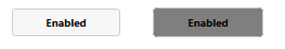
The default style, available just by placing a ToggleButton control in XAML looks like the default MahApps.Metro button.
  <Grid>
      <ToggleButton/>
  </Grid>
Another style, MetroCircleToggleButtonStyle is available by setting the ToggleButton’s style to MetroCircleToggleButtonStyle. This style changes the button’s background to AccentColorBrush when it is checked. To modify this behaviour, you will have to edit a copy of the control template using Blend.
  <ToggleButton Width="50"
                Height="50"
                Margin="0, 10, 0, 0"
                Style="{DynamicResource MetroCircleToggleButtonStyle}">
  </ToggleButton>

Using Glyphs Within a Circle Toggle Button
In order to use glyphs, you will have to add a reference to Icons.xaml.
<UserControl.Resources>
    <ResourceDictionary>
        <ResourceDictionary.MergedDictionaries>
            <ResourceDictionary Source="pack://application:,,,/MahApps.Metro.Resources;component/Icons.xaml" />
        </ResourceDictionary.MergedDictionaries>
    </ResourceDictionary>
</UserControl.Resources>
You can then include the icon you want using the following steps:
- Nest a
Rectanglewithin theToggleButton - Set it’s fill to the color you want the icon to have
- Set
Rectangle.OpacityMaskto contain aVisualBrushwith a Visual using the icon’s value as a reference.
For example:
<ToggleButton Width="50"
              Height="50"
              Margin="0, 10, 0, 0"
              Style="{DynamicResource MetroCircleToggleButtonStyle}">
    <Rectangle Width="20"
               Height="20"
               Fill="{DynamicResource BlackBrush}">
        <Rectangle.OpacityMask>
            <VisualBrush Stretch="Fill"
                         Visual="{DynamicResource appbar_city}"/>
        </Rectangle.OpacityMask>
    </Rectangle>
</ToggleButton>
Syncing Checked State of ToggleButton with Foreground
By default, any icon you set will retain the same color you set it to even if the ToggleButton is checked. To alter this, you can bind your content’s color to the ToggleButton’s Foreground property which changes to white by default when it is checked.
An example of how to do the binding can be found below:
<ToggleButton Width="50"
              Height="50"
              Margin="0, 10, 0, 0"
              Style="{DynamicResource MetroCircleToggleButtonStyle}">
    <Rectangle Width="20"
               Height="20"
               Fill="{Binding Path=Foreground, RelativeSource={RelativeSource FindAncestor, AncestorType={x:Type ToggleButton}}}">
        <Rectangle.OpacityMask>
            <VisualBrush Stretch="Fill"
                         Visual="{DynamicResource appbar_city}"/>
        </Rectangle.OpacityMask>
    </Rectangle>
</ToggleButton>