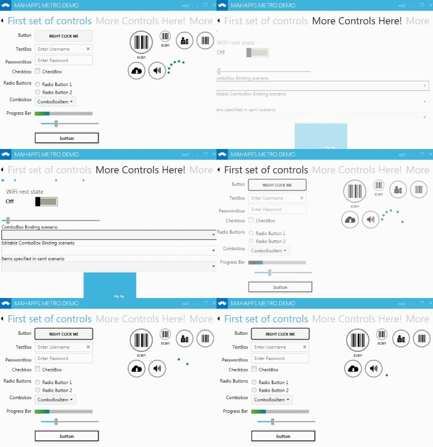
TabControl
There are three included tab styles - AnimatedTabControl, SingleRowAnimatedTabControl and the default TabControl.
The default TabControl style is included in Controls.xaml, but the other two require specific referencing (make sure to do this after a reference to Controls.xaml)
Default look

This shows the three states - selected/active tab, hover and inactive.
AnimatedTabControl
<ResourceDictionary Source="pack://application:,,,/MahApps.Metro;component/Styles/Controls.AnimatedTabControl.xaml" />
Functioning just like the regular TabControl, except it animates every tab change by wrapping everything in a MetroContentControl.

AnimatedSingleRowTabControl
<ResourceDictionary Source="pack://application:,,,/MahApps.Metro;component/Styles/Controls.AnimatedSingleRowTabControl.xaml" />
AnimatedSingleRowTabControl functions exactly the same as the AnimatedTabControl except the tabs will only appear on a single line rather than wrapping.
Instead of wrapping, arrows (left/right) are presented.

