SplitButton and DropDownButton
SplitButton

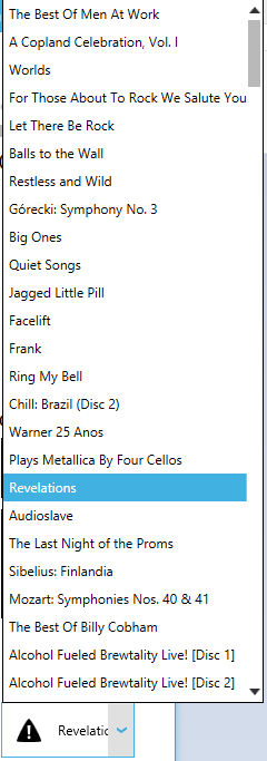
This controls is like button with dropdownlist, but content of the button changed when selected item changed.
Events
SplitButton has SelectionChanged and Click events
SelectedItem and SelectedIndex
This properties usage is just like in Listbox or ComboBox. When one of this properties changed, Content of the button will also changed.
Binding to ObservableCollection or Dictionary
To correctly bind an ObservableCollection or a Dictionary to SplitButton, you need to use ItemsSource and DisplayMemberPath
For ex, ItemsSource="{Binding Albums}" DisplayMemberPath="Title"
In case you bind simple types like an enum or integer, you dont need to use DisplayMemberPath property, only ItemsSource`.
Orientation
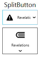
SplitButton supports orientation changing as you can see on the screenshot.
Button commands
You can use button commands for SplitButton
Icon property
You can add separate icon to SplitButton to display it independently from its content.
It could be bitmap image or vector icon.
Icon="{DynamicResource appbar_alert}"
Example
<Controls:SplitButton
    Icon="{DynamicResource appbar_alert}"
    HorizontalContentAlignment="Left"
    HorizontalAlignment="Center"
    VerticalContentAlignment="Center"
    Width="120"
    SelectedIndex="2"
    ItemsSource="{Binding Albums}"
    DisplayMemberPath="Title"
    VerticalAlignment="Center" />
result will be:

DropDownButton

This control almost the same as SplitButton with few differences:
It has no SelectedItem and SelectedIndex properties and also has no SelectionChanged event.
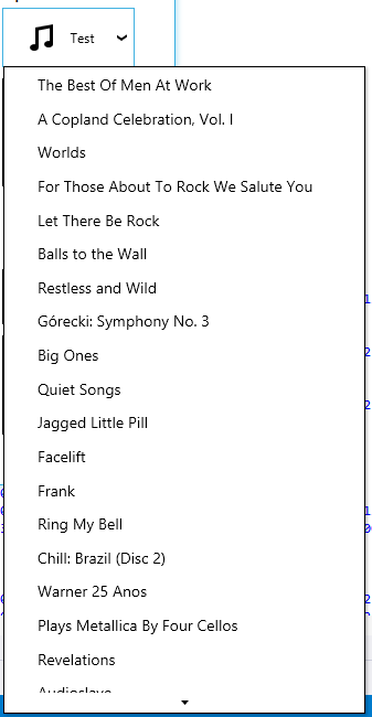
The content of the button also doesn’t change, it’s static. The Dropdownlist is a context menu instead of Listbox in SplitButton.
Inj all other aspects it’s identical to SplitButton.
Example
<Controls:DropDownButton
    VerticalContentAlignment="Center"
    Width="120"
    Content="Test"
    DisplayMemberPath="Title"
    Icon="{DynamicResource appbar_music}"
    ItemsSource="{Binding Albums}">
</Controls:DropDownButton>
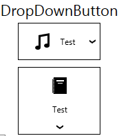
Result:

Internally, the items are stored in a ContextMenu that is executed when the button is clicked. Therefore, if you want to do something when an item is clicked, you have to define a command that is attached to the item.
One way of doing this is setting the ItemContainerStyle:
<Controls:DropDownButton.ItemContainerStyle>
    <Style TargetType="MenuItem" BasedOn="{StaticResource {x:Type MenuItem}}">
        <Setter Property="Header" Value="{Binding Title}"/>
        <Setter Property="Command" Value="{Binding DataContext.SetAlbumCommand, RelativeSource={RelativeSource FindAncestor, AncestorType=UserControl}}"/>
        <Setter Property="CommandParameter" Value="{Binding }"/>
    </Style>
</Controls:DropDownButton.ItemContainerStyle>
Each MenuItem has one item from the ItemsSource as DataContext, which we can access here. Therefore, {Binding Title} will use the title from the current Album object. To break out of the current DataContext and call the command from our original ViewModel, we need to reference it in some way. Here, we search for a UserControl above the current item in the visual tree. The command gets the current album as parameter (via {Binding }, which gives the current Album as it is the DataContext of the MenuItem).
