
Flyouts
A flyout is an overlay for a window that has custom content.
Add the following code to your MetroWindow:
<Controls:MetroWindow.Flyouts>
    <Controls:FlyoutsControl>

    </Controls:FlyoutsControl>
</Controls:MetroWindow.Flyouts>
This is the container for the flyouts. Inside this container add the following:
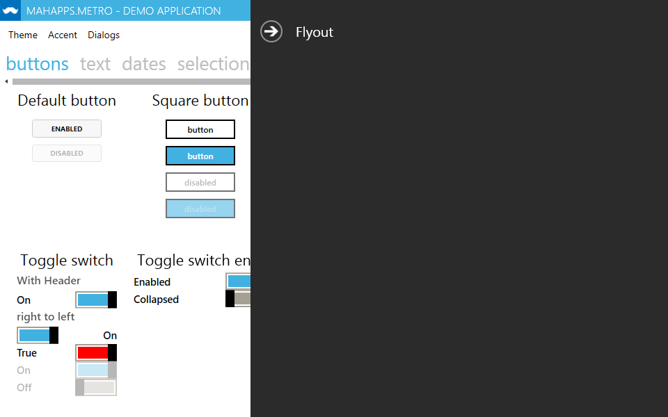
<Controls:Flyout Header="Flyout" Position="Right" Width="200">
    <!-- Your custom content here -->
</Controls:Flyout>
This creates a flyout with a header, sliding out from the right side of the window and has a width of 200.
The Position property can have the values
    Left,
    Right,
    Top,
    Bottom
Themed flyouts
As of version 0.12, flyouts can have various themes, assignable through the Theme property, those are:
    Adapt,
    Inverse,
    Dark,
    Light,
    Accent
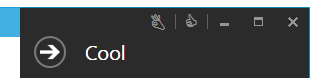
Adaptadapts the flyout theme to the host window’s theme.Inversehas the inverse theme of the host window’s theme.Darkwill always be the dark theme, this is also the default value.Lightwill always be the light theme.Accentadapts the flyout theme to the host window’s theme, it looks like this for the blue theme:

WindowCommandsOverlayBehaviorn
MetroWindow has overlay properties for LeftWindowCommands, RightWindowCommands, WindowButtonCommands and the Icon to handle the topmost status, even if a flyout is shown.
public WindowCommandsOverlayBehavior LeftWindowCommandsOverlayBehavior
public WindowCommandsOverlayBehavior RightWindowCommandsOverlayBehavior
public WindowCommandsOverlayBehavior WindowButtonCommandsOverlayBehavior
public WindowCommandsOverlayBehavior IconOverlayBehavior
These are the values for WindowCommandsOverlayBehavior
Never // Doesn't overlay flyouts nor a hidden TitleBar.
Flyouts // Overlays opened Flyout controls.
HiddenTitleBar // // Overlays a hidden TitleBar.
Always
WindowCommandsOverlayBehavior.Always
WindowCommandsOverlayBehavior.Never
